TYPOGRAPHY
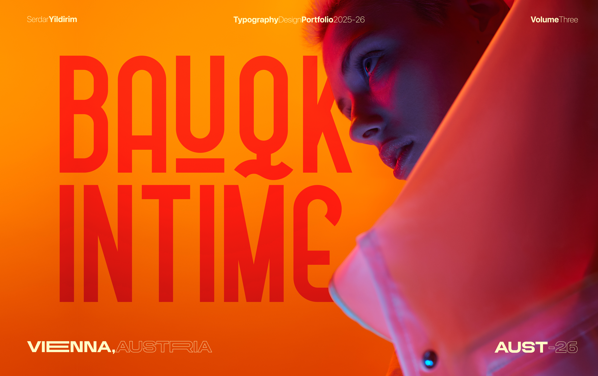
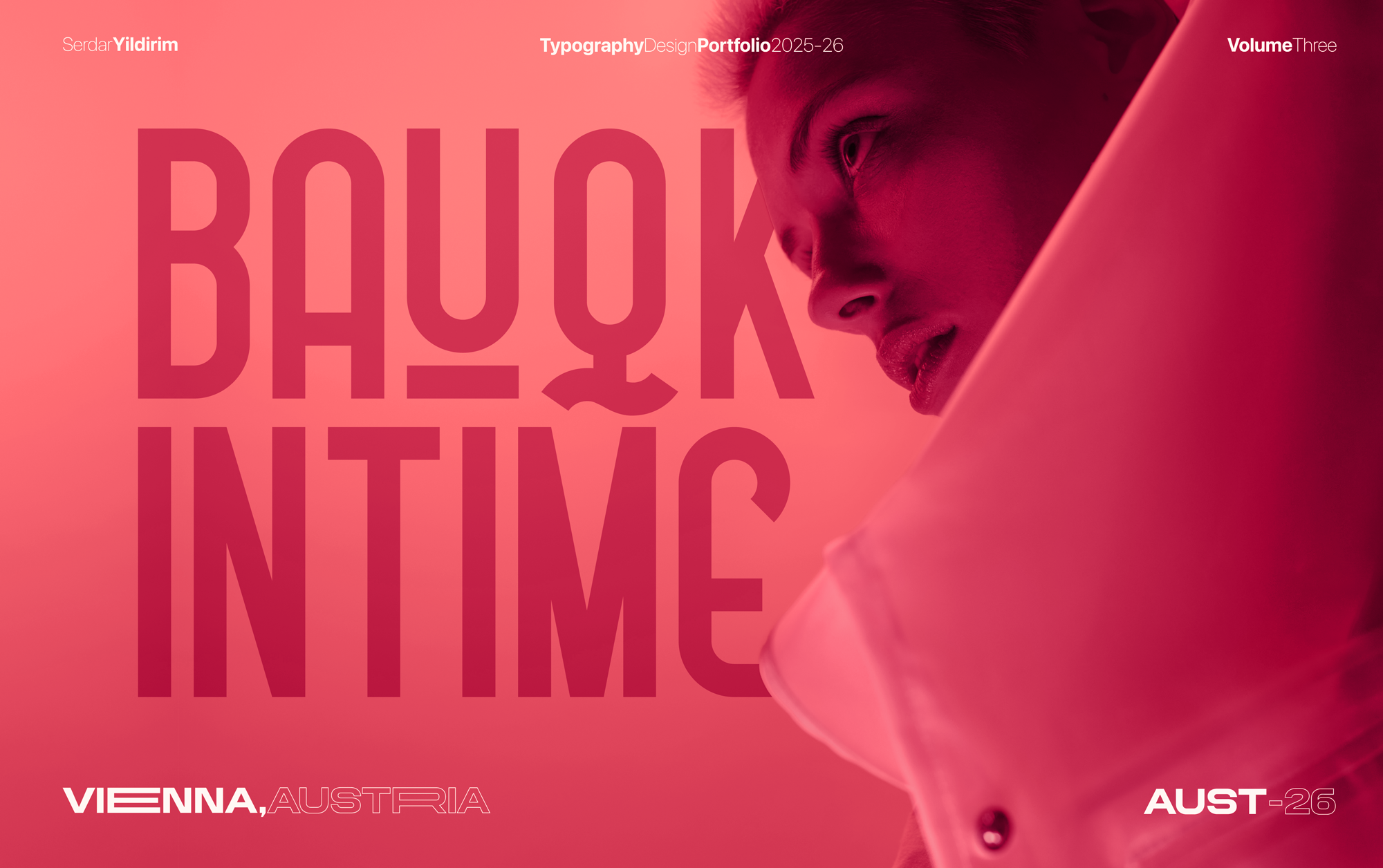
ARCHITECTURAL MINIMALISM. CINEMATIC EXECUTION.
I merge the precision of the Swiss grid with the moody depth of Noir, treating typography not just as information, but as physical form. This collection represents a commitment to technical precision—a cohesive body of work where every layout is executed with absolute control and a singular point of view.


CASE STUDIES
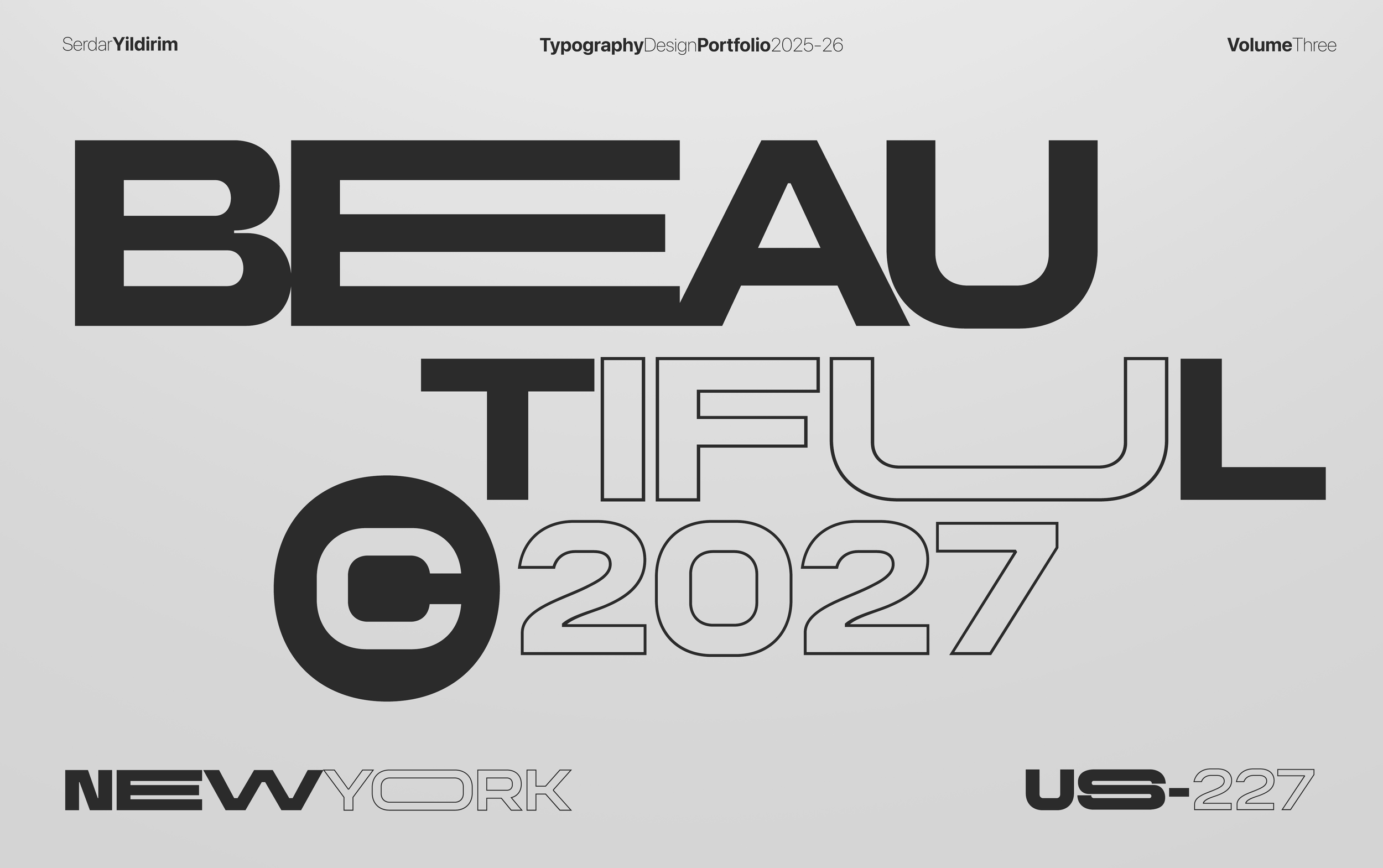
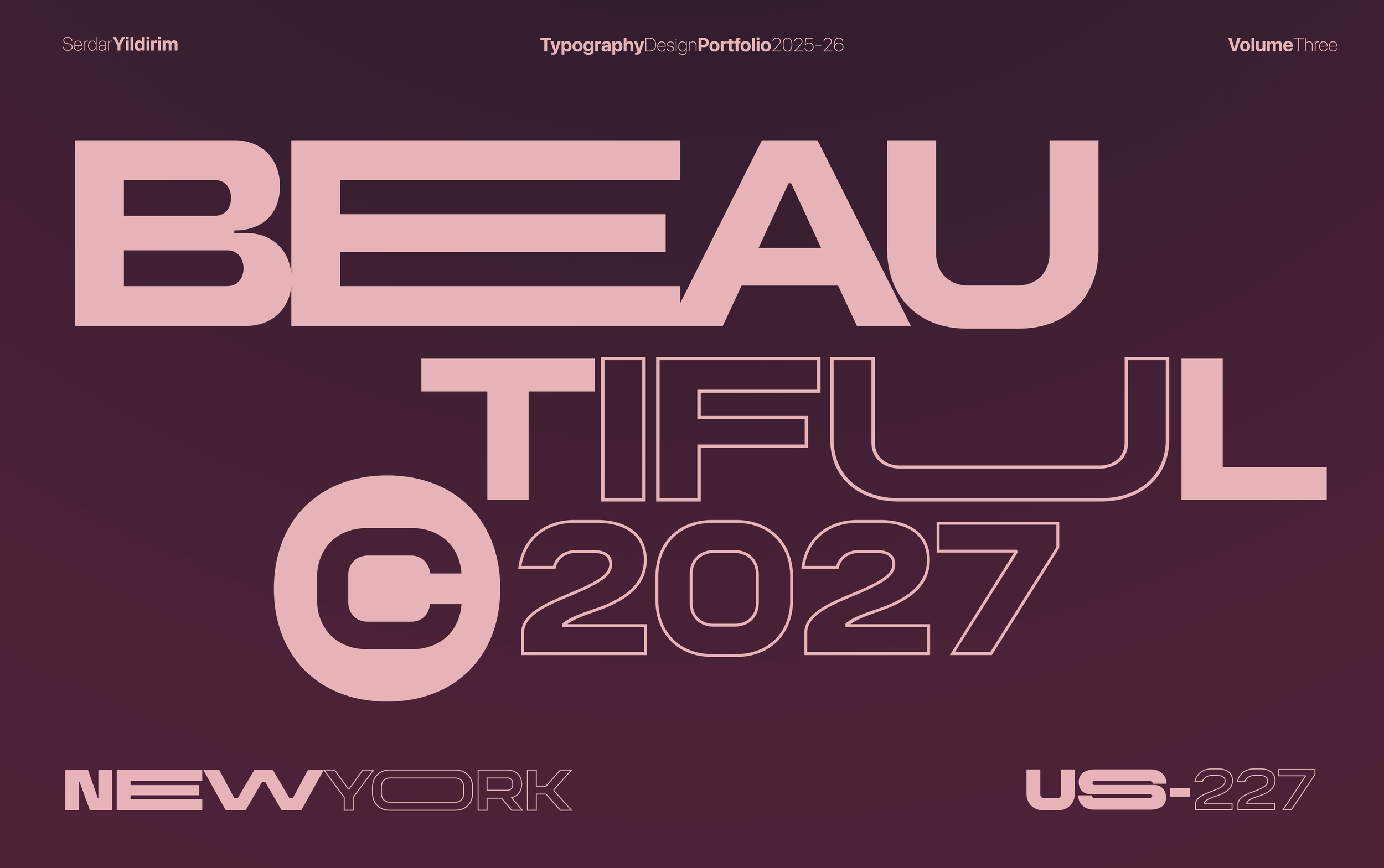
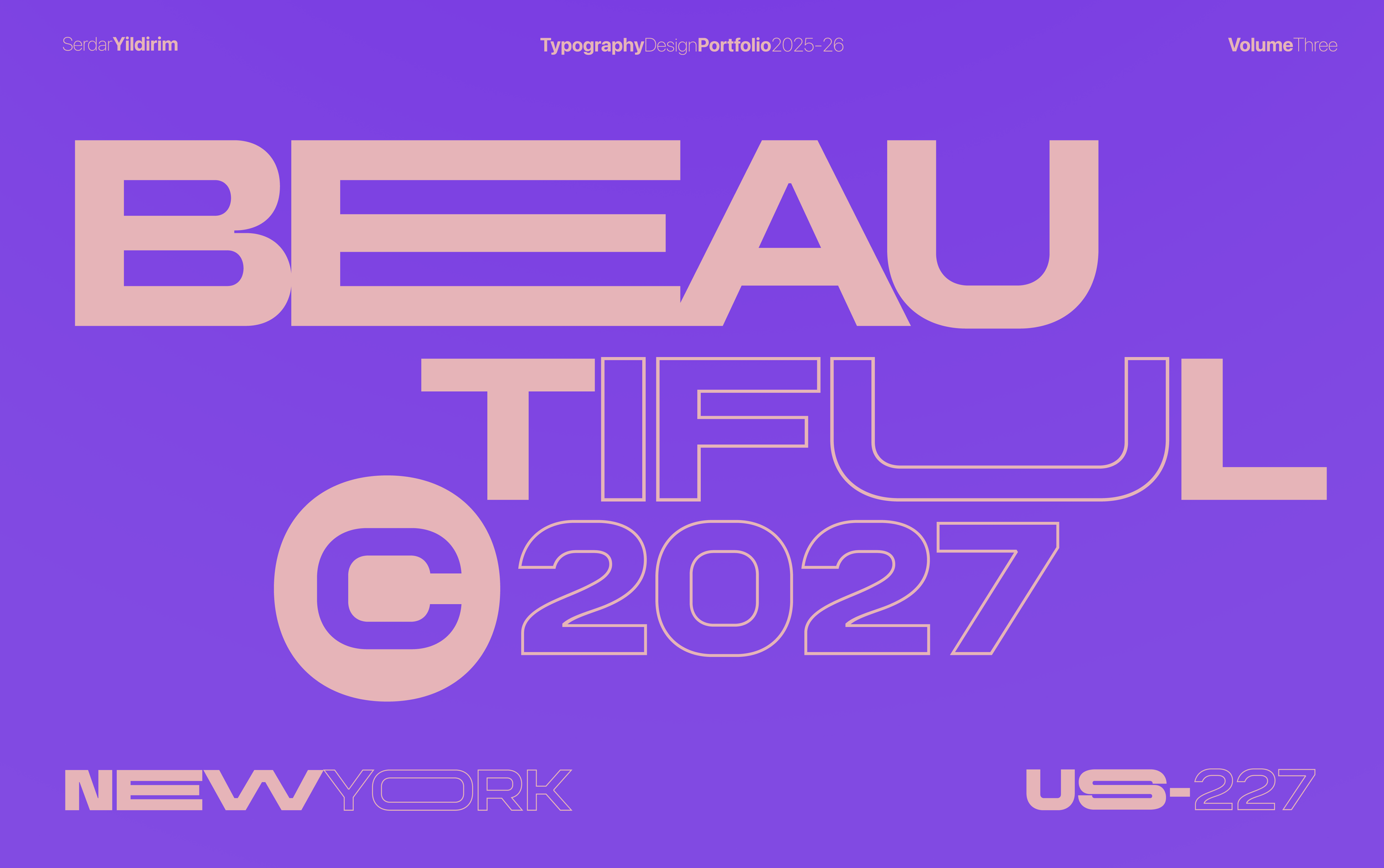
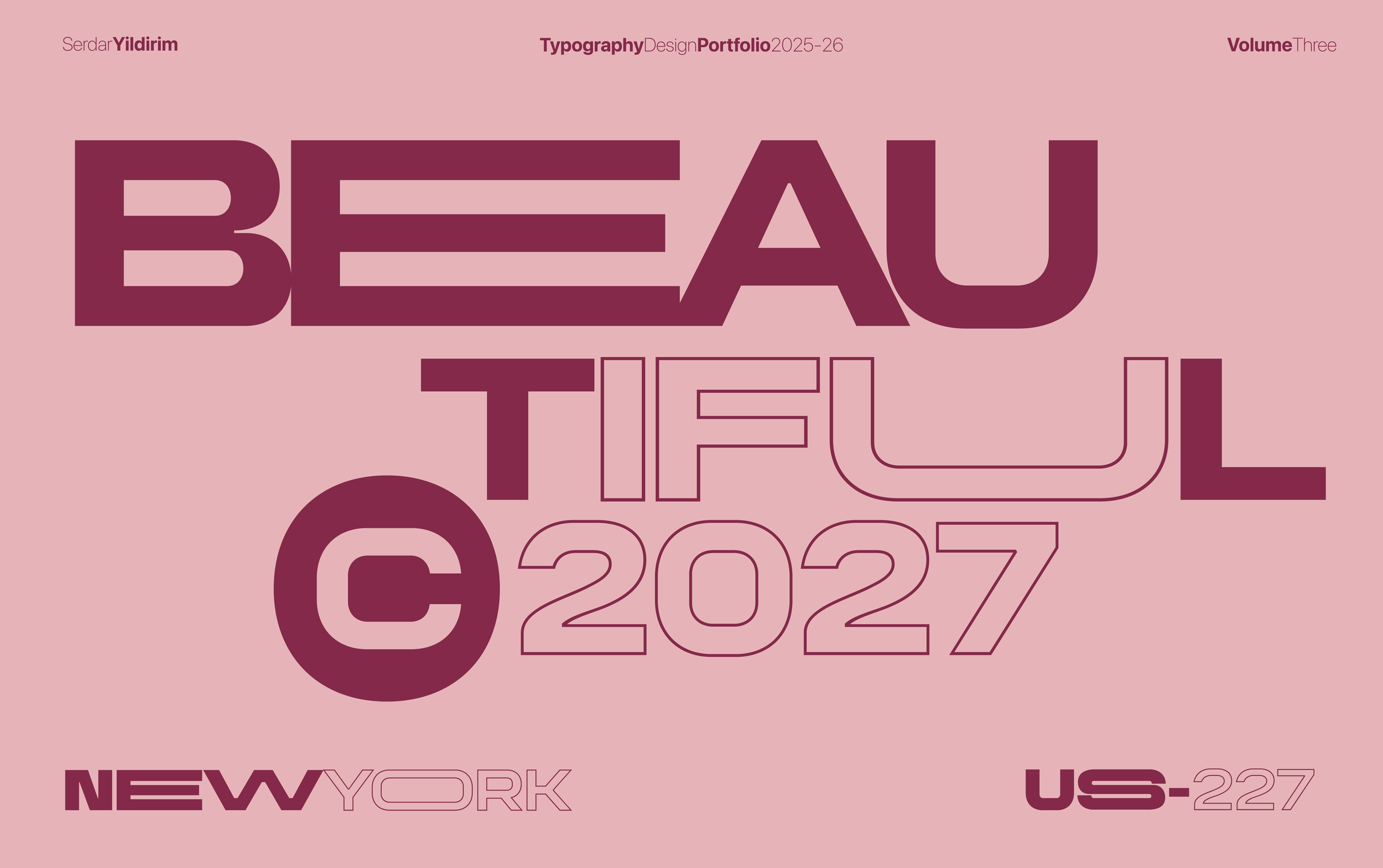
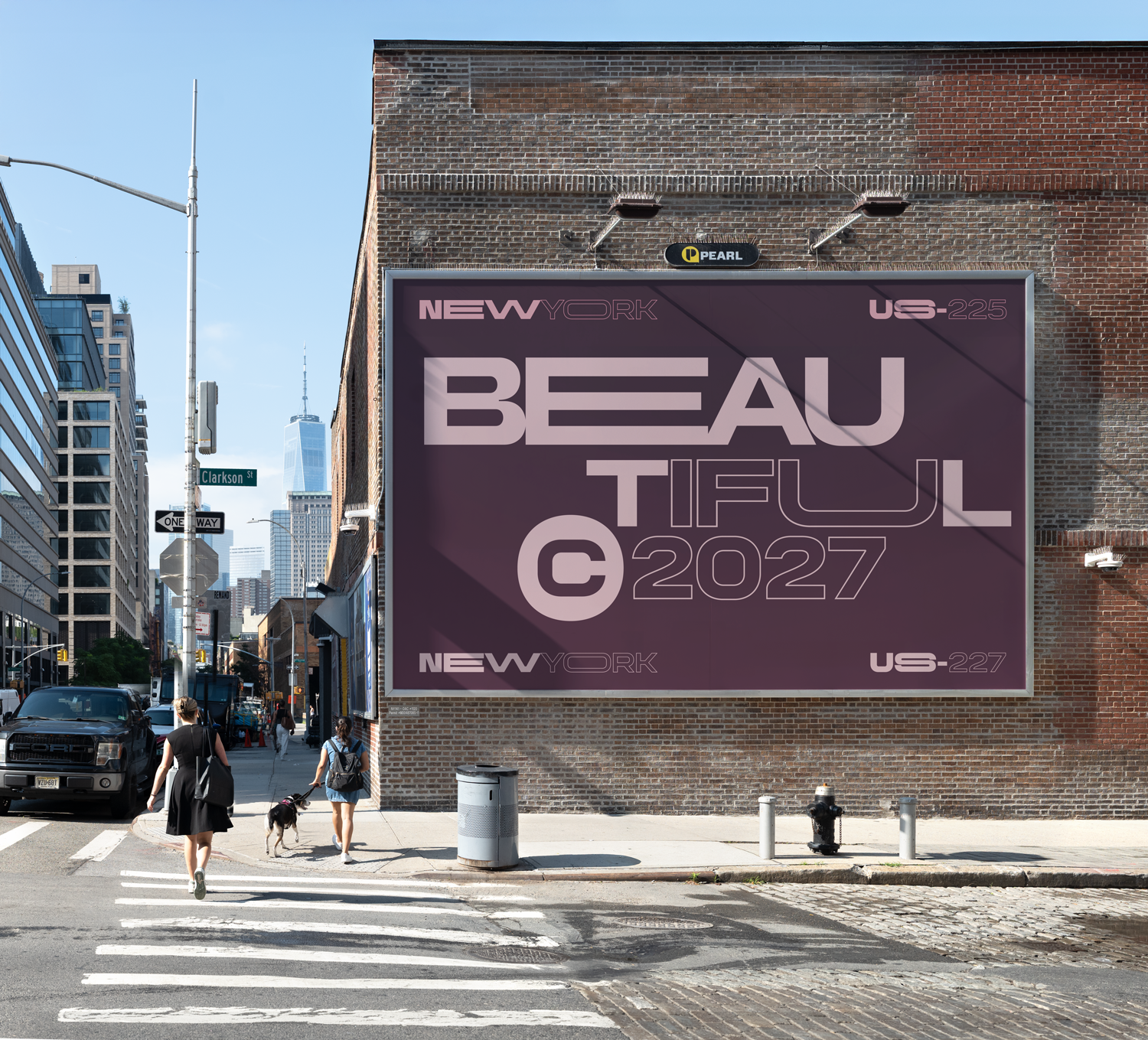
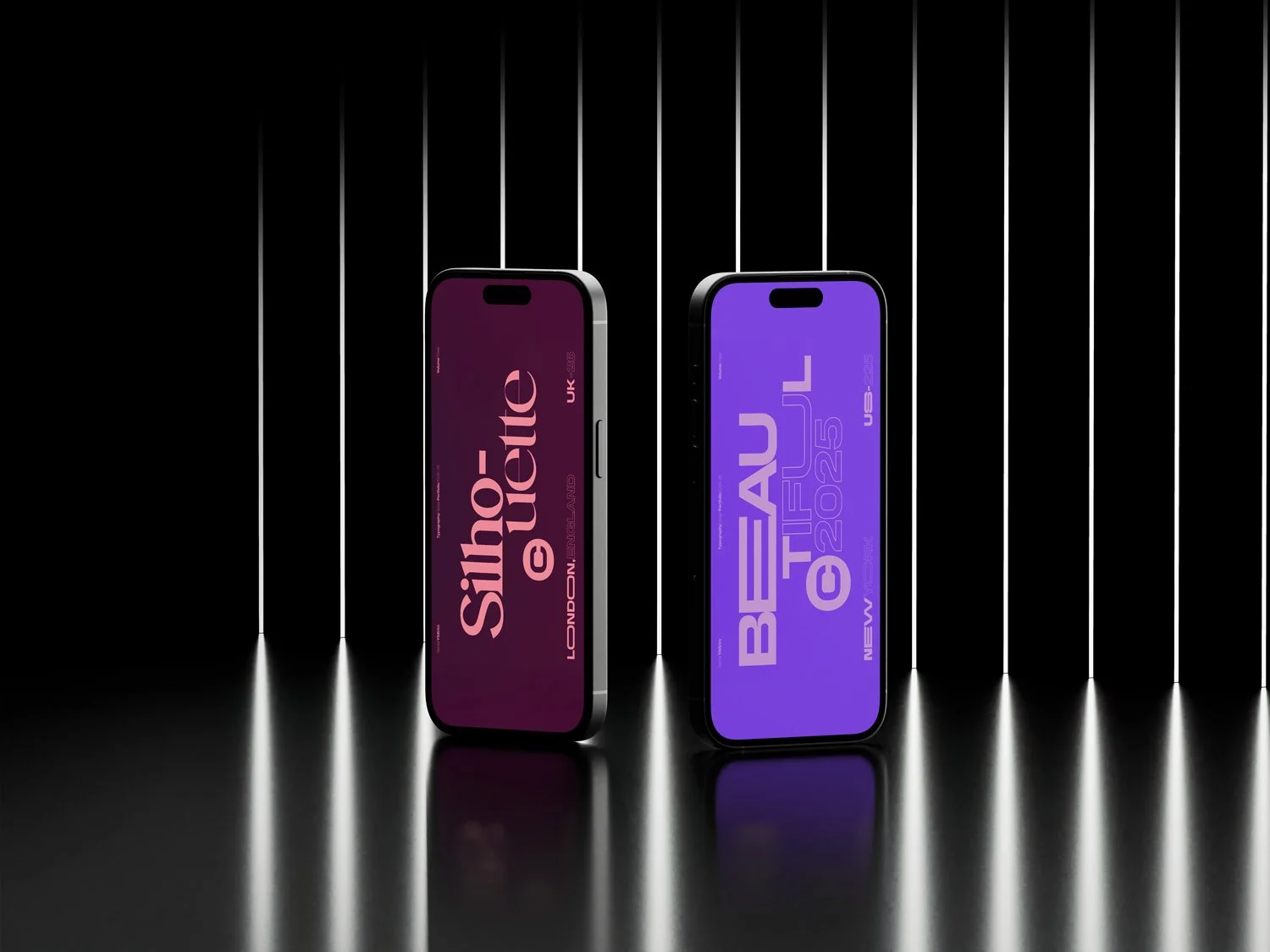
CASE STUDY: THE BEAUTIFUL TYPOGRAPHY SERIES
The Typographic Obstacle: This series explores the power of rhythmic Typographic Stutter—the intentional fracturing of a word against its natural syllable structure. By stacking "BEAU-TIFUL" into a dense, architectural block, the design transforms the word from simple language into a physical obstacle for the eye. The typography looks like it has weight- not just floating around the canvas.
The Strategy: Standard legibility invites passive scanning. This layout rejects that passivity. The broken syntax creates visual friction, forcing the viewer to decelerate and actively reconstruct the word. This process shifts the interaction from "reading" to "decoding," ensuring the image arrests attention and remains in memory long after the scroll.


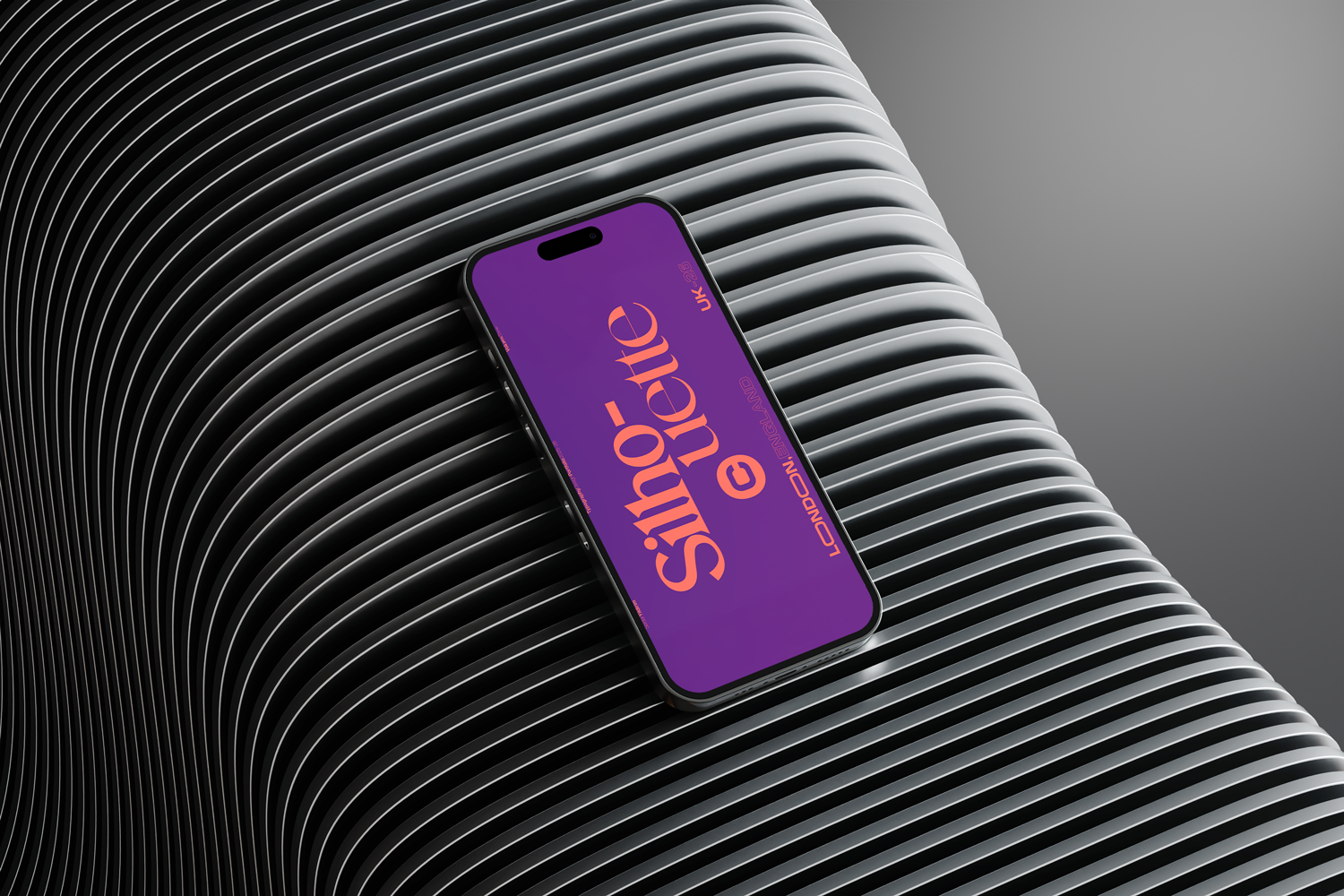
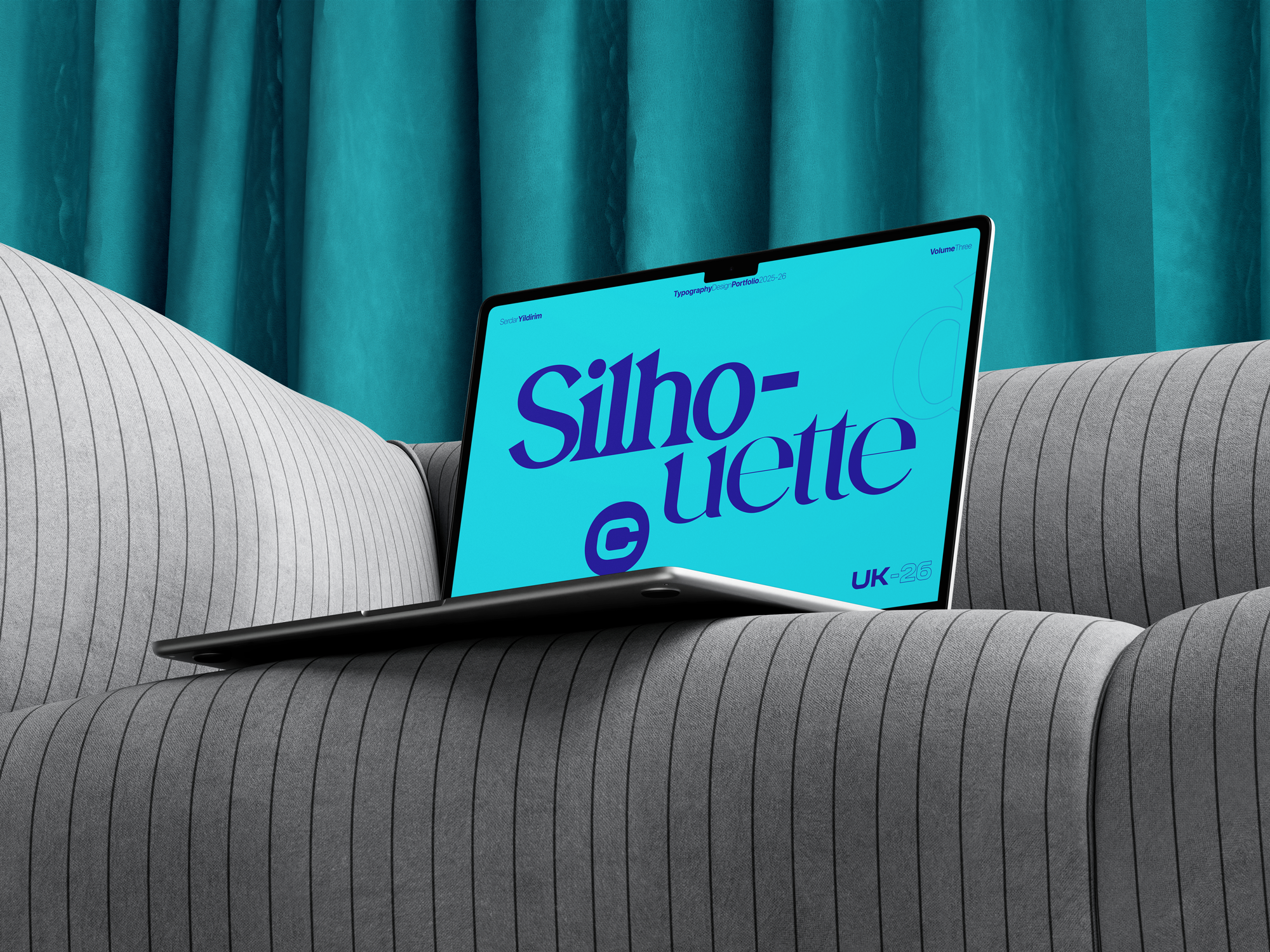
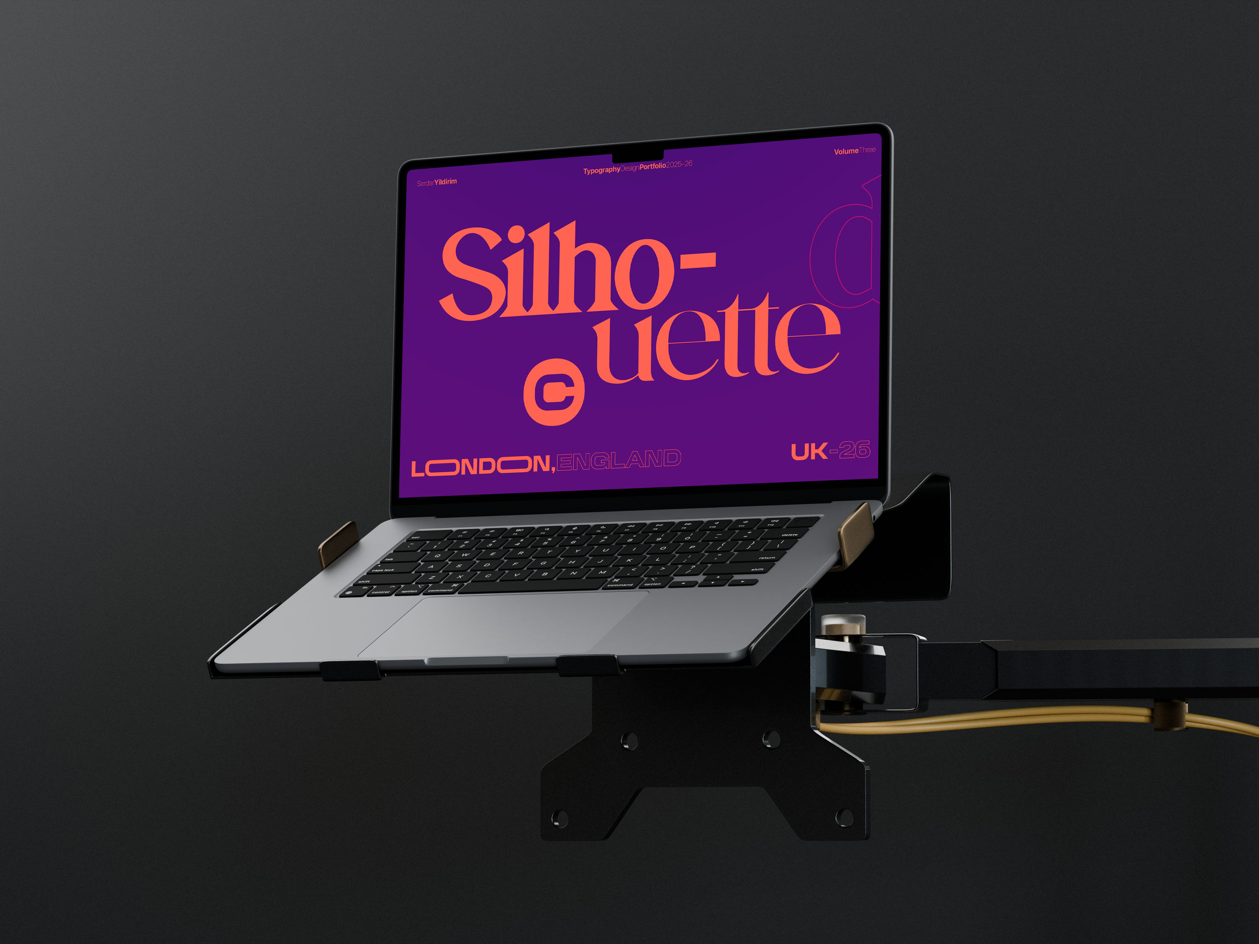
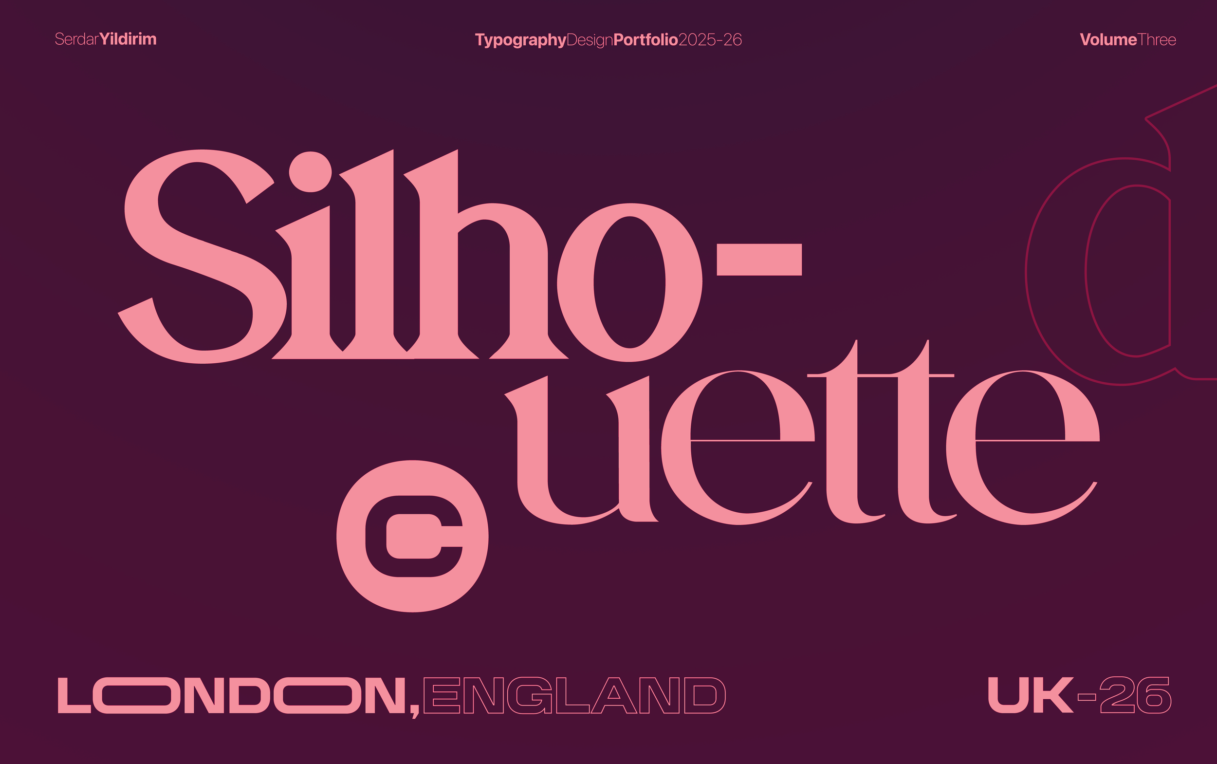
CASE STUDY: SILHOUETTE TYPOGRAPHY SERIES
The Swiss Counterweight: A study in the tension between expression and discipline. The central composition features "Monolithic" typography—heavy, blocky forms that dominate the negative space and prioritize the grid over the dictionary.
The Balance: To ground this expressive energy, the perimeter is anchored by a rigorous Metadata Layer. Precise volume numbers, timestamps, and location codes frame the chaos with "Swiss" exactitude.
The Result: These minute details act as a Technical Counterweight. They signal to the viewer that the disruption in the center is not accidental; it is a calculated choice framed by a system of absolute control.