DESIGN FRAMEWORKS
FOUNDATIONS FOR CONSISTENCY AND SCALE.
This section highlights the core structures that govern visual systems—typography, color, imagery, and layout. Designed to standardize execution and maintain brand integrity, these frameworks enable consistent, scalable output across teams and platforms.
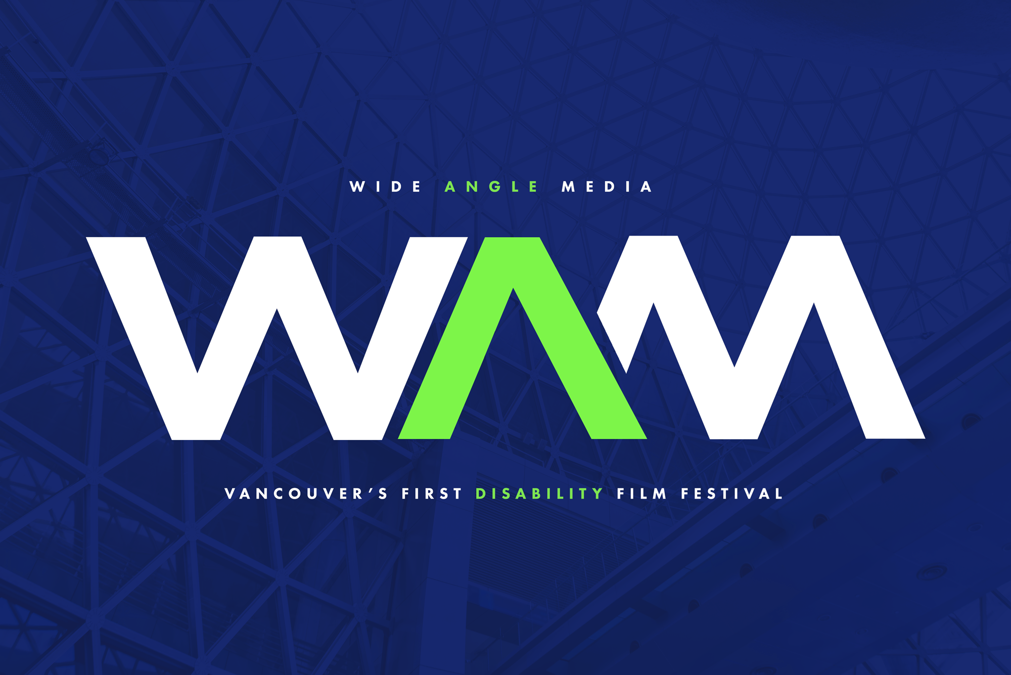
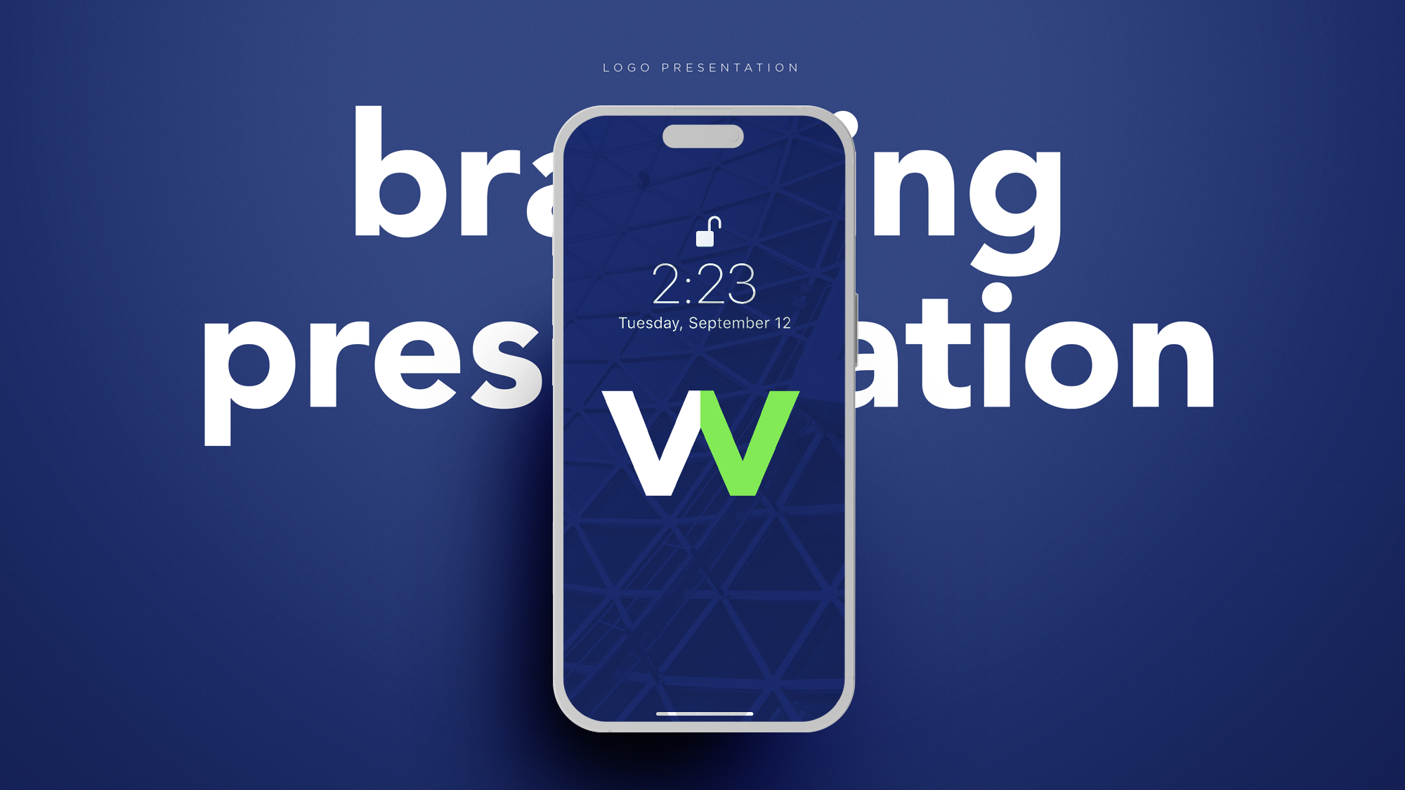
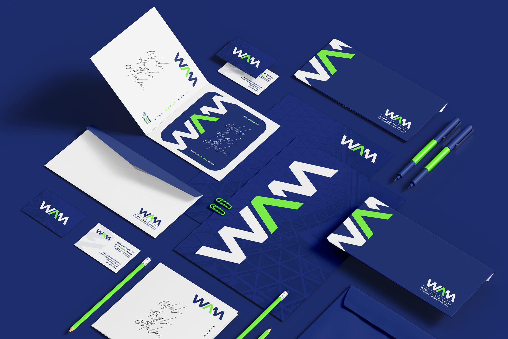

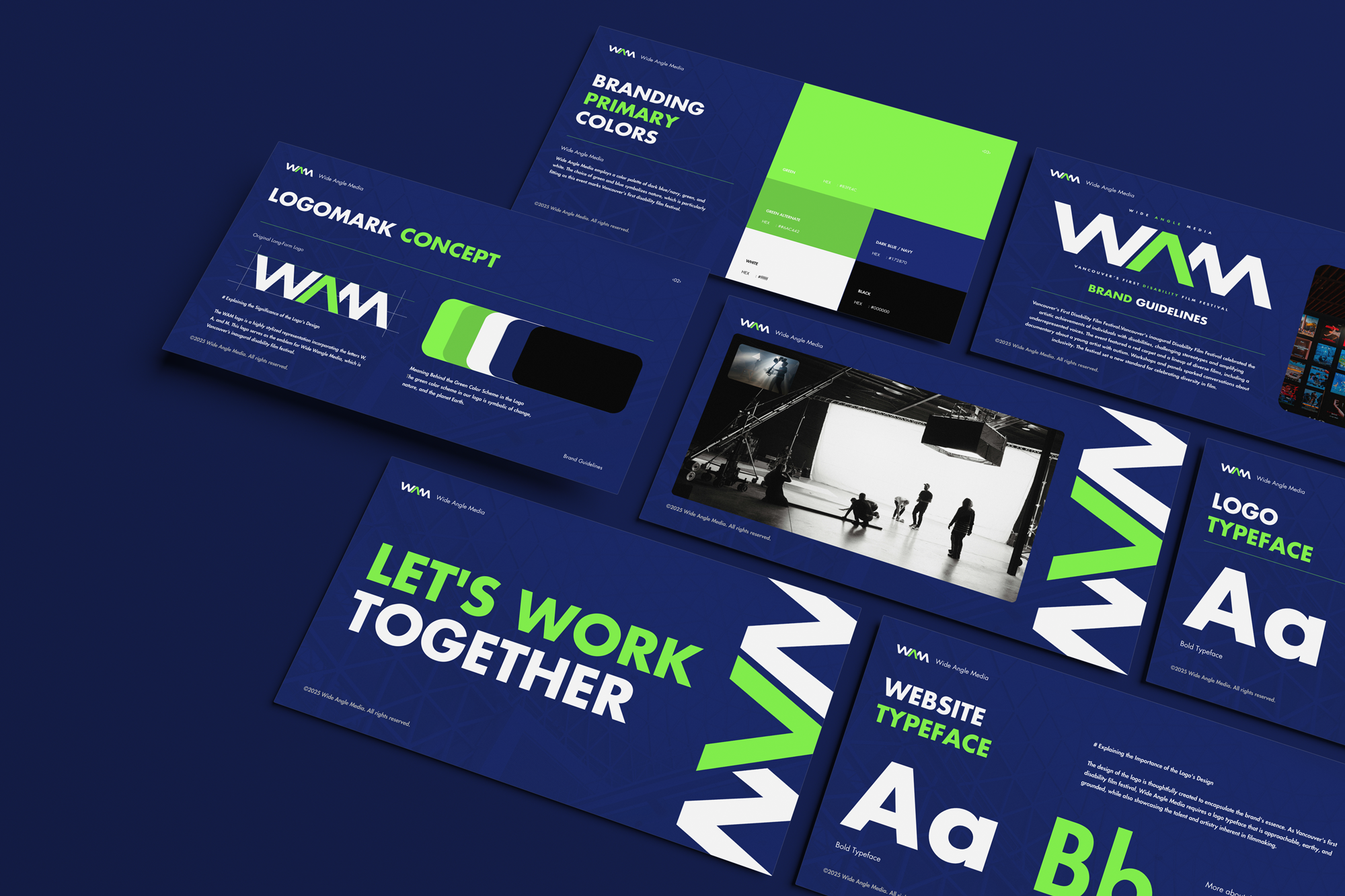
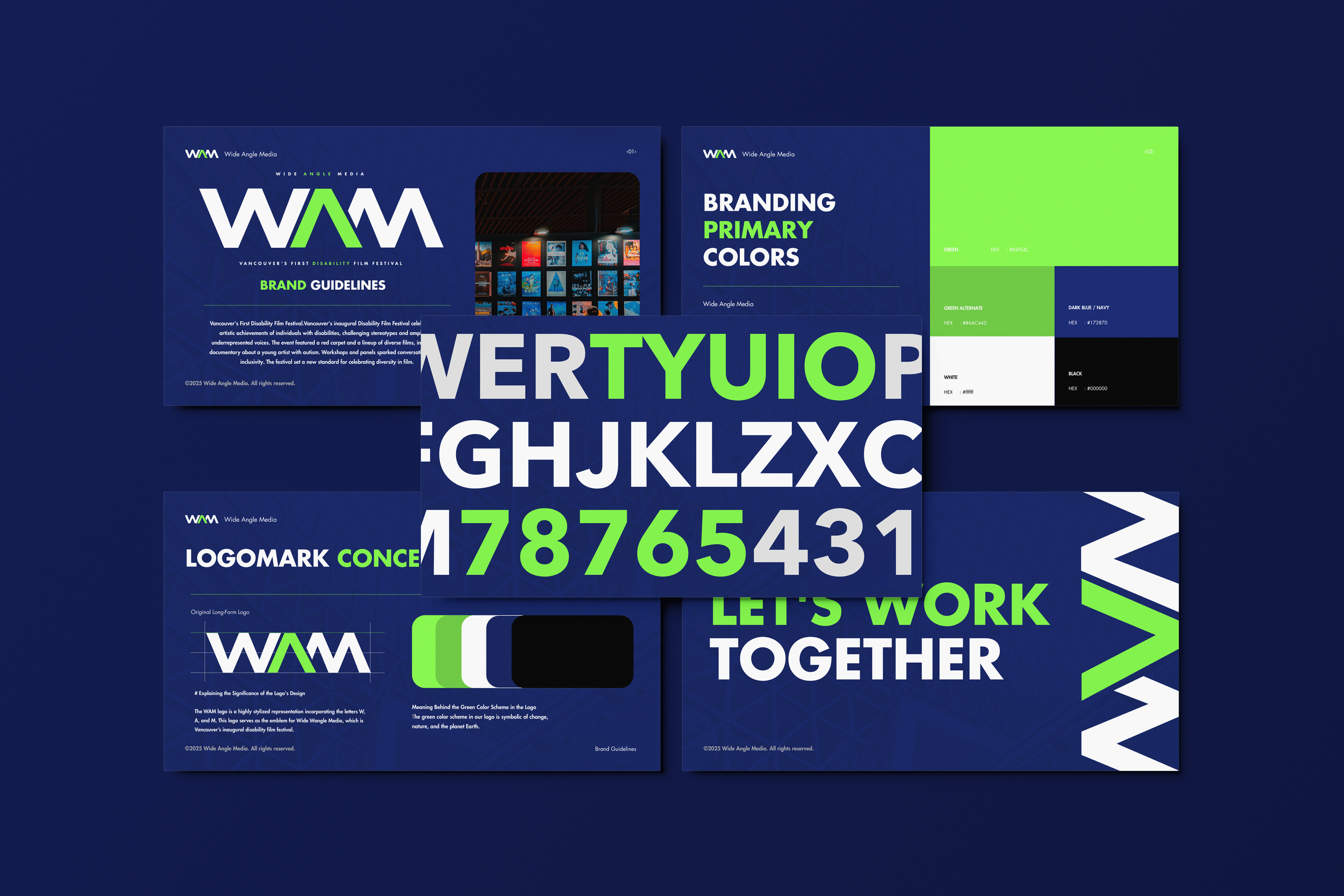
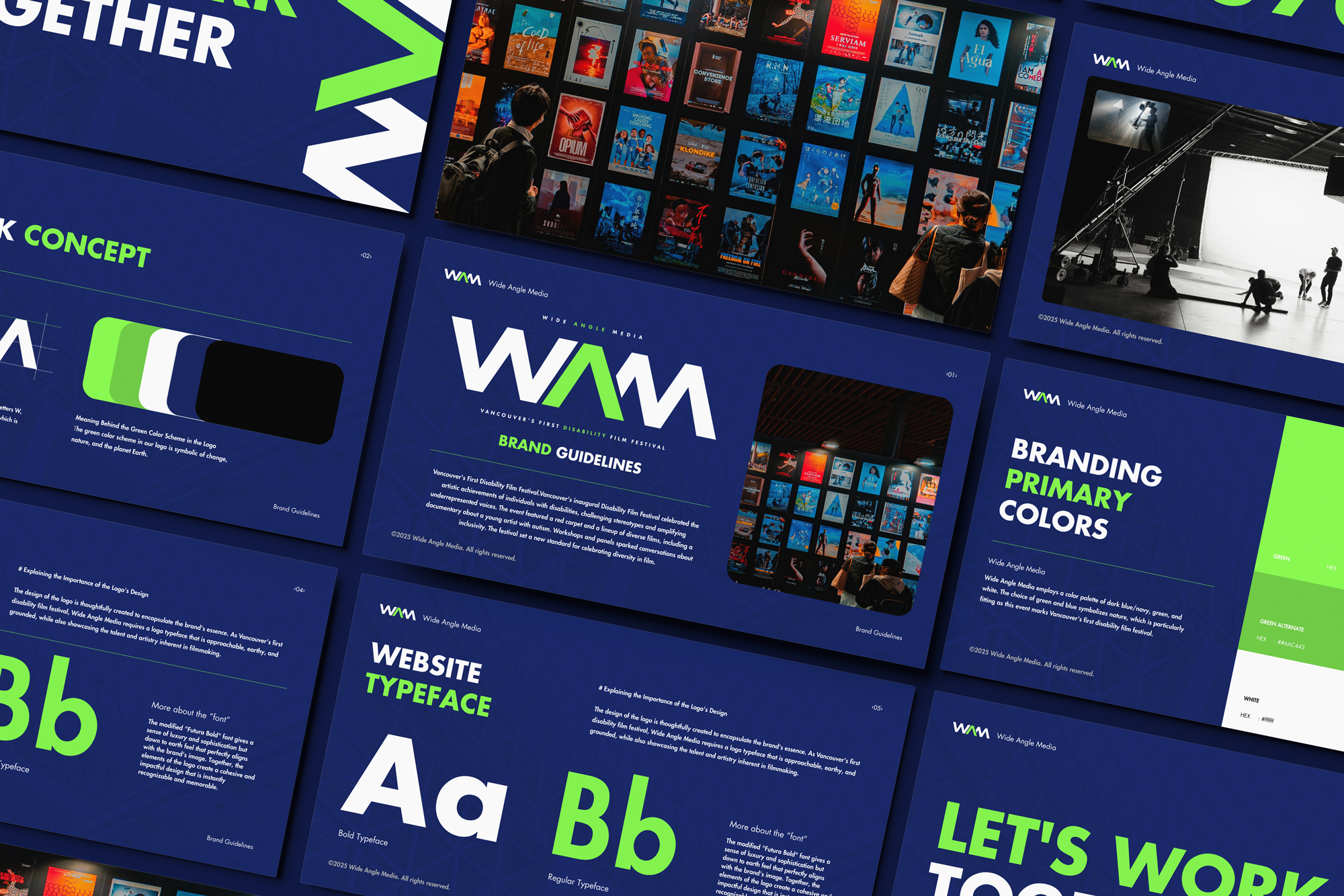
CASE STUDY: WIDE ANGLE MEDIA (WAM)
Wide Angle Media
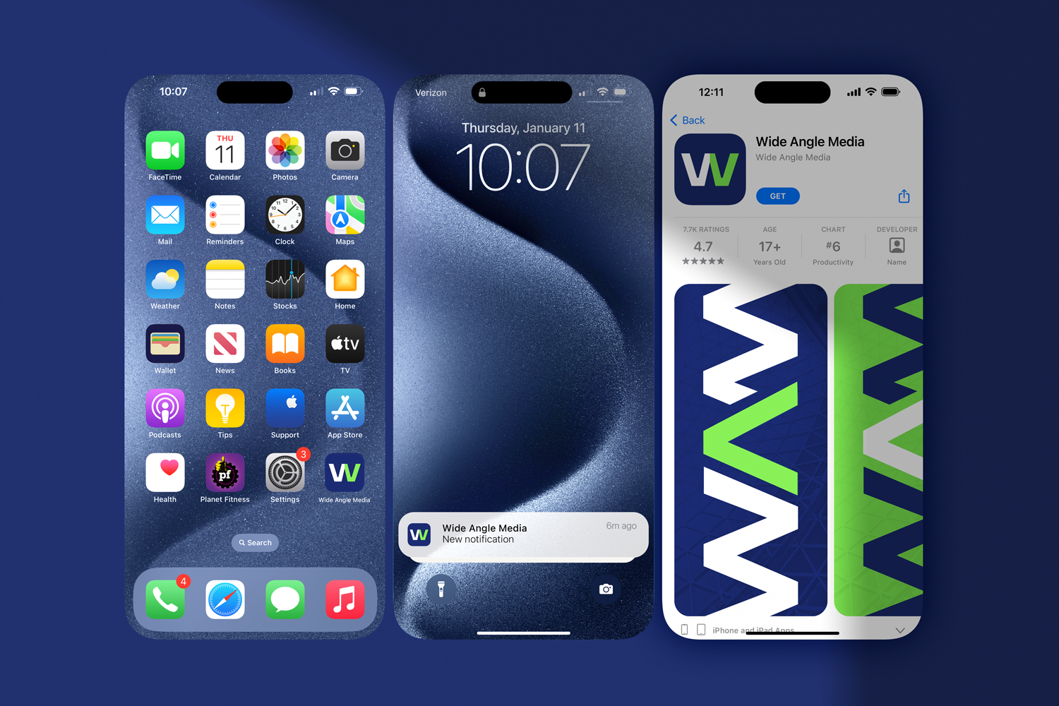
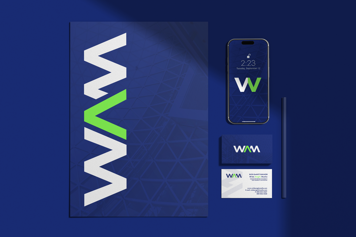
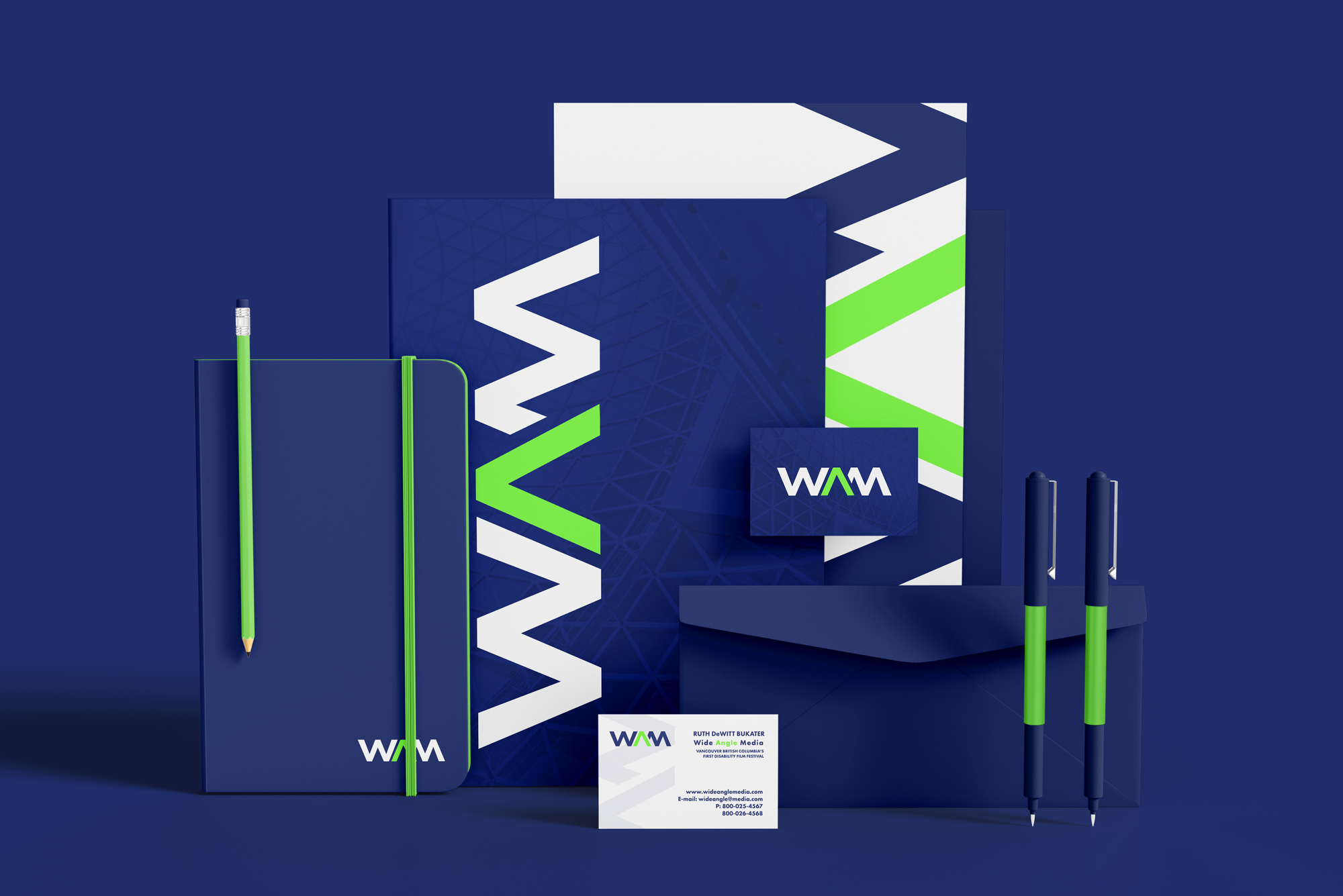
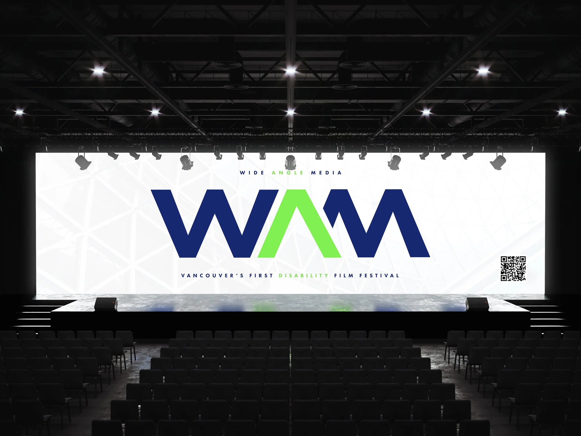
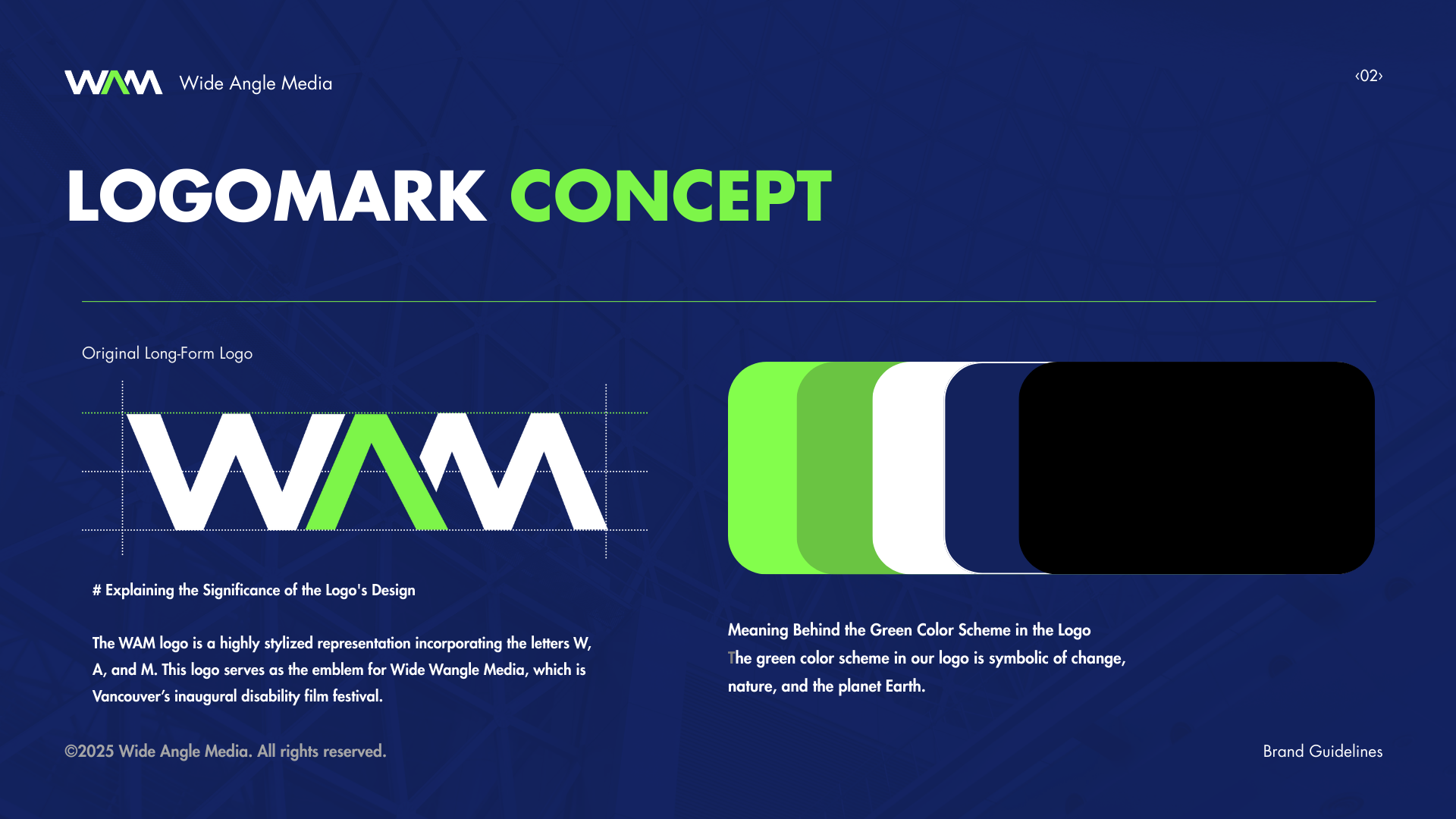
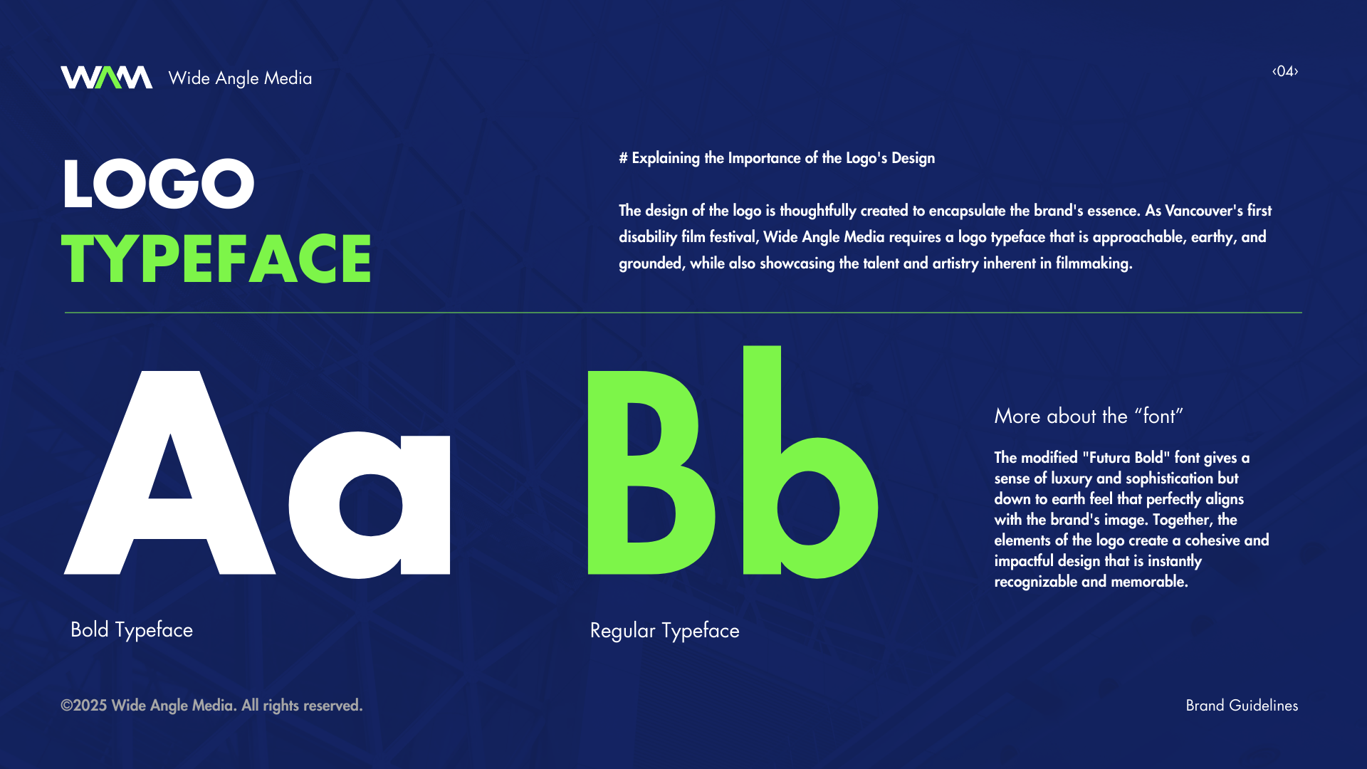
Wide Angle Media (WAM) is the identity system for Vancouver’s first disability-focused film festival, designed to support clarity, accessibility, and consistent communication across all audience touchpoints.
Challenge
Create a cohesive brand system for a first-of-its-kind festival with no existing visual foundation, while ensuring accessibility across a wide range of audience needs. The system needed to perform across physical environments (event signage, stage, print) and digital platforms (mobile, social) without compromising legibility or consistency.
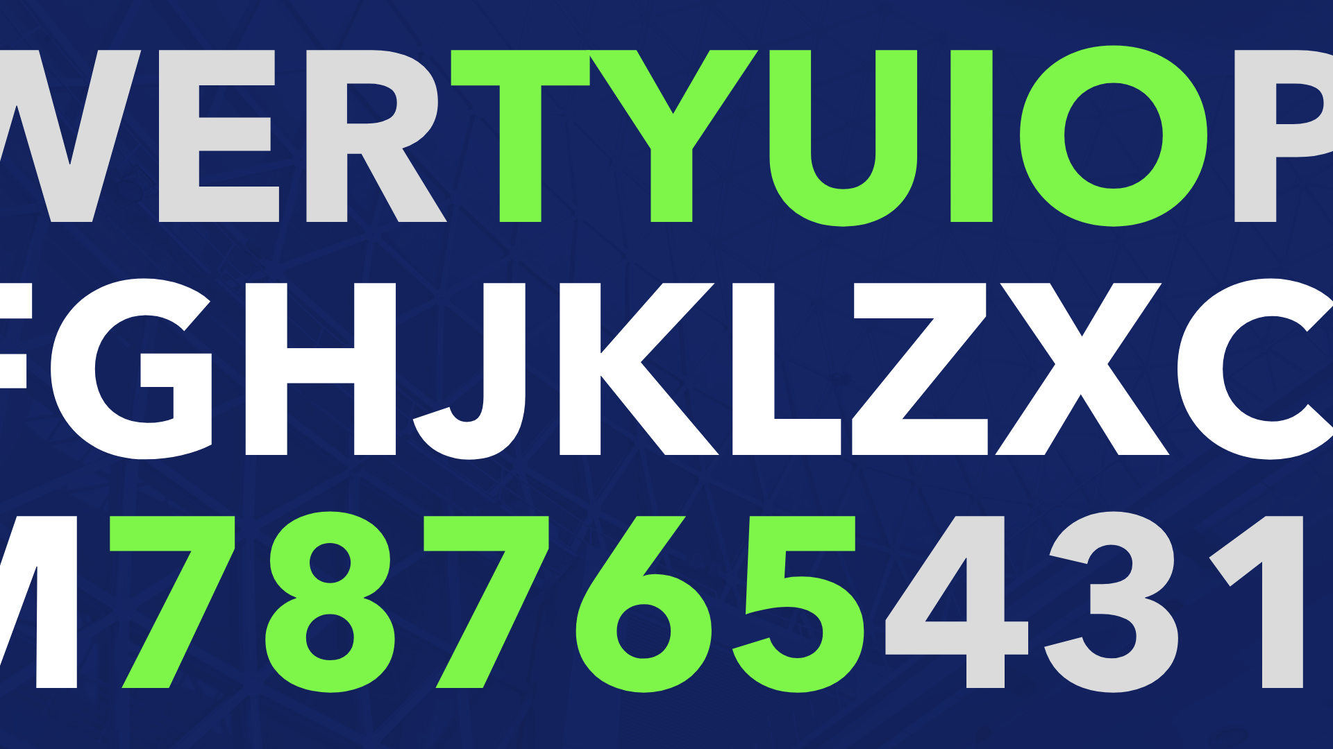
Approach
Developed a typography-led identity built on high-contrast color, clear hierarchy, and a repeatable grid system. Every component was designed for scalability—allowing assets to be produced quickly while maintaining visual consistency. The system was structured to prioritize readability, navigation, and adaptability across formats.
Result
Delivered a production-ready brand system deployed across event environments, digital platforms, and marketing materials. The system enabled efficient, high-volume asset creation while maintaining accessibility standards and a unified visual presence across all touchpoints.


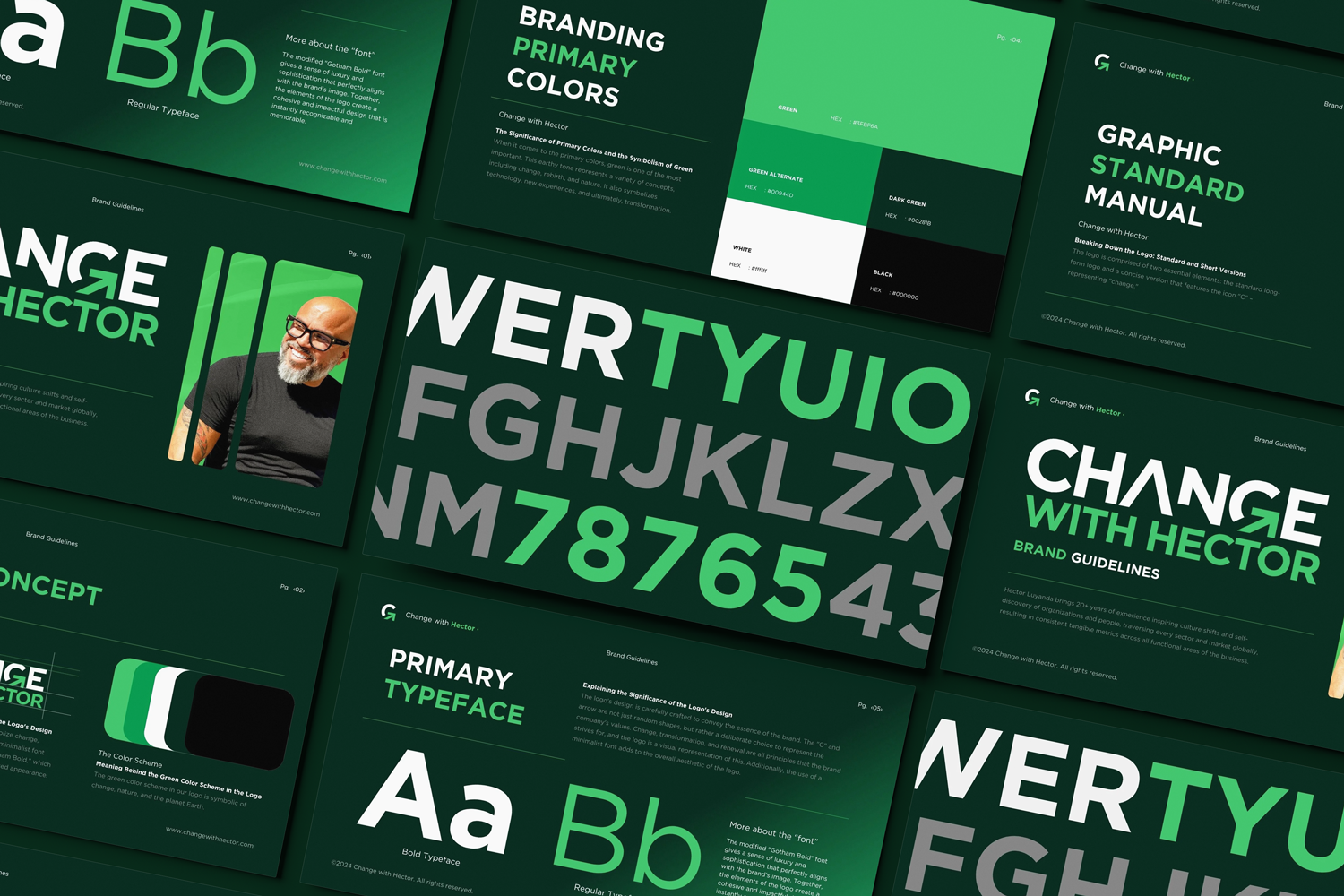
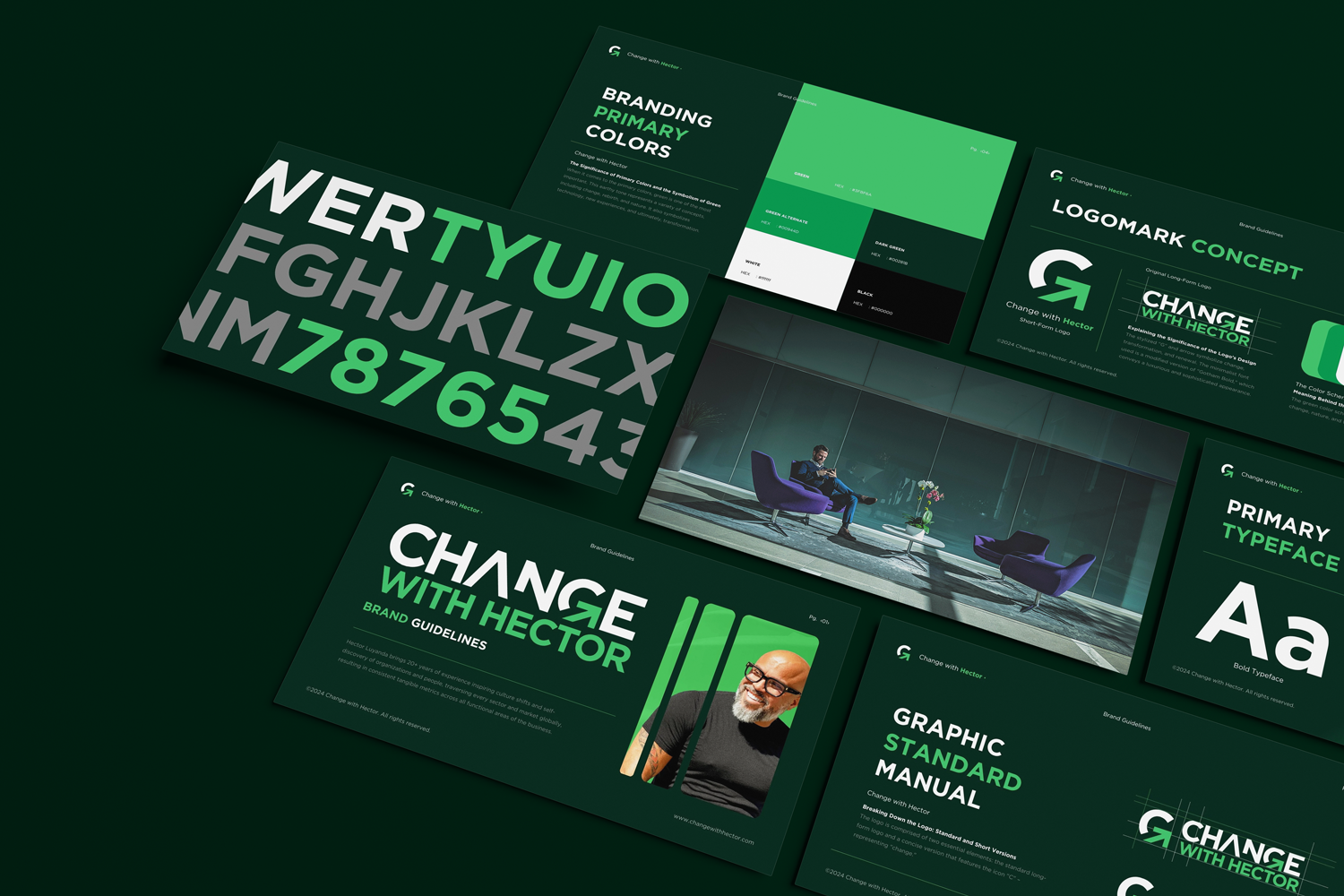
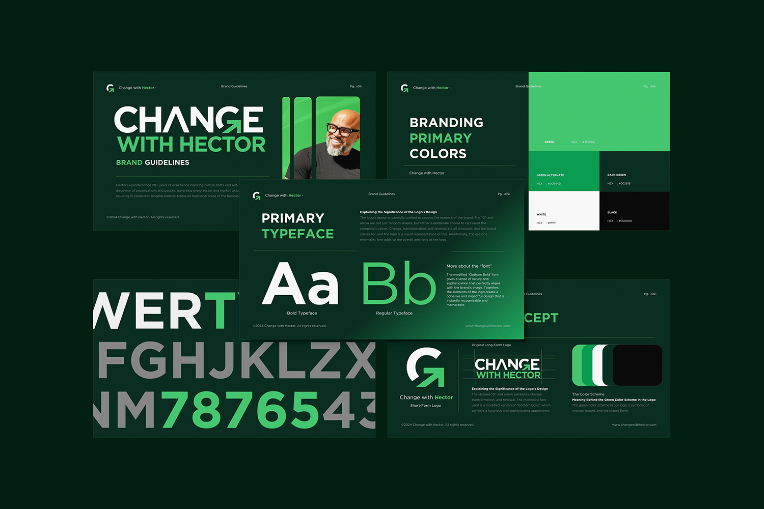
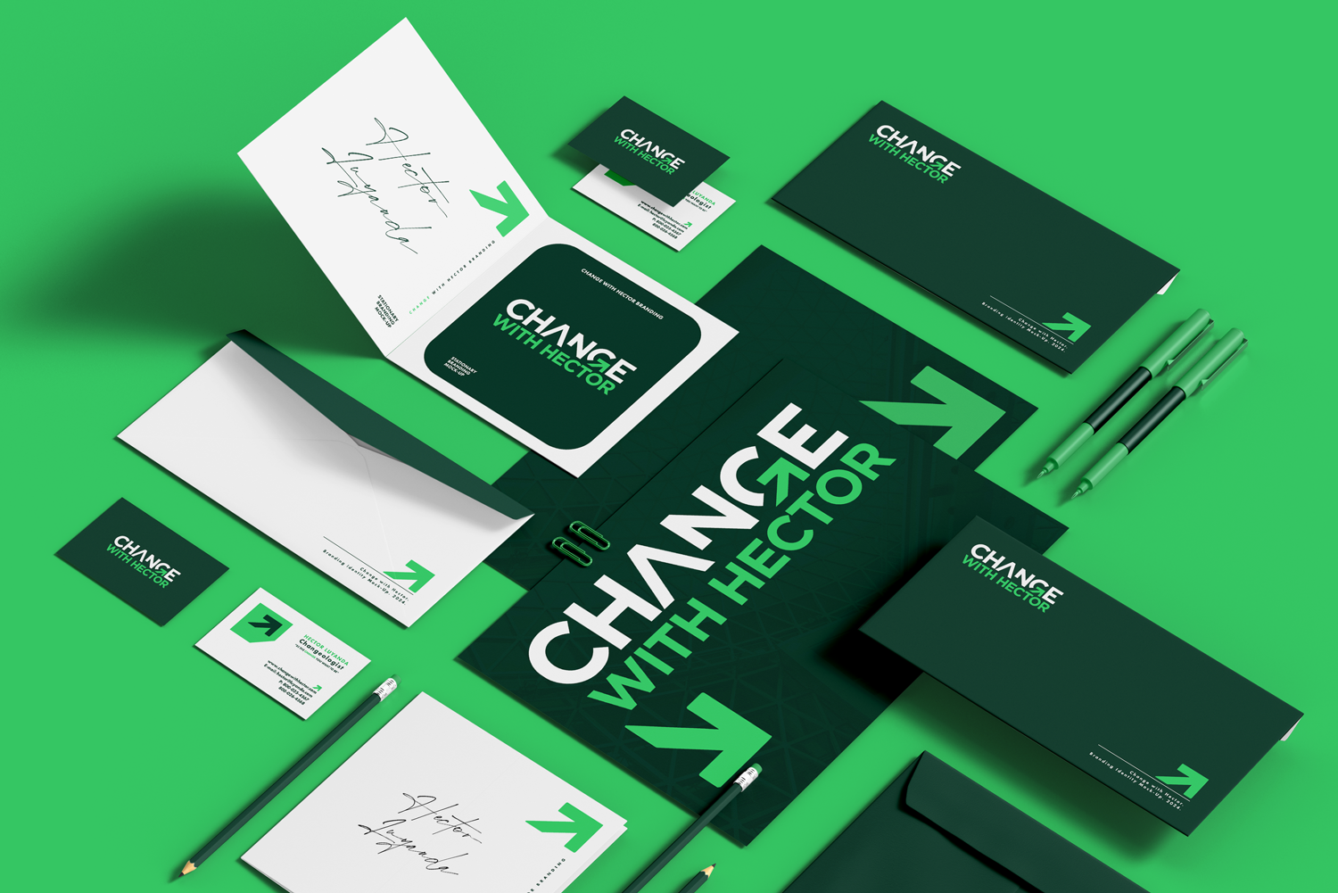
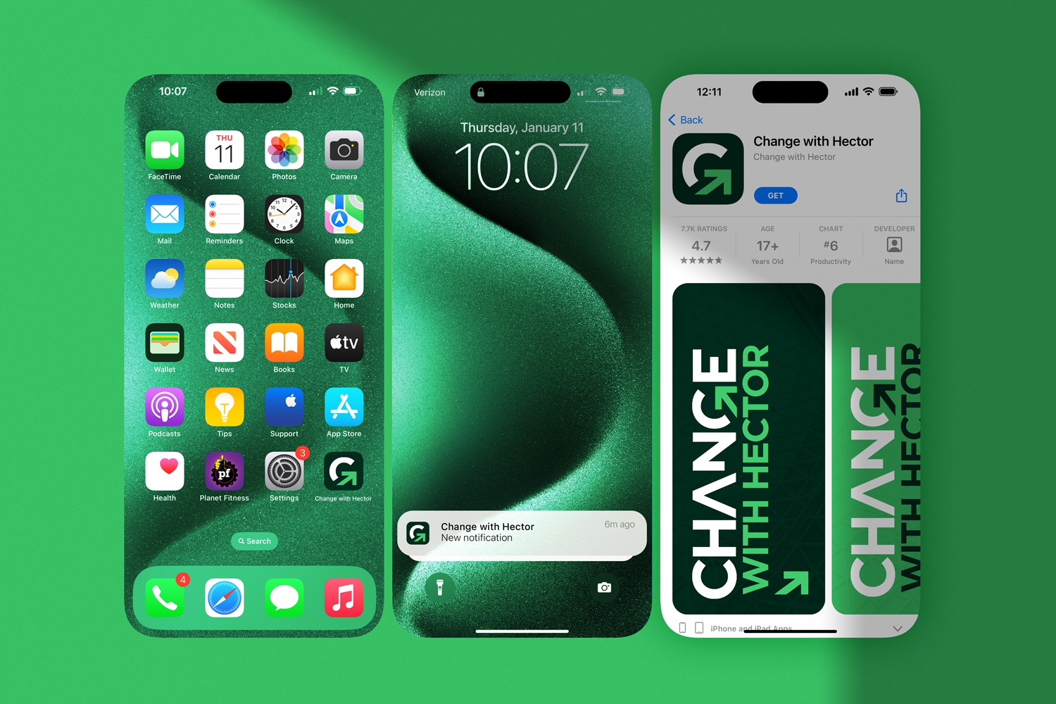
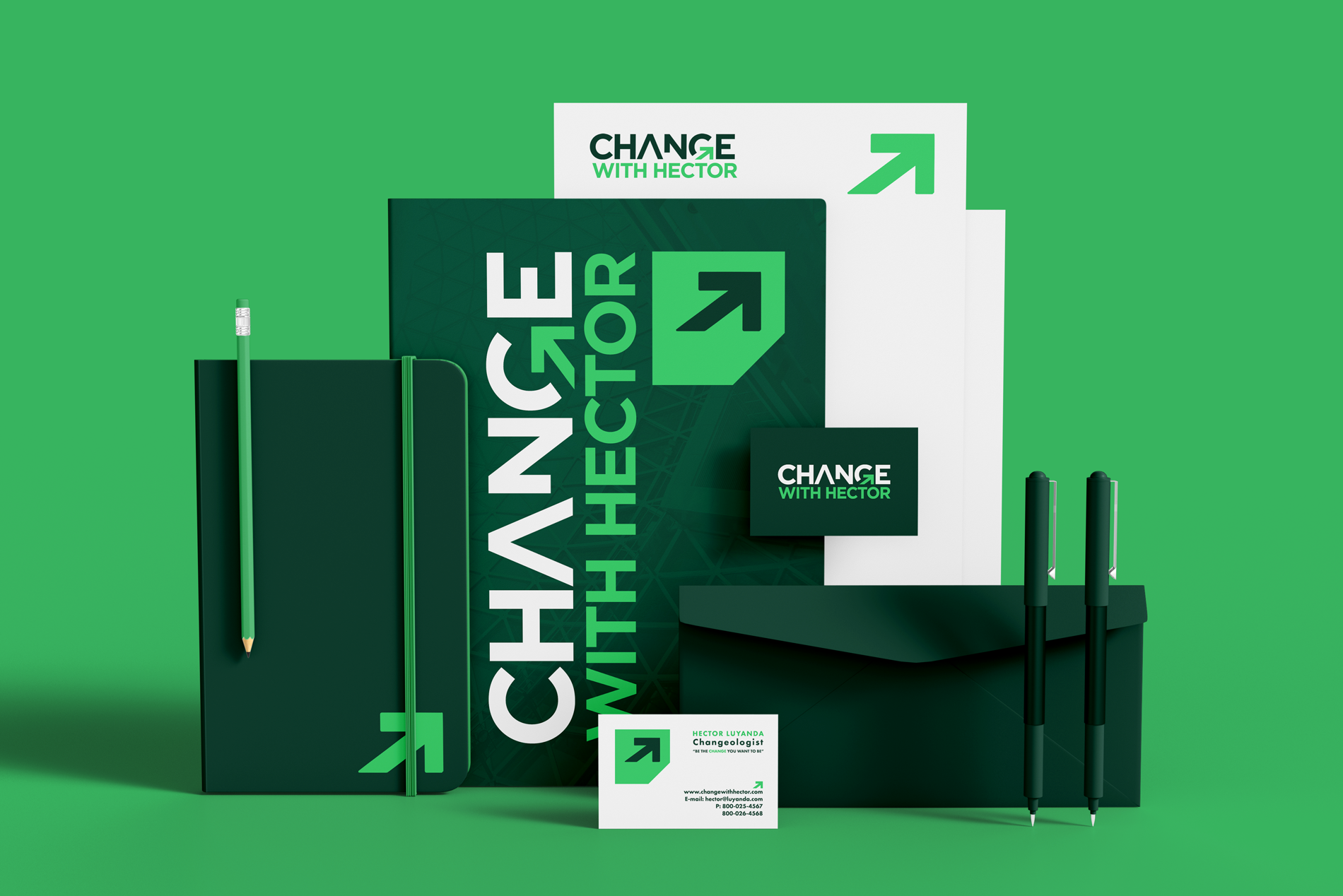

CASE STUDY: CHANGE WITH HECTOR
Change with Hector is a brand system designed to transform a personal identity into a scalable, institution-ready presence.
Built on a bold typographic foundation and a directional visual language, the system introduces structure, consistency, and clarity across all touchpoints. The identity balances approachability with authority—enabling the brand to operate confidently across digital platforms, print, and environmental applications.
The result is a cohesive, production-ready system that supports growth, recognition, and long-term brand evolution.
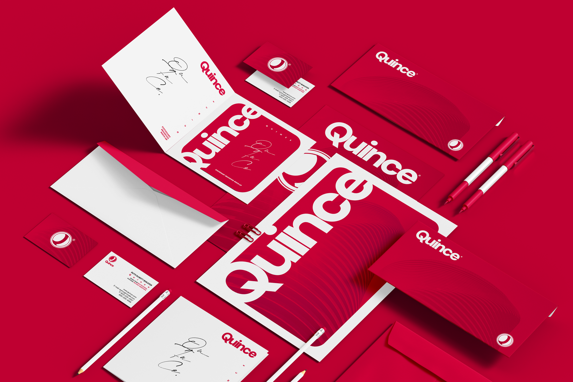
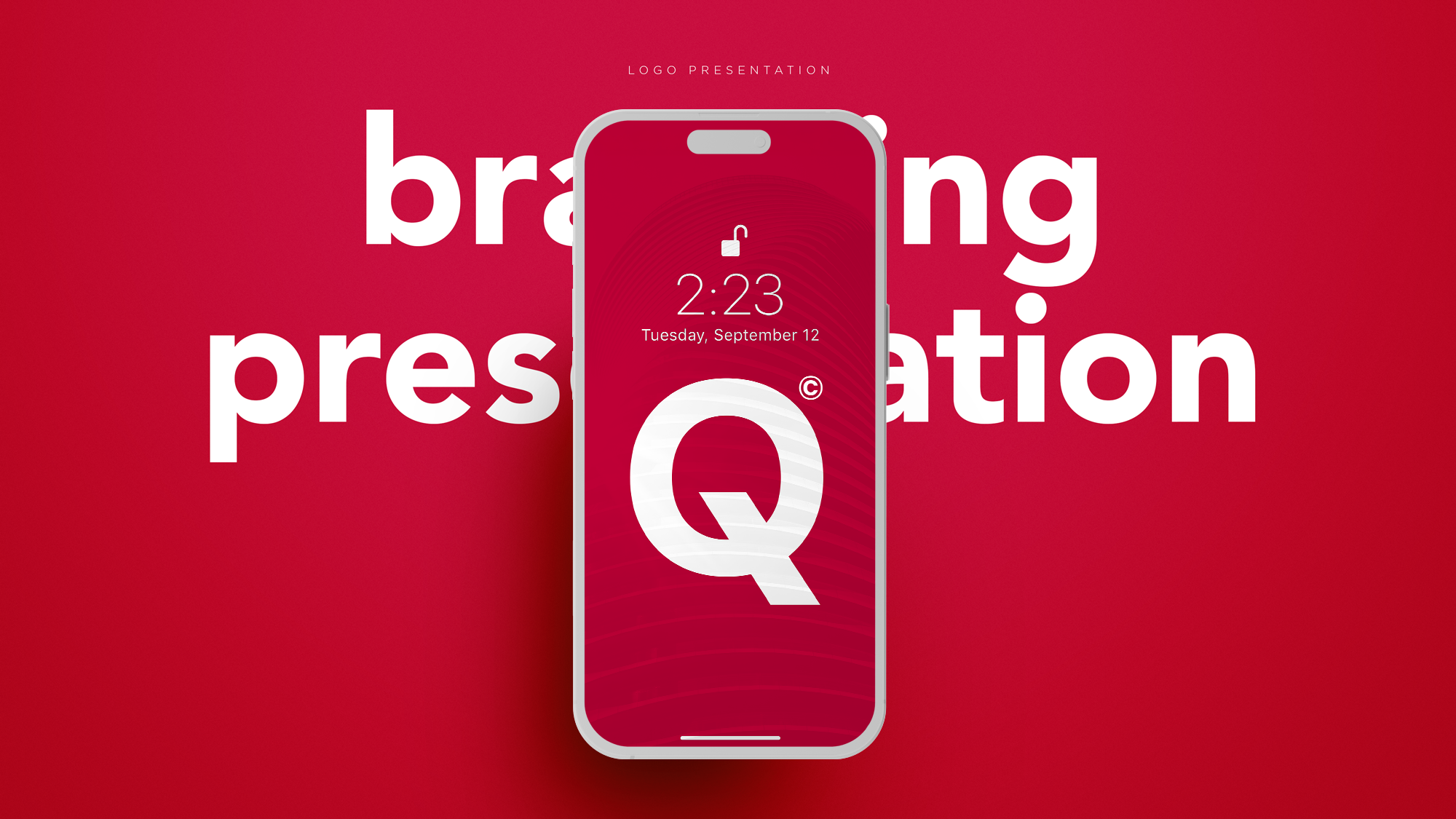
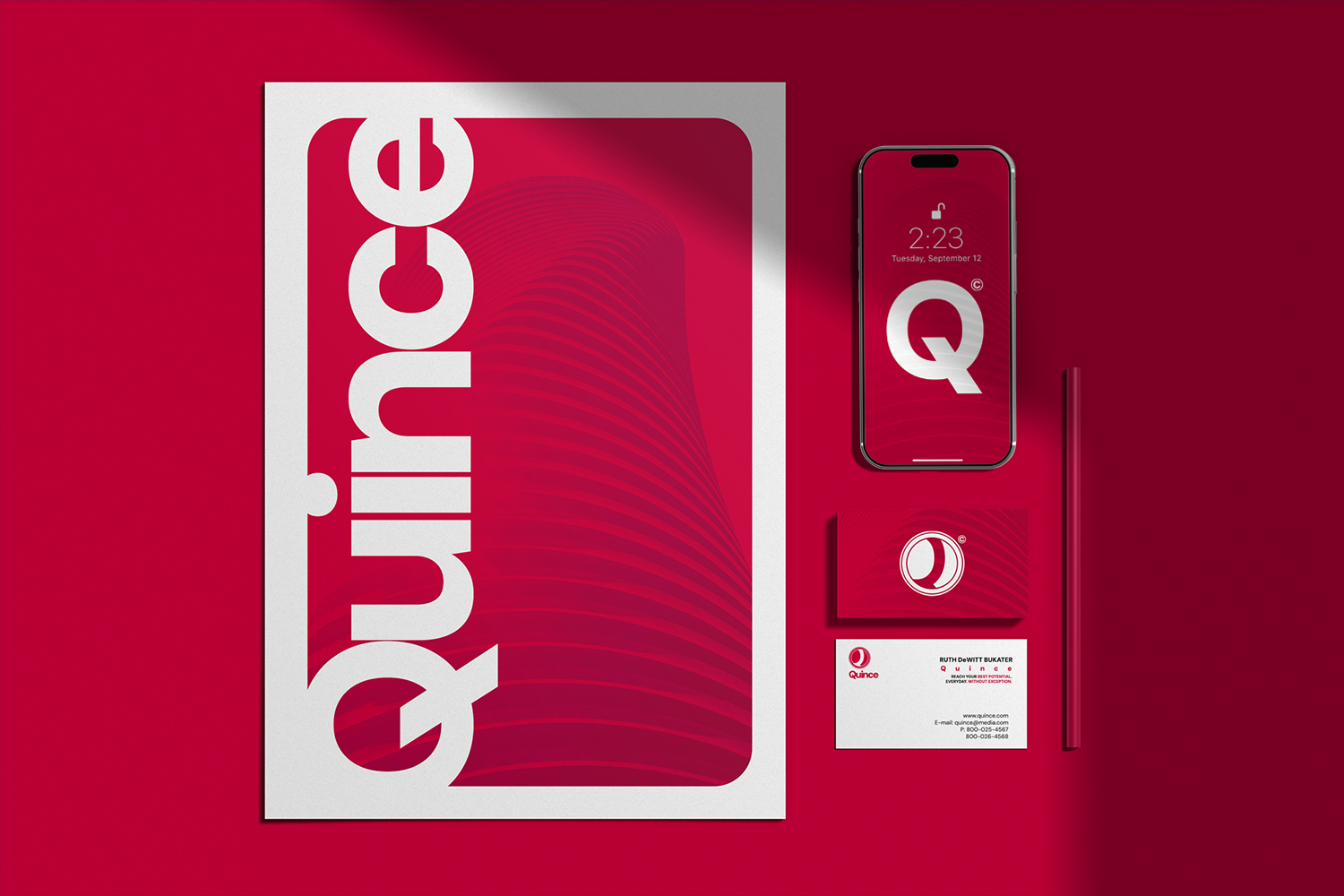
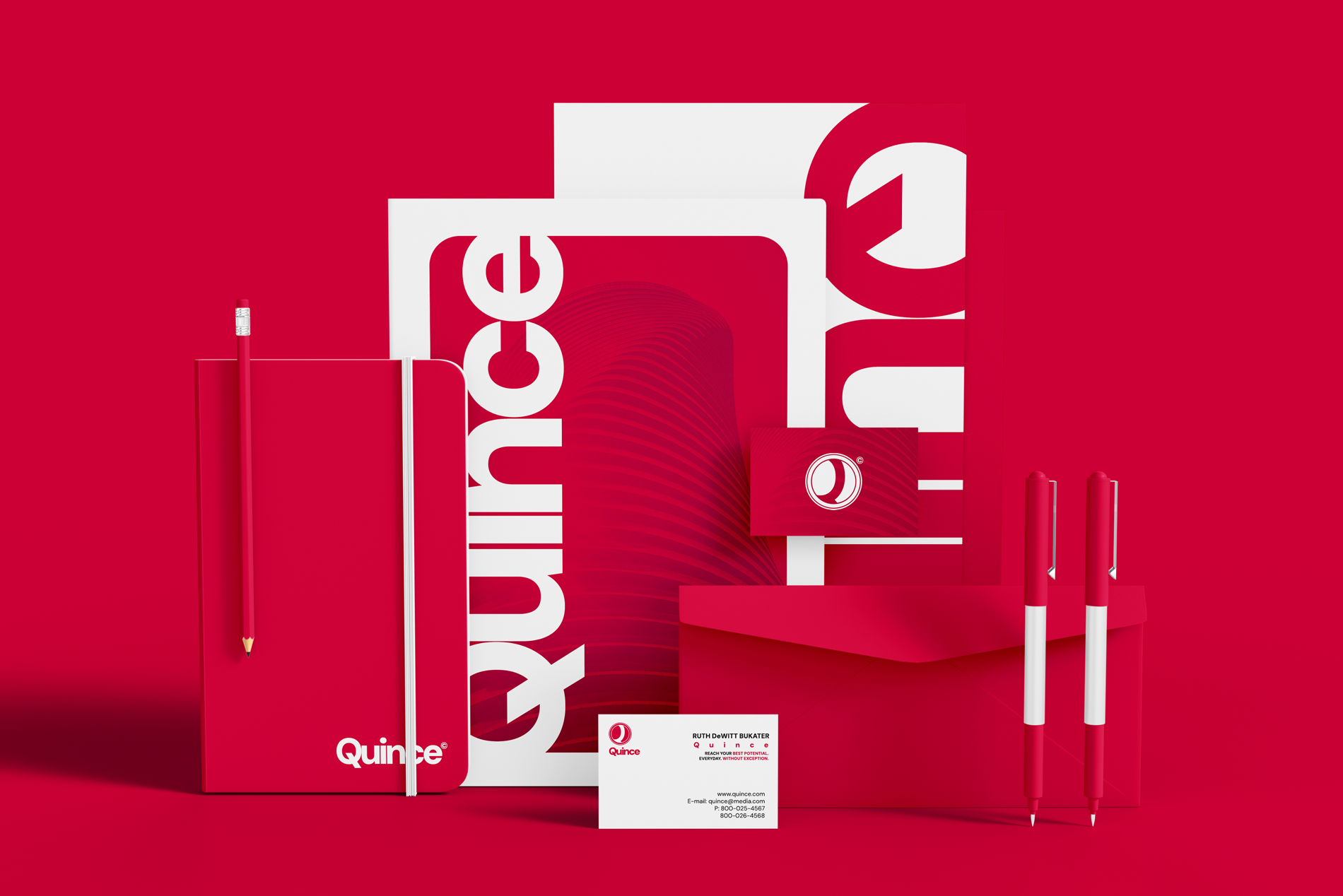
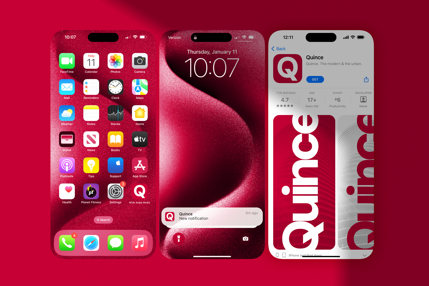

CASE STUDY: QUINCE
Quince is a scalable, typography-driven brand system designed for clarity and consistency across digital and physical touchpoints.
The identity uses a high-contrast typographic structure supported by a controlled gradient system to introduce motion without compromising legibility. Layouts are built on repeatable rules, allowing assets to be produced quickly while maintaining visual consistency.
The system is optimized for multi-format deployment, including mobile, social, and print. Each component is designed to function independently or as part of a larger ecosystem, enabling efficient rollout across campaigns.
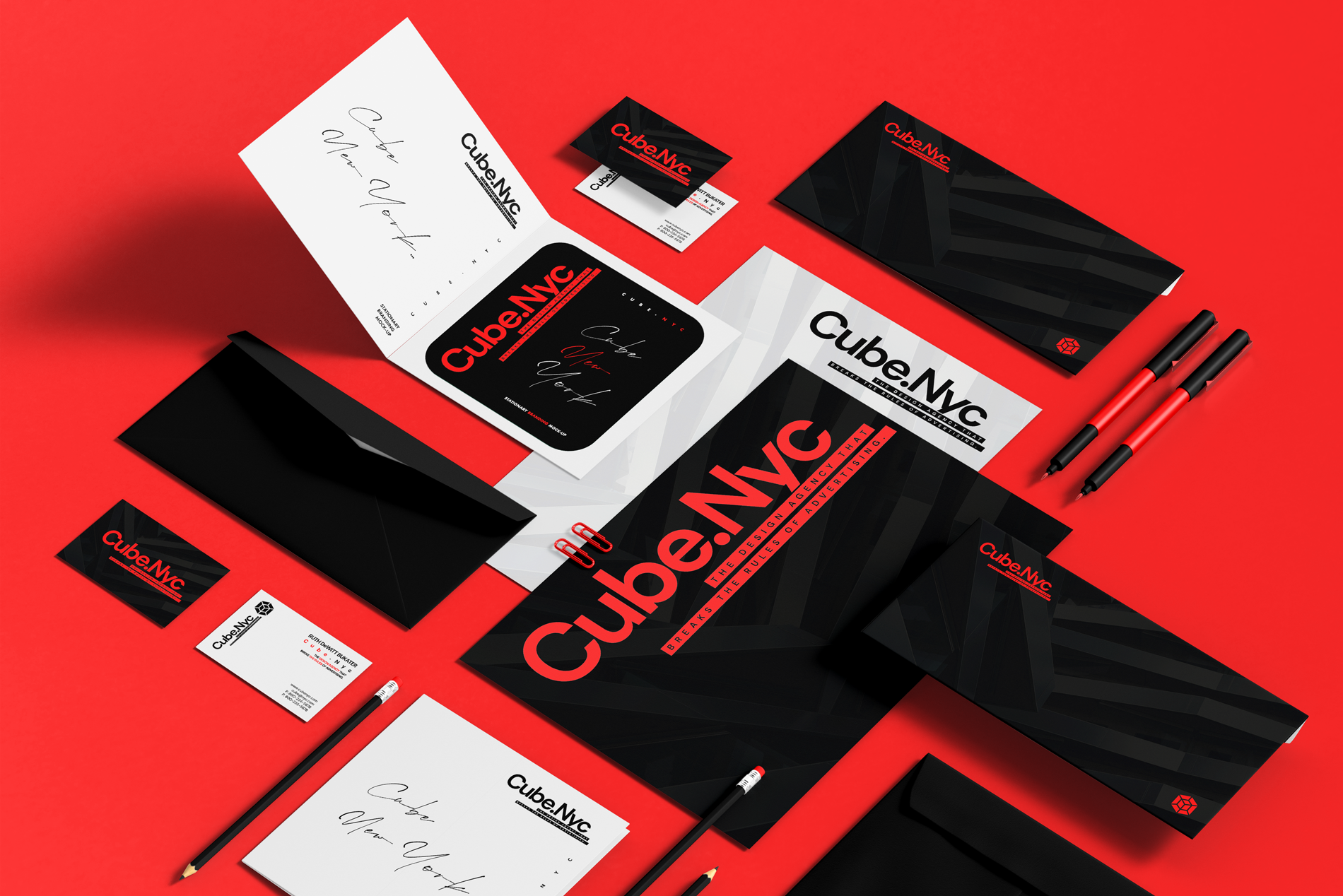
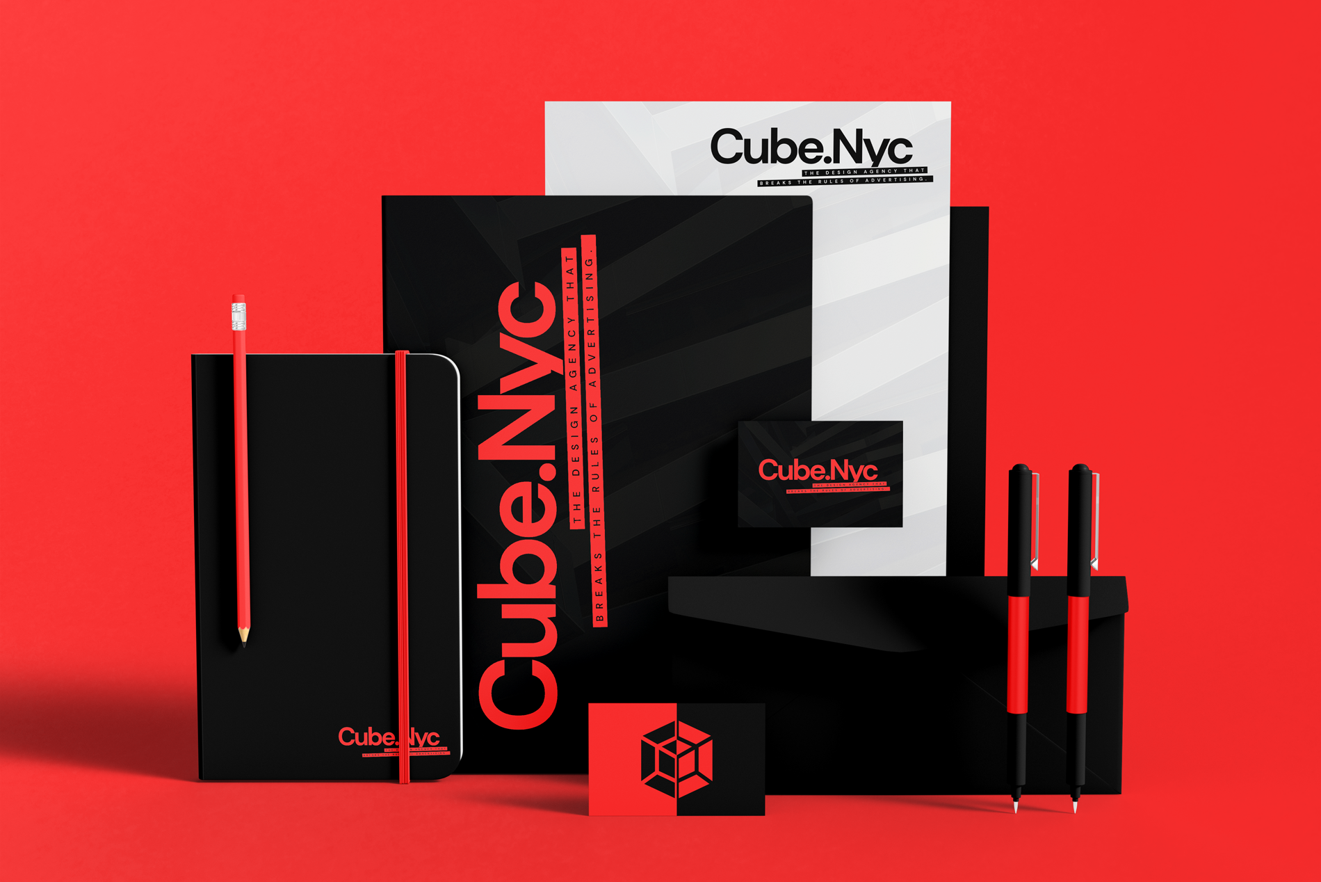
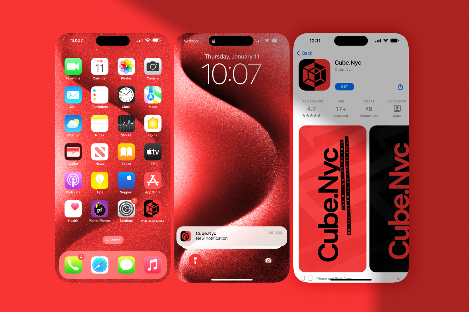
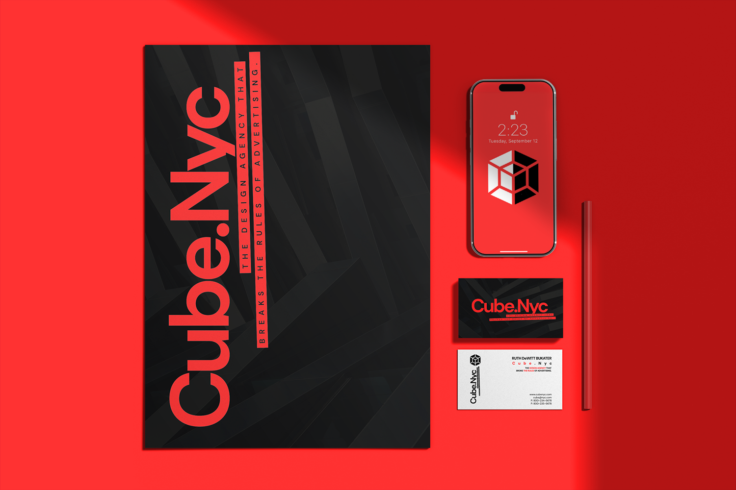
CASE STUDY: CUBE NYC
Cube NYC is a modular brand system built on geometric structure and repeatable layout logic.
The identity uses a restrained color palette and a grid-based framework to create consistent, scalable outputs across applications. Visual elements are designed as interchangeable components, allowing the system to expand across formats without introducing inconsistency.
The system supports high-volume production across print and digital environments. It enables fast asset creation while maintaining a unified visual standard.


PRESENTATION SYSTEMS
Presentation Systems are structured frameworks designed to translate complex ideas into clear, scalable communication.
Built on consistent typographic hierarchy, layout logic, and visual rules, these systems enable the creation of high-volume decks while maintaining clarity and visual consistency. They are designed to support storytelling, improve comprehension, and elevate otherwise standard presentation formats into cohesive brand experiences.