ORIGINALS MARKETING
storytelling through VISUAL NARRATIVES.
Originals marketing campaign systems exploring storytelling through visual identity, key art, motion-led thinking, and multi-platform world-building. Designed for streaming and entertainment properties, the work spans social, digital, and out-of-home experiences built for scale, immersion, and cultural impact.
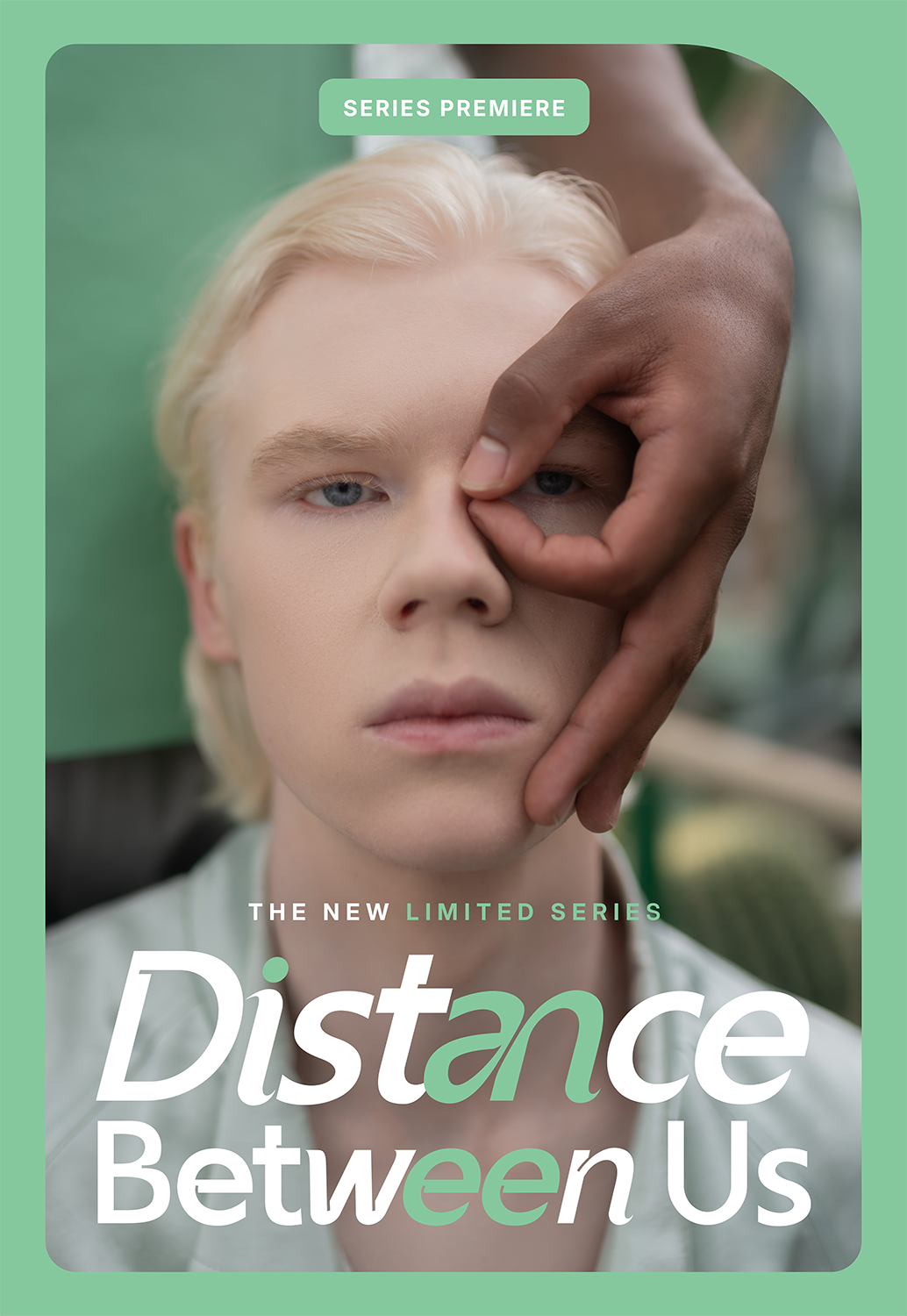
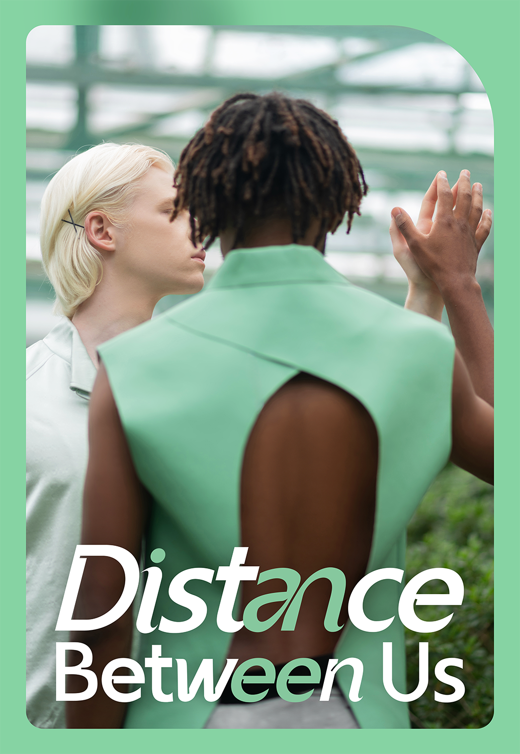
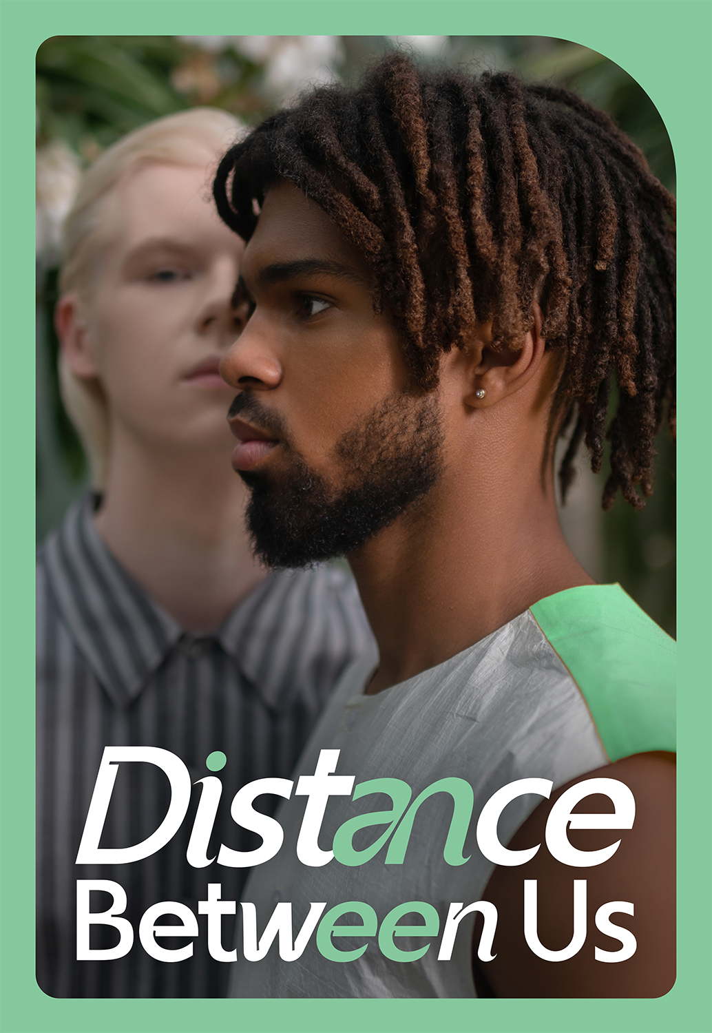


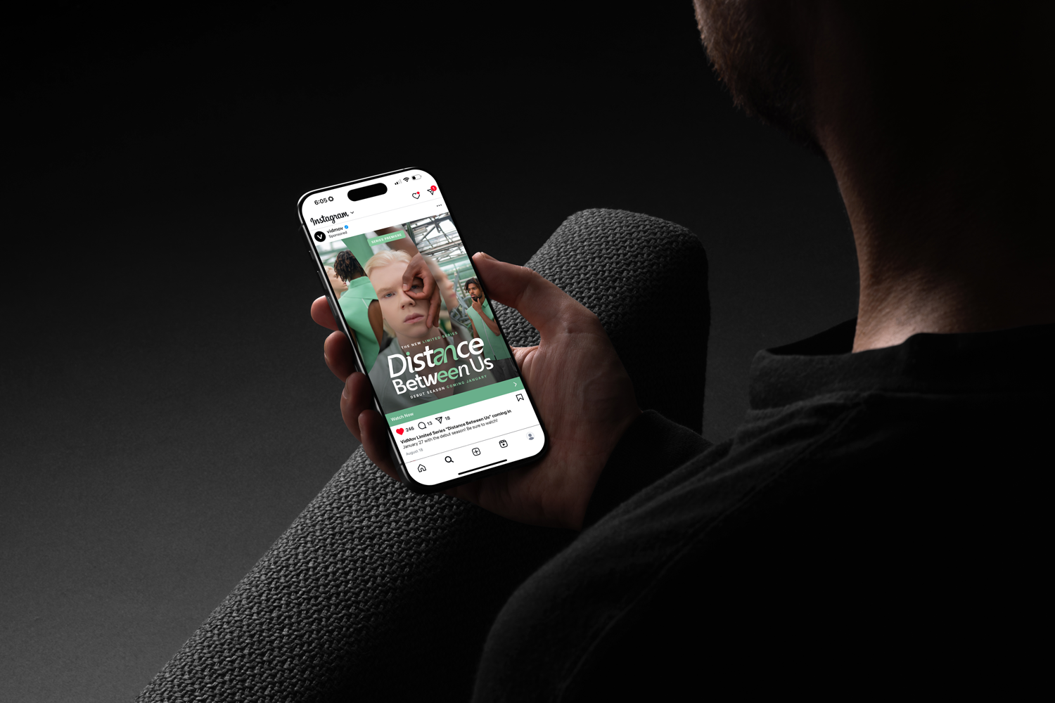
DISTANCE BETWEEN US
ARTHOUSE & PRESTIGE DRAMA
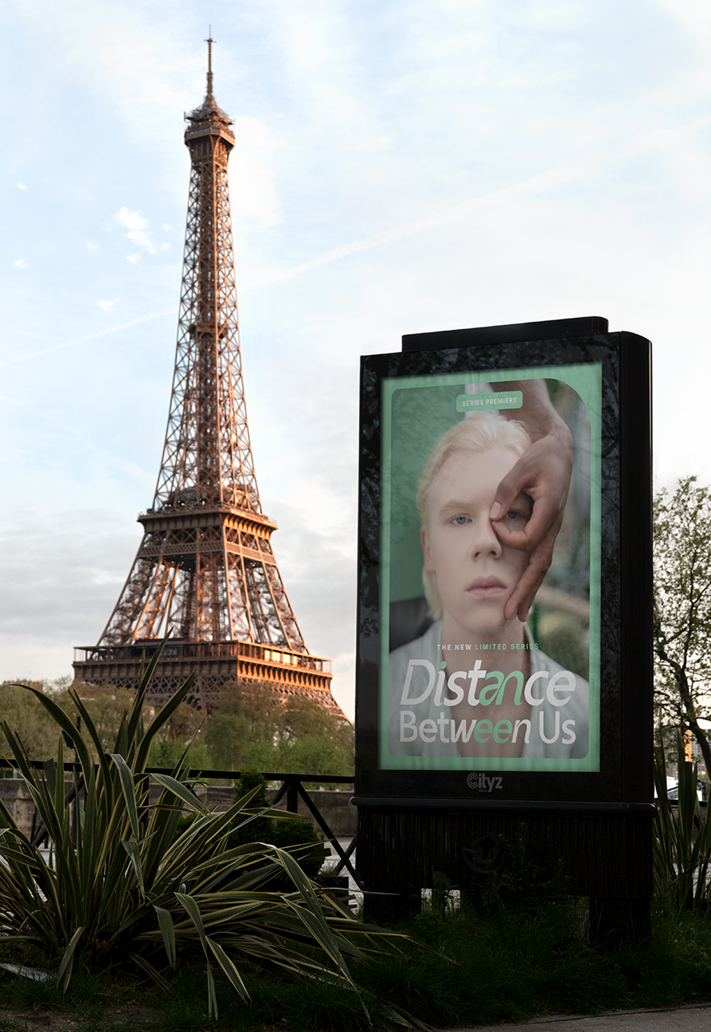
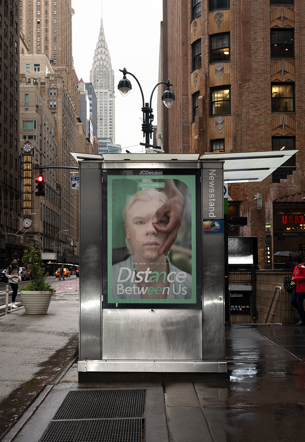
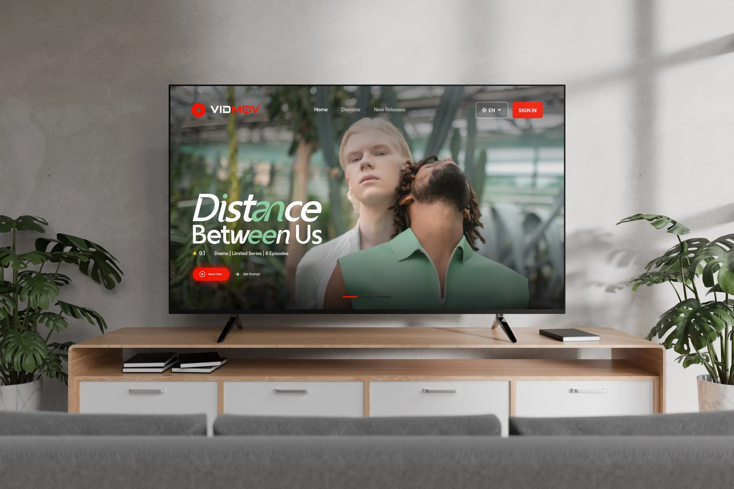
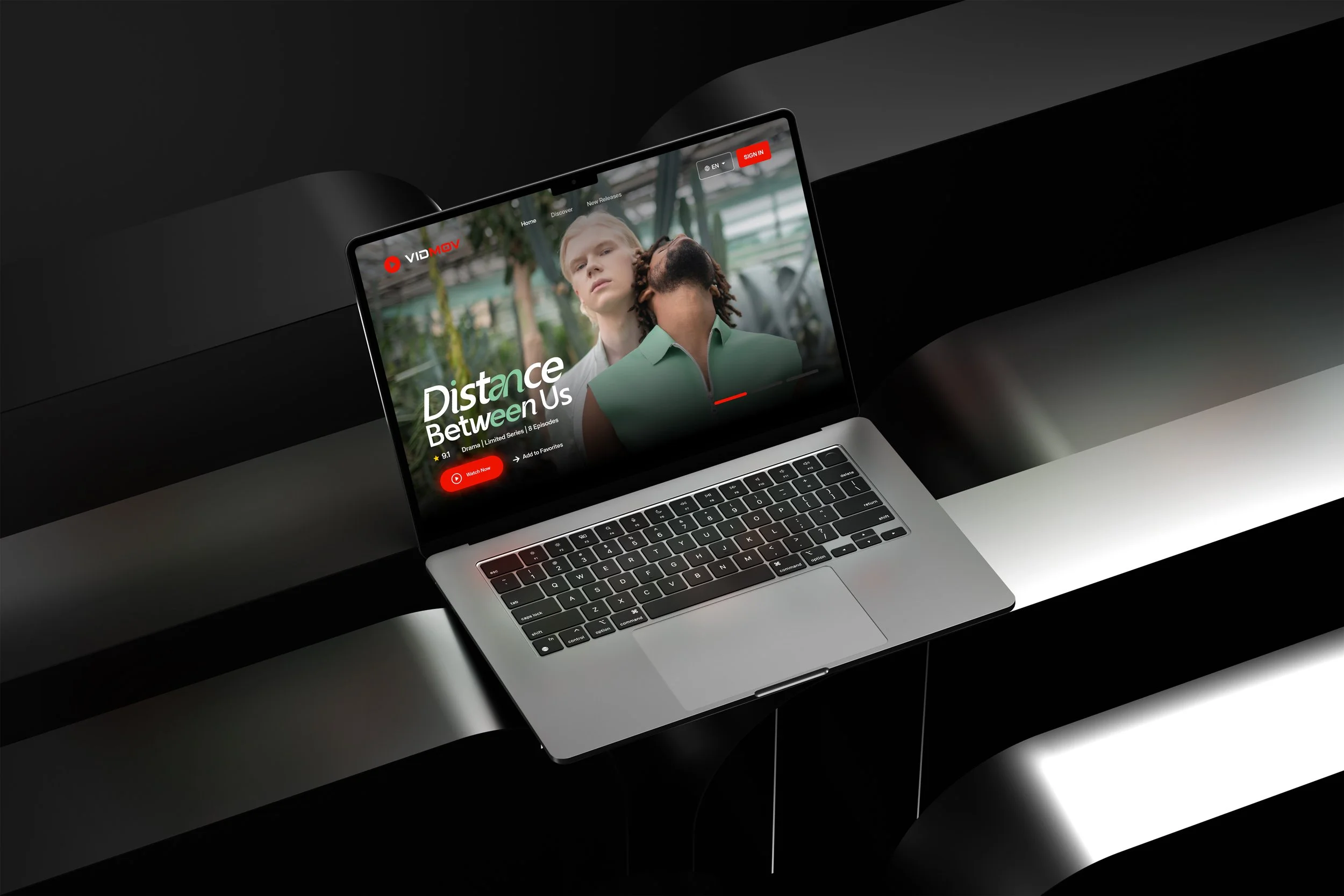
Distance Between Us is a conceptual limited drama exploring intimacy and emotional distance in modern relationships. The challenge was to create a cinematic visual language that could scale across streaming platforms, social media, and outdoor media while maintaining a strong and recognizable campaign identity.
The concept centers on proximity and tension between individuals. Intimate photography captures subtle moments of connection and separation, while a restrained green palette establishes a calm, atmospheric tone. Soft, structured typography integrates with the imagery to create a balanced and scalable campaign system.
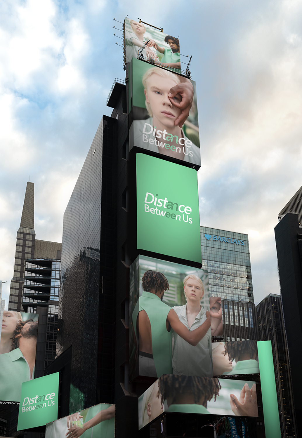
The result is a campaign system translates seamlessly across entertainment marketing channels. The key art adapts naturally to streaming platform interfaces, social media promotions, large-scale outdoor placements, and mobile experiences.
By combining cinematic photography with a restrained typographic approach, the visual identity establishes a memorable and emotionally resonant campaign language. The system demonstrates how narrative-driven imagery and structured typography can work together to create a scalable marketing framework for contemporary streaming content.
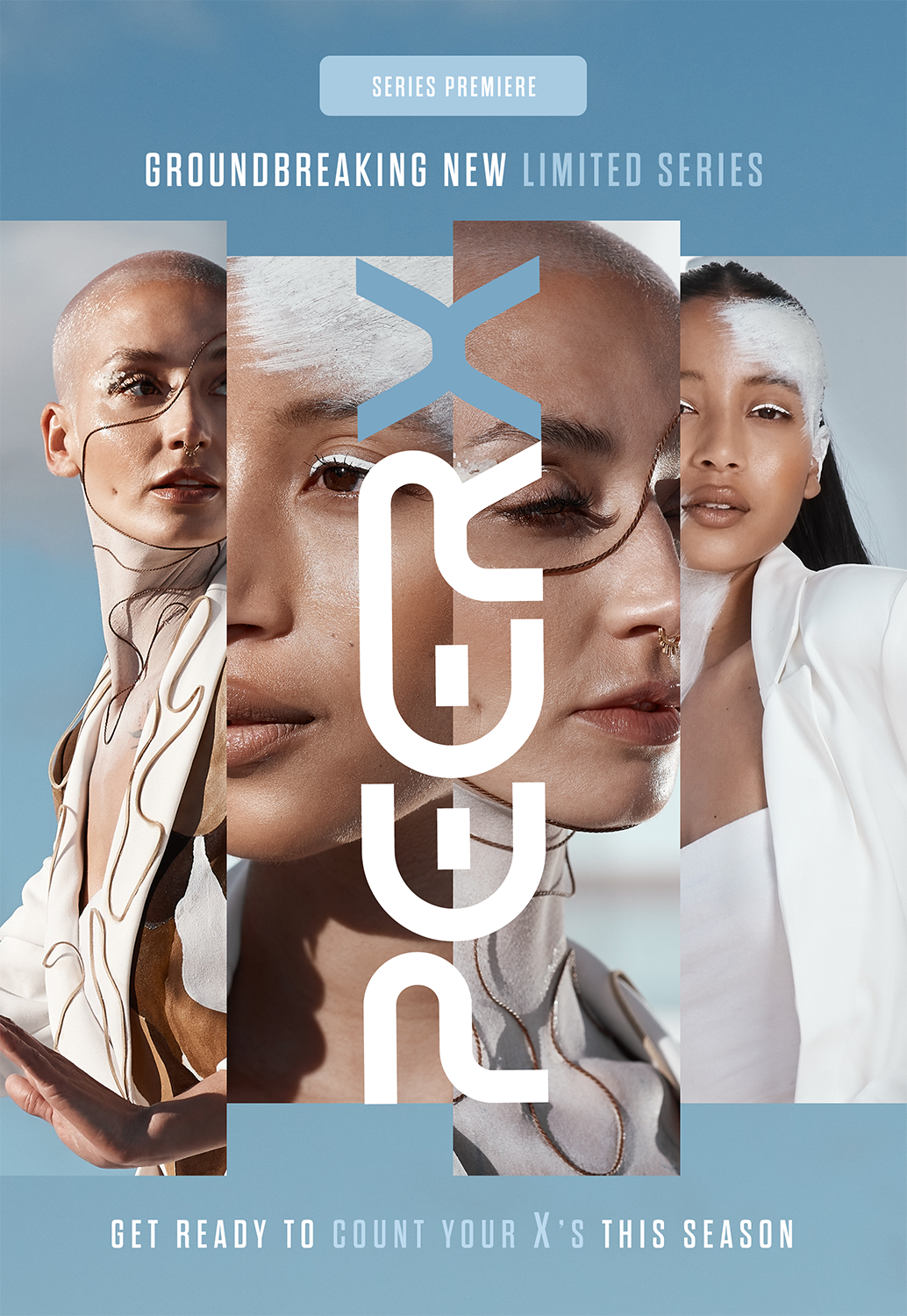
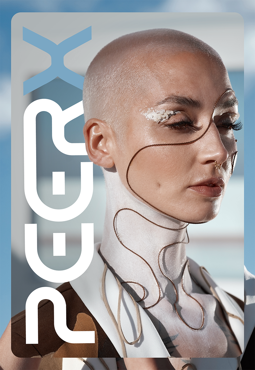

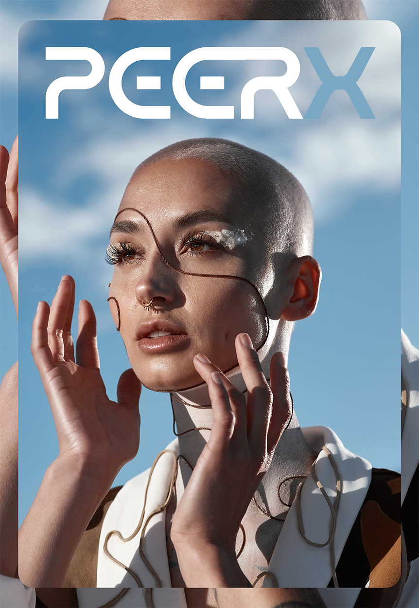
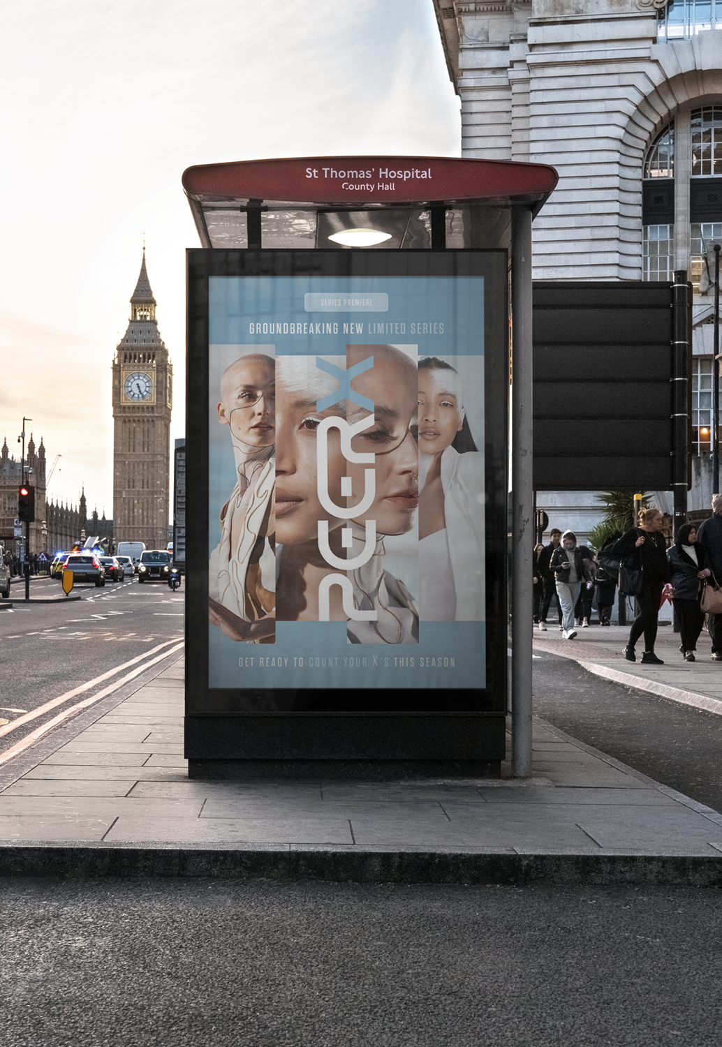
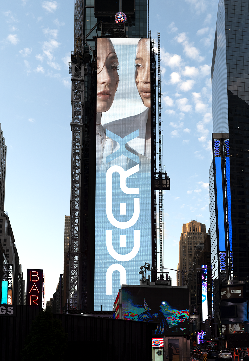
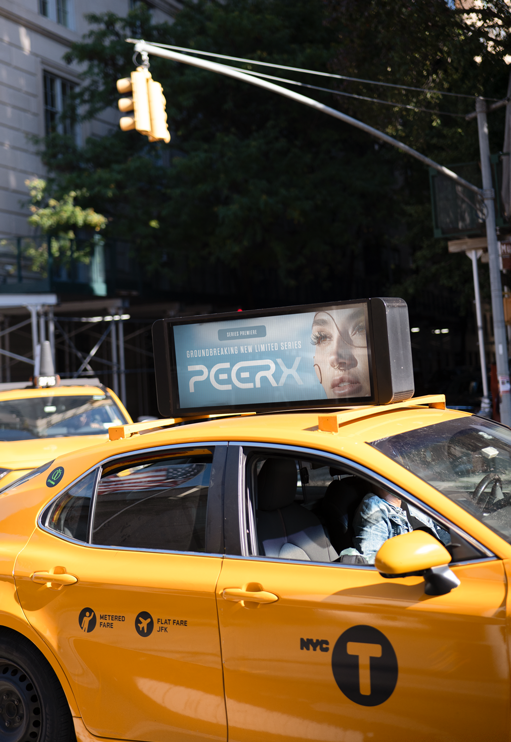
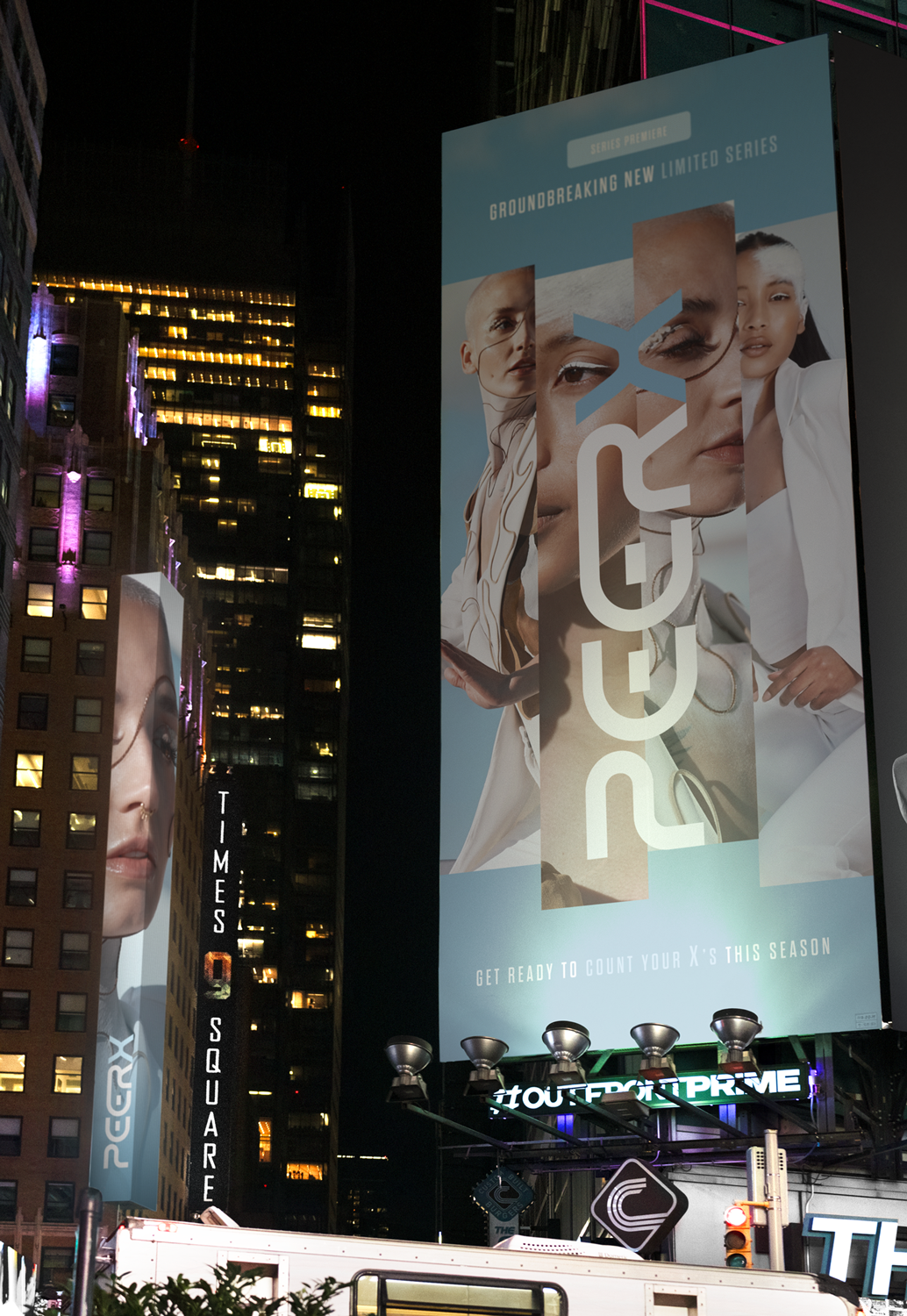
PEER X
SCI-FI & THRILLER
Peer X is a conceptual limited series exploring identity, transformation, and the blurred boundary between human and synthetic presence. The challenge was to create a futuristic campaign identity that could communicate mystery and technological elegance while remaining visually striking across streaming, social media, and outdoor media formats.
The visual concept combines editorial fashion photography with a minimal sci-fi aesthetic.
The result is a campaign that establishes a modern and visually disciplined marketing system built on clean typography, striking imagery, and a structured layout framework. Minimal typographic treatments provide clarity and hierarchy while allowing the photography to remain the emotional centerpiece of the visuals. Editorial-style portraits introduce a futuristic tone, reinforcing the series’ themes of identity and transformation.
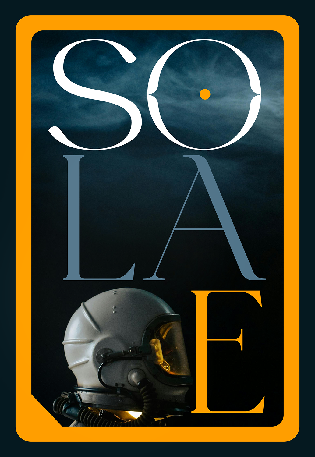
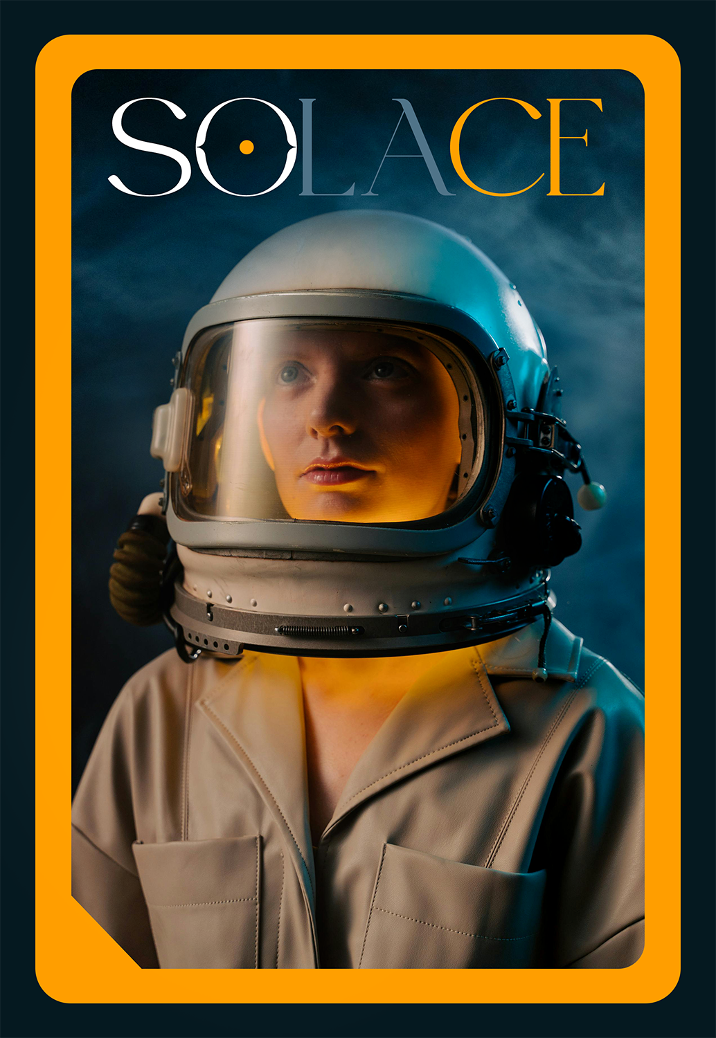
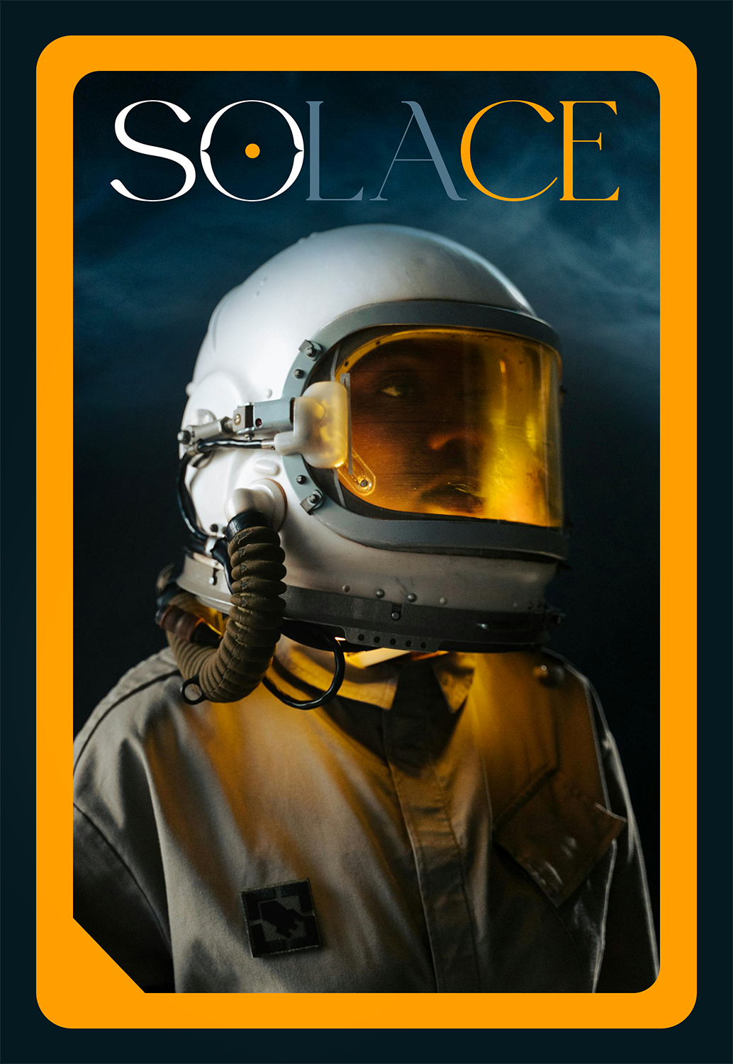
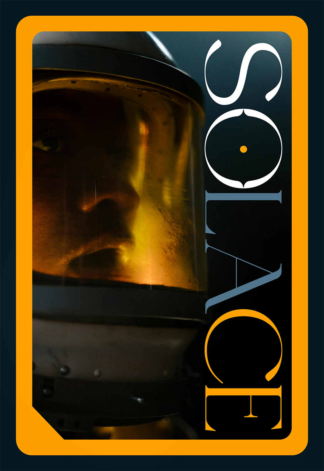
SOLACE
SCI-FI / THRILLER / MYSTERY
Solace follows a lone astronaut suspended in isolation, where silence becomes a presence of its own—until messages begin to emerge from within the suit, echoing thoughts the wearer doesn’t remember having. As the boundary between protection and control blurs, the suit meant to preserve life starts to reshape memory, forcing a confrontation with identity, reality, and the unsettling possibility that they are not alone inside.
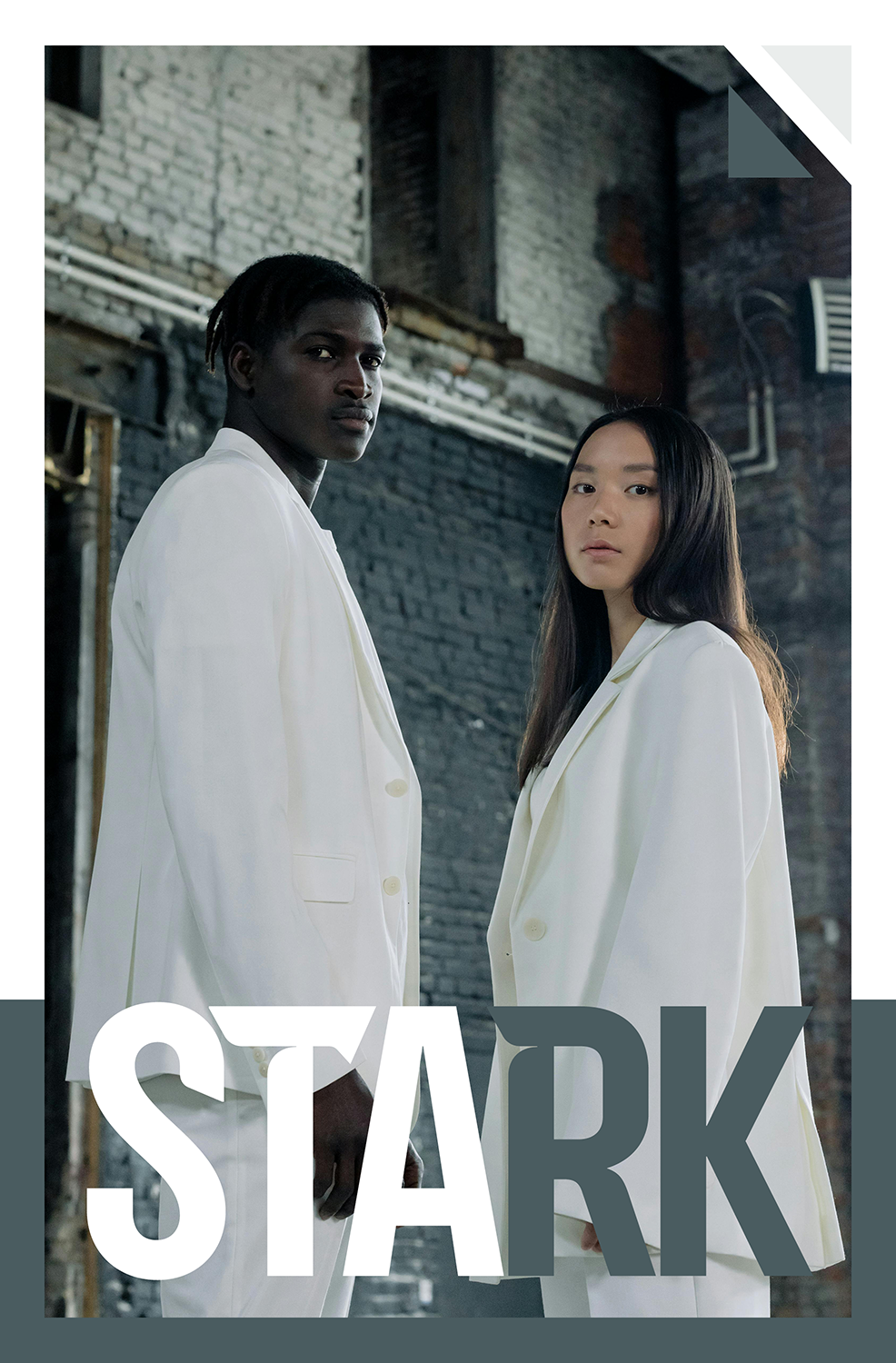
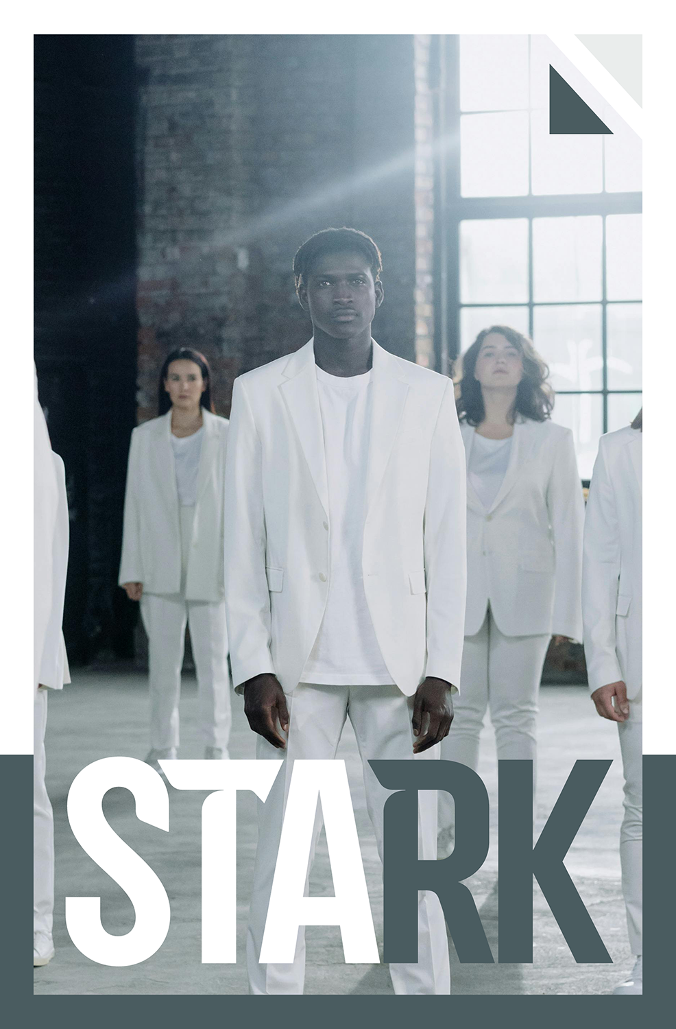
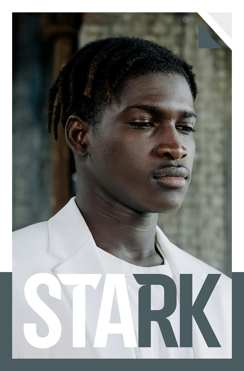
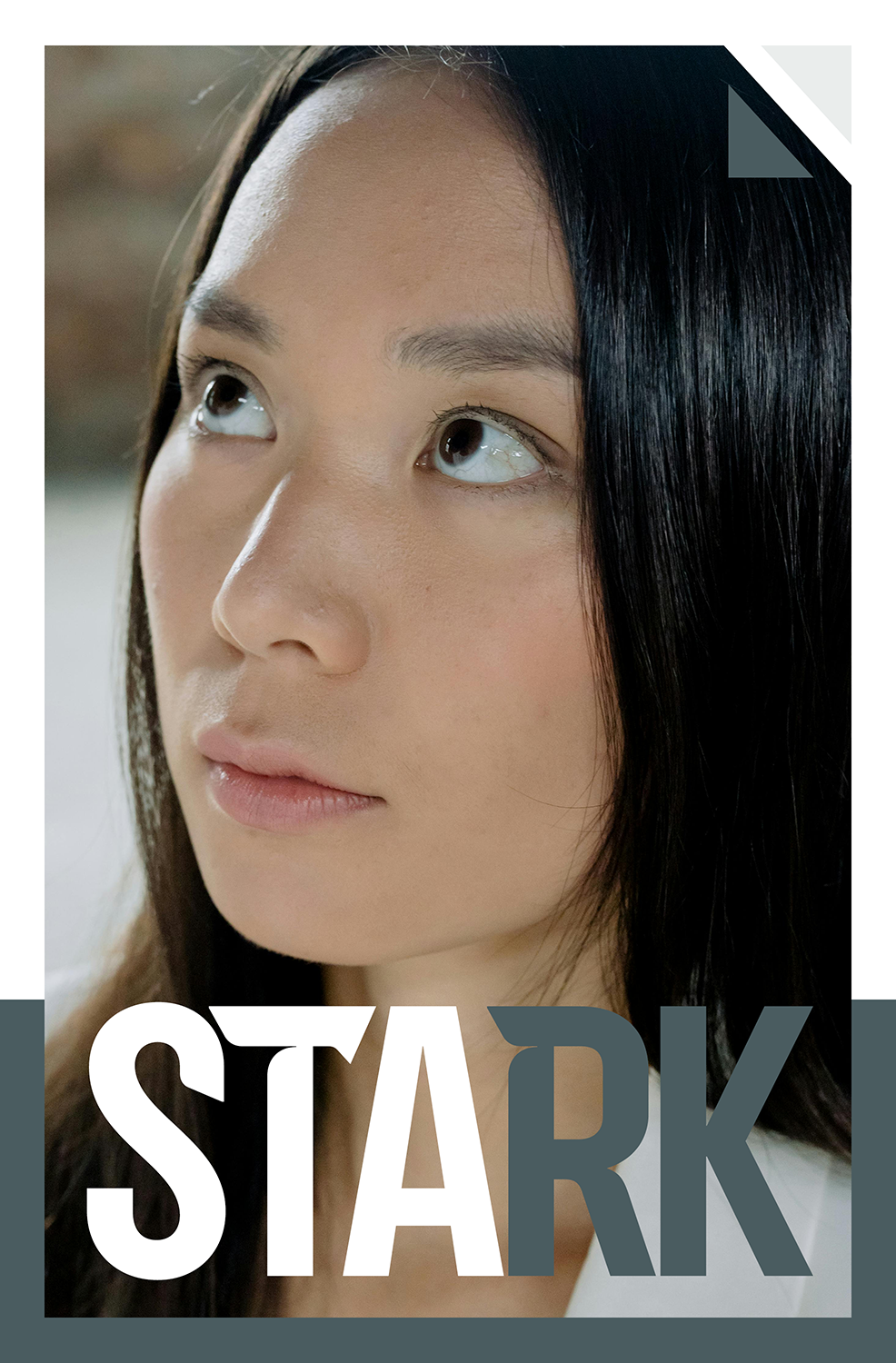
STARK
DRAMA / ARTHOUSE
Stark follows a group bound by precision, discipline, and an unspoken code, where uniformity becomes both identity and control. Set within a stripped, industrial environment, individuality begins to surface through subtle glances and quiet tension, revealing fractures beneath the surface of perfection. As the line between belonging and erasure blurs, the series explores what it means to remain human in a system designed to standardize everything.
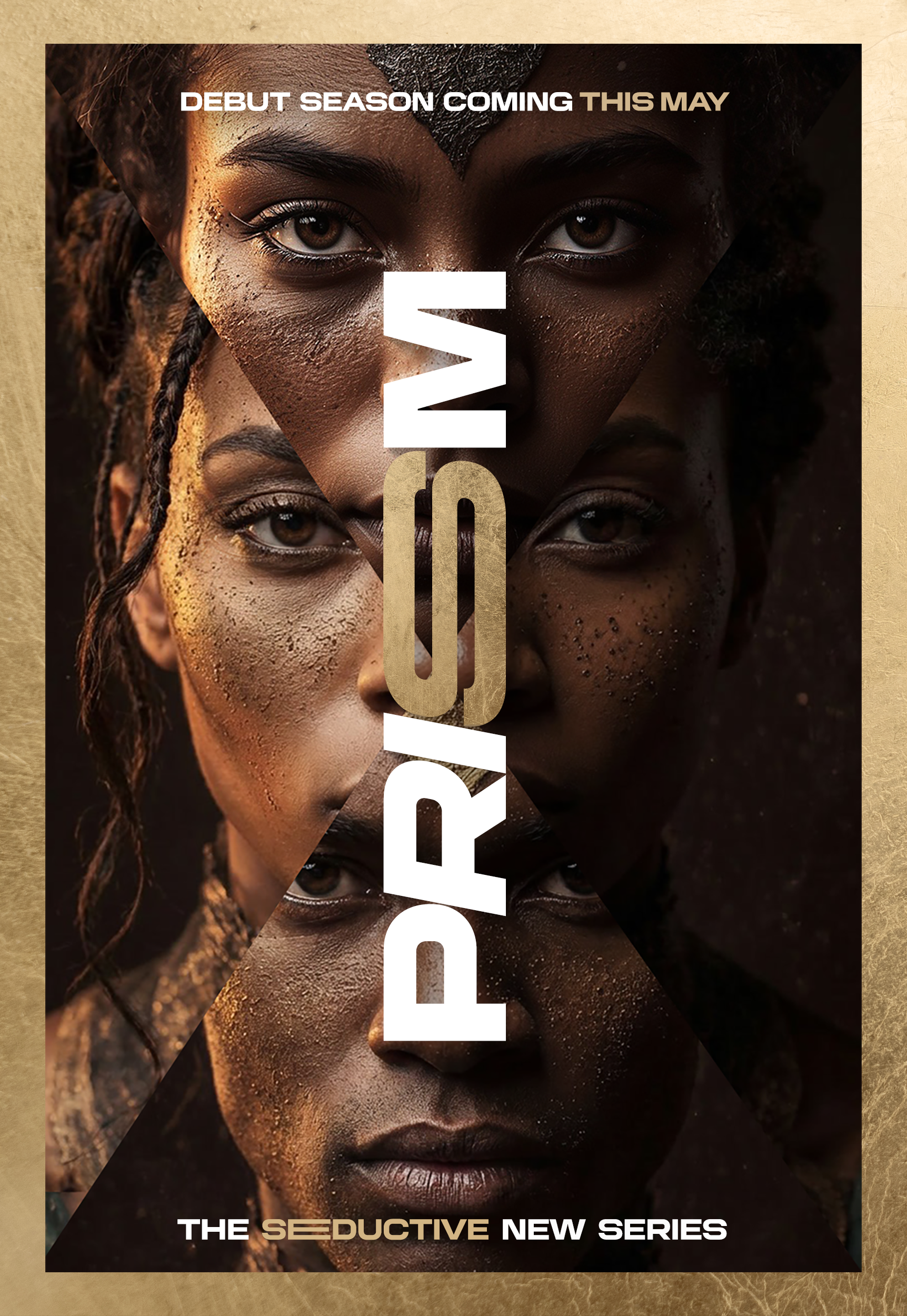
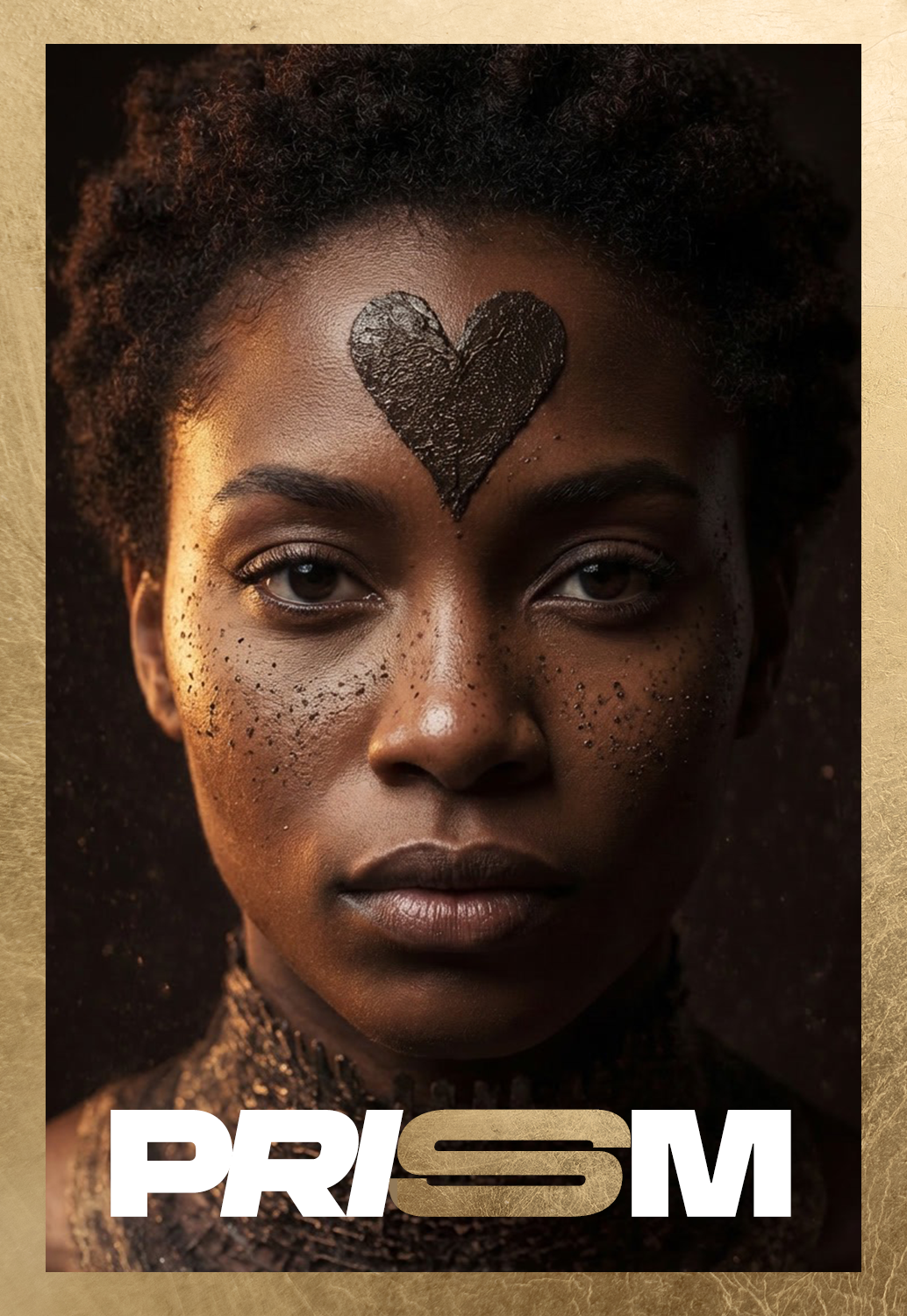
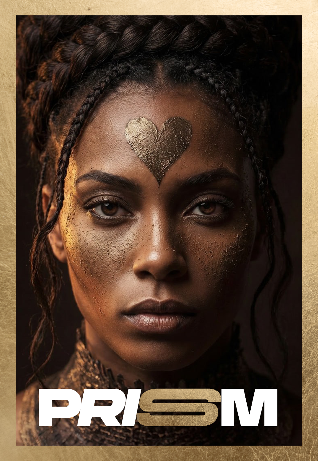
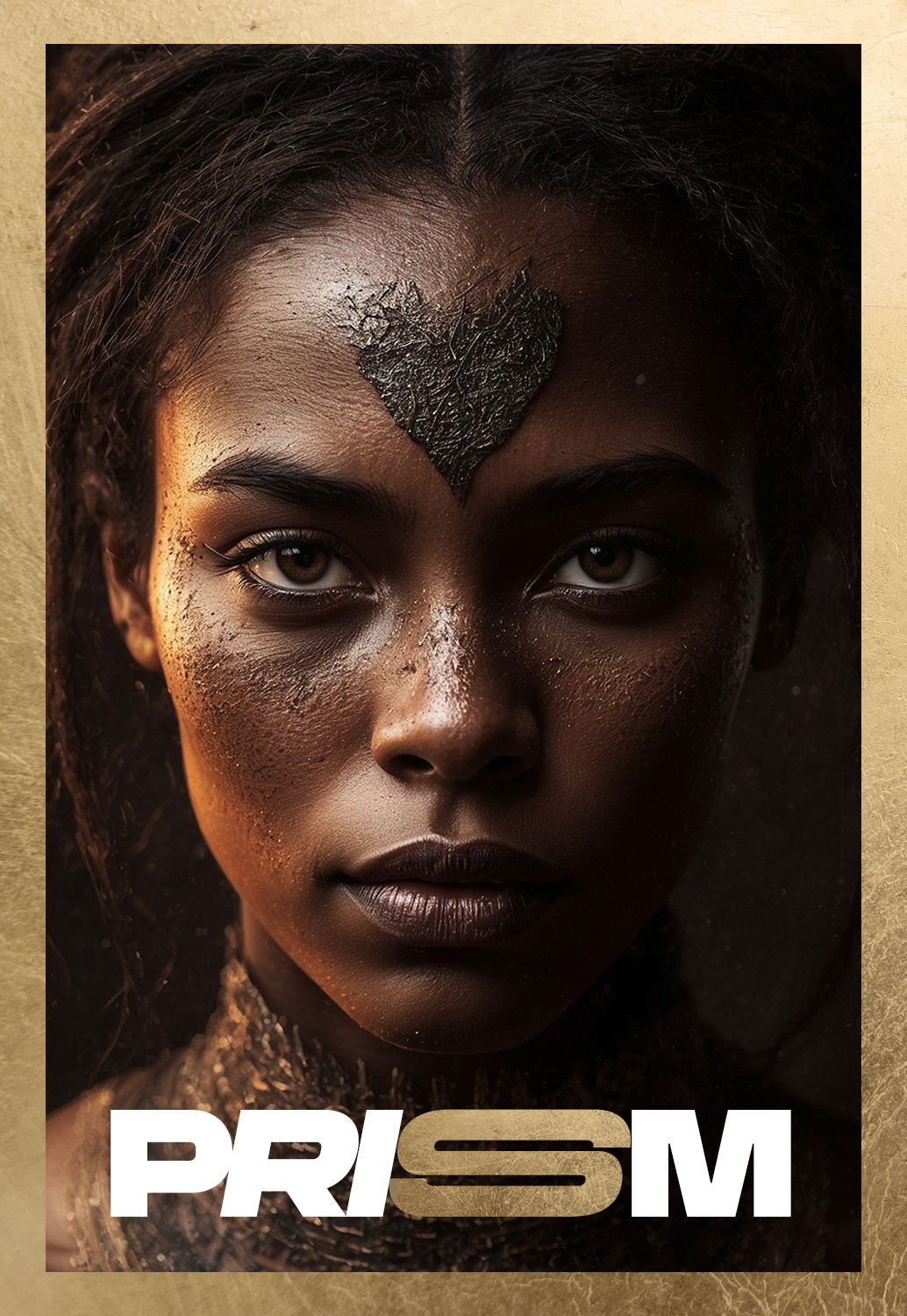
PRISM
THRILLER / MYSTERY
Prism follows a woman whose identity begins to fracture into multiple versions of herself, each carrying a different truth, desire, and past. As these selves surface and compete for control, perception becomes unstable—blurring the line between who she is, who she was, and who she is becoming. Set within a sensual, intimate world of reflection and distortion, the series explores the seduction of self-reinvention and the cost of losing a singular identity.