Brand identity
SCALABLE COMMERCIAL ARCHITECTURE
Brand Identity is the architecture of commercial integrity. This section showcases my systematic approach to translating core business values into resilient, scalable visual ecosystems. My focus is on creating globally compliant, unified brand systems that do more than just look good—they act as powerful Go-to-Market (GTM) tools.
“Design is the last great competitive advantage.”
— Seth Godin
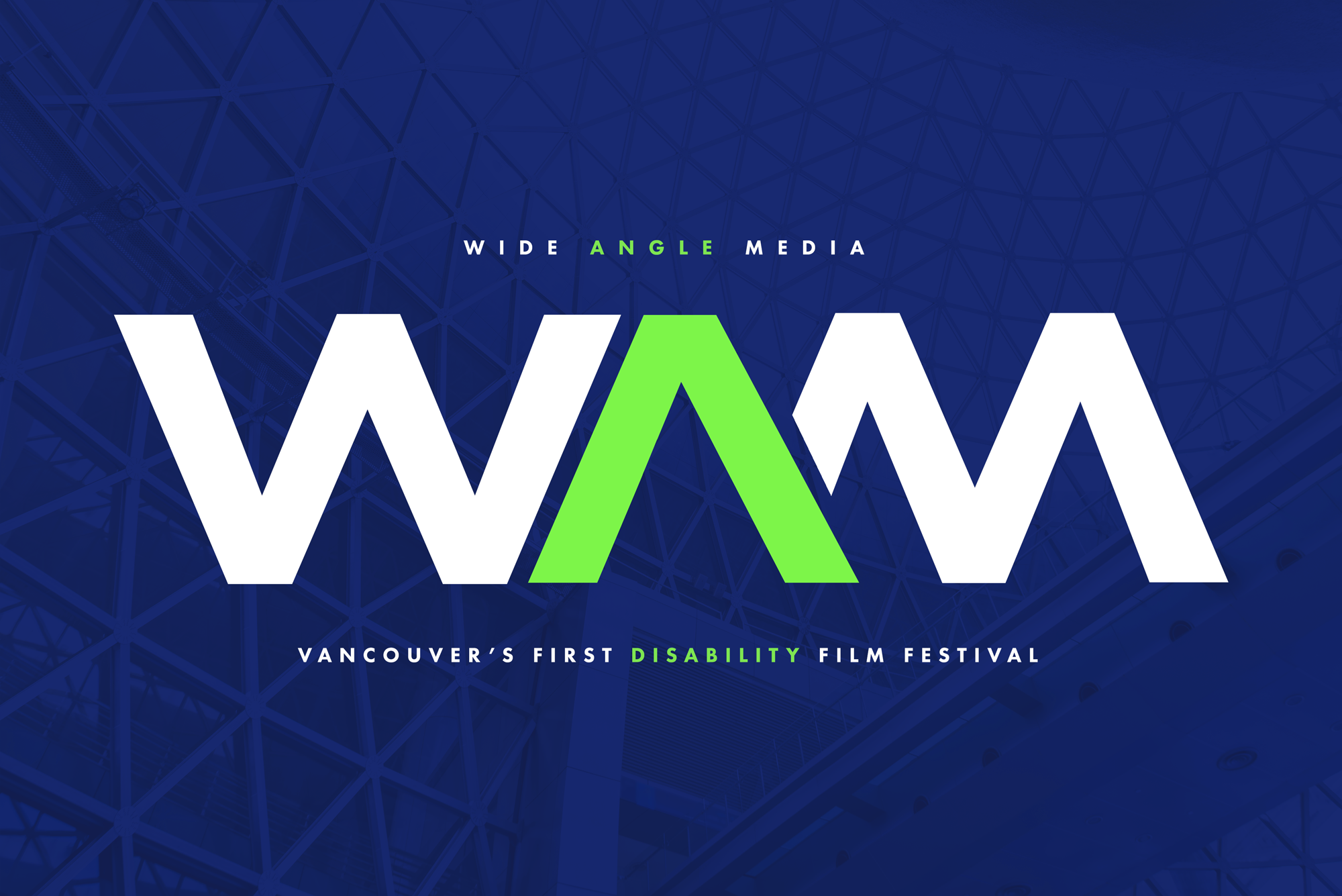
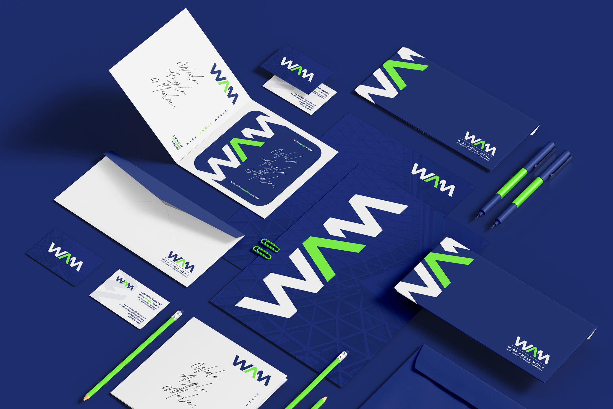
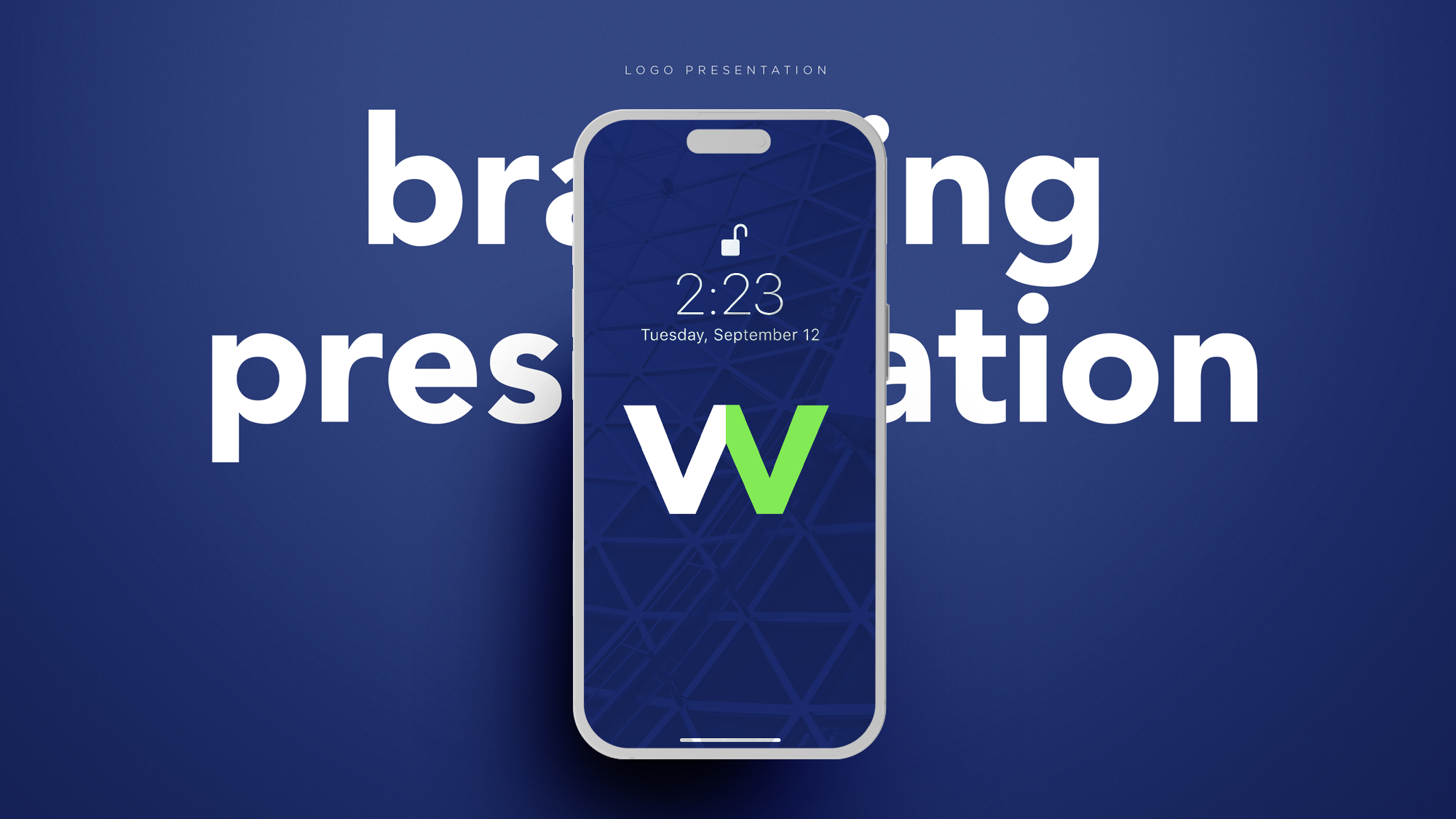
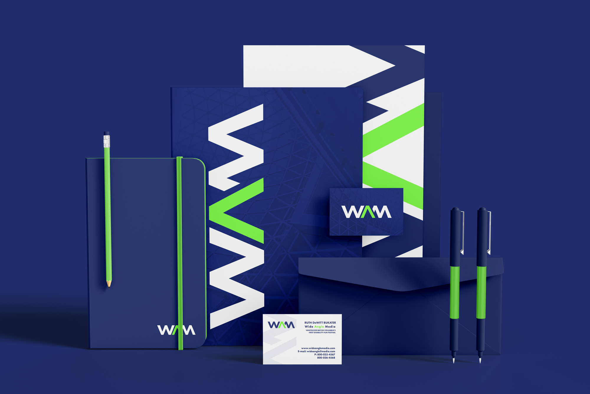
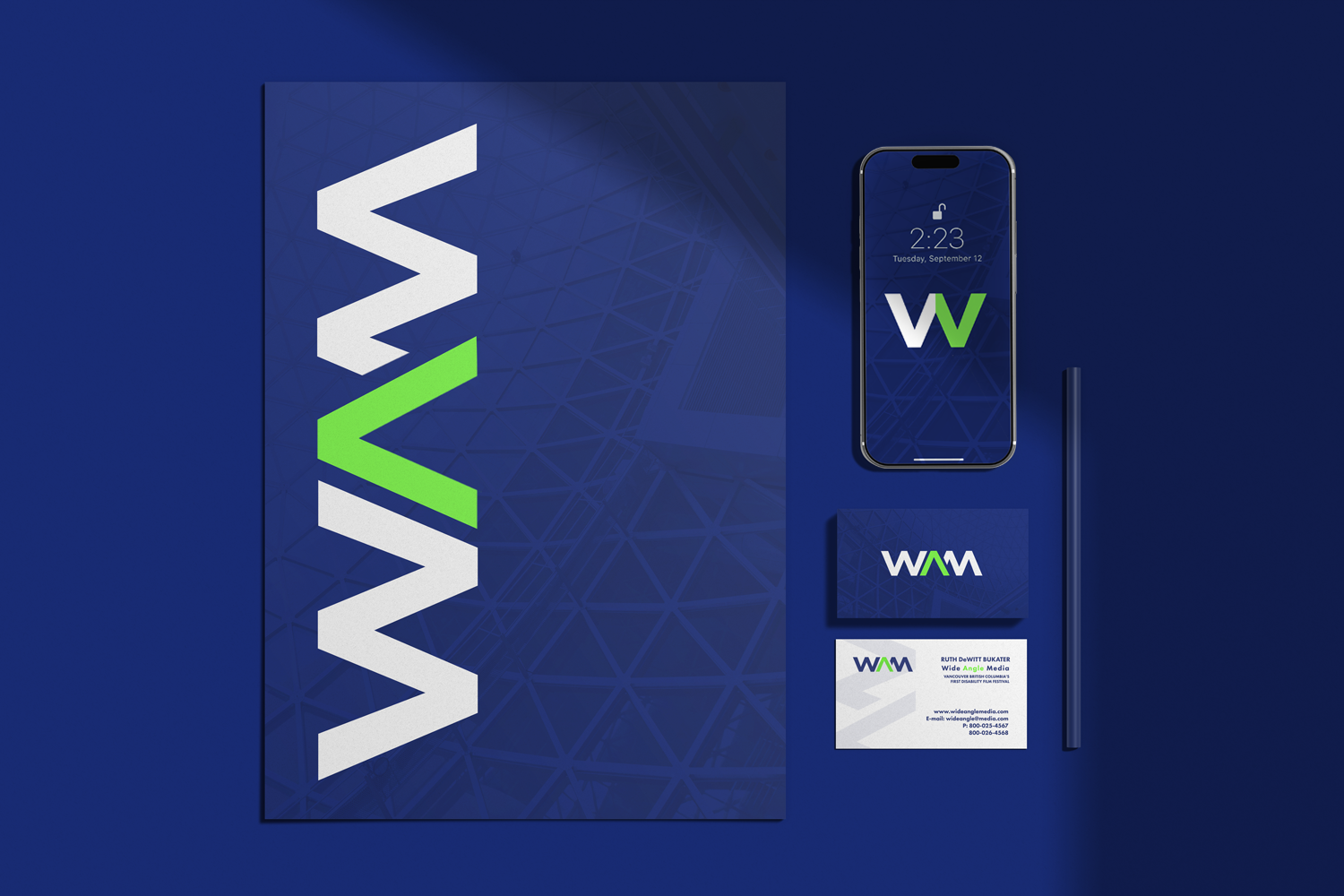
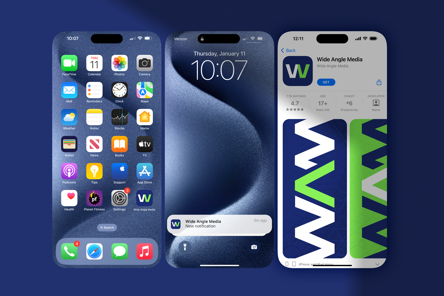

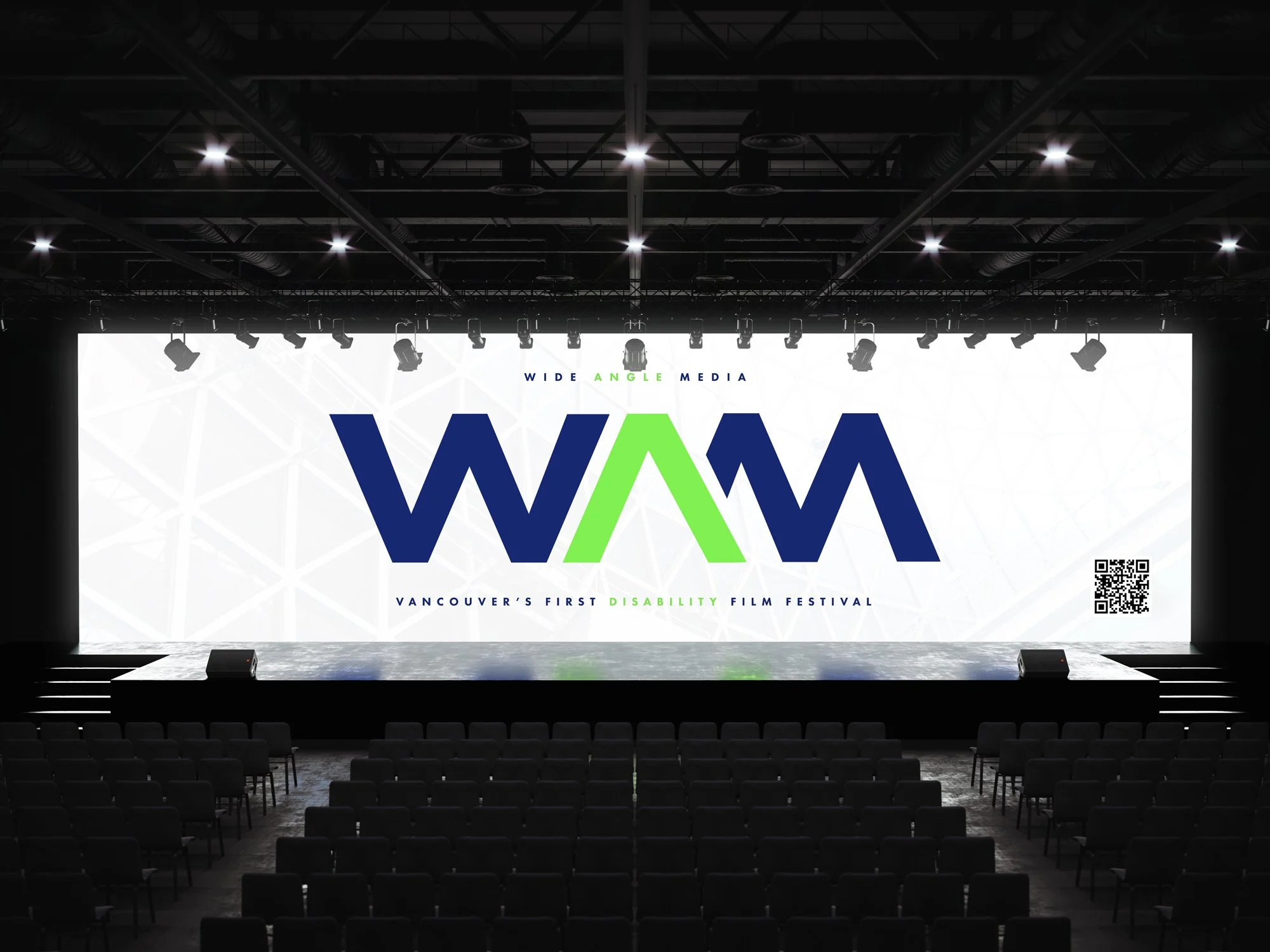
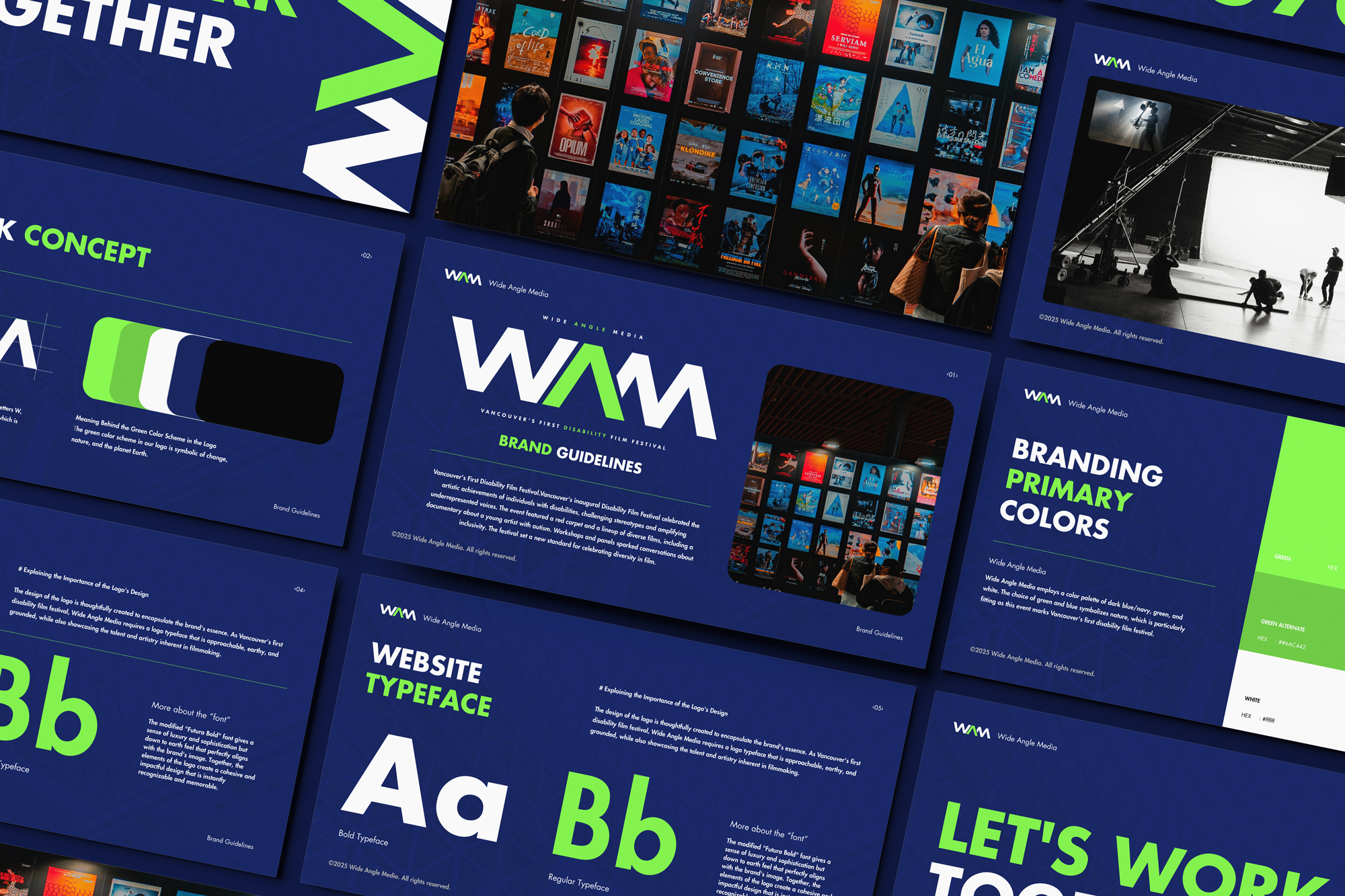
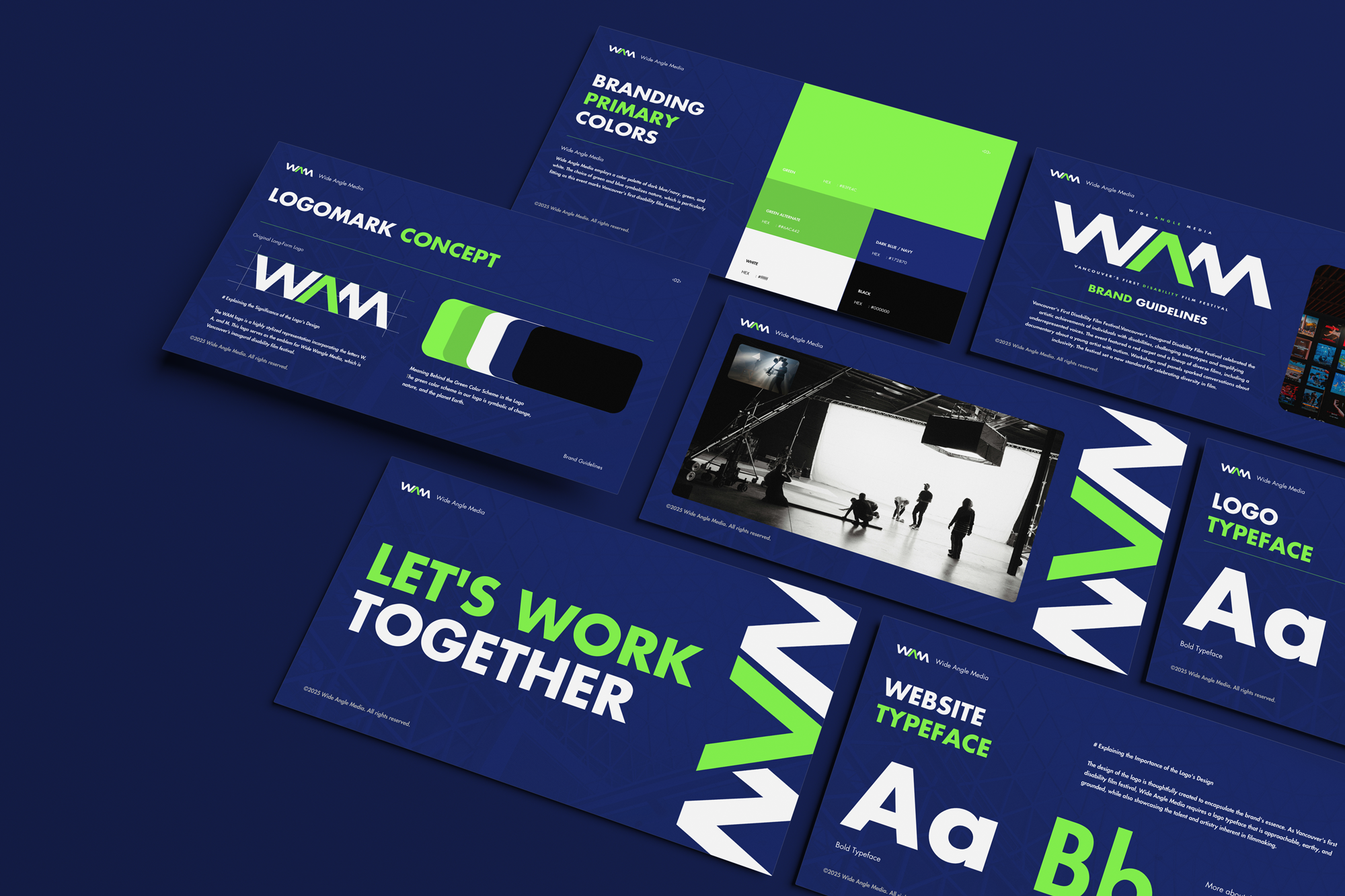
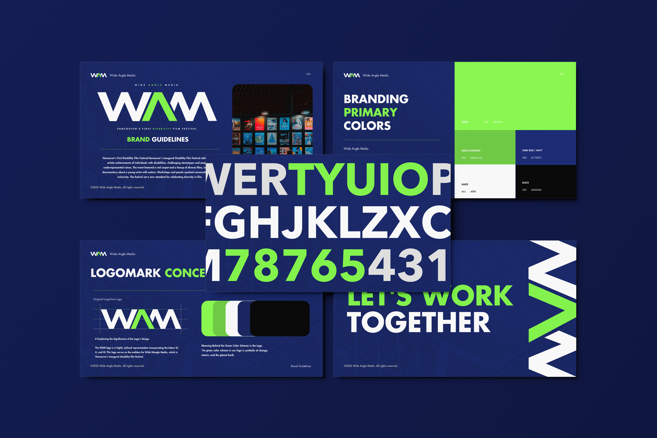
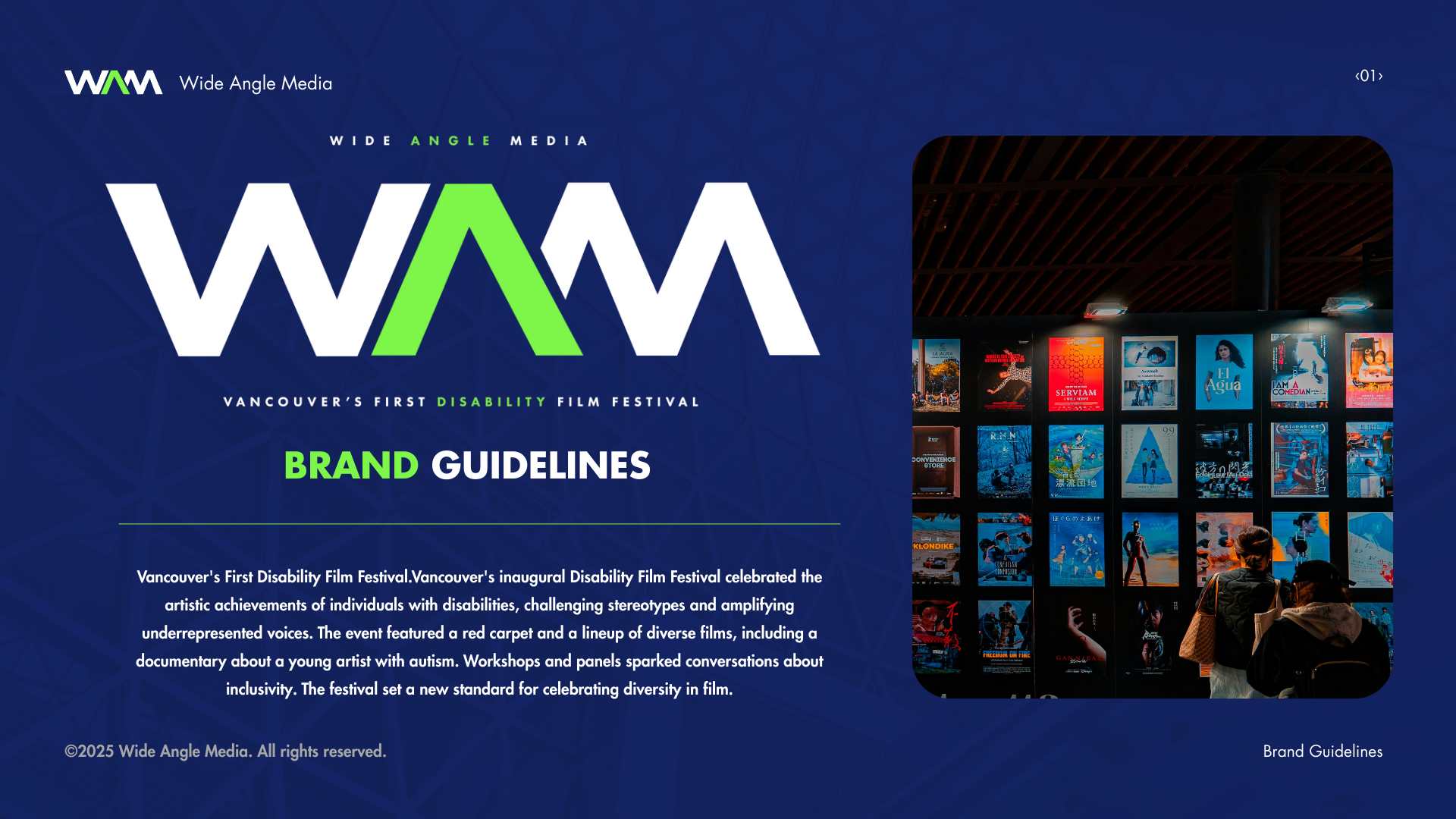
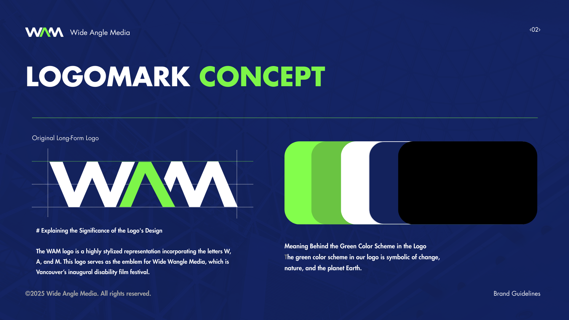
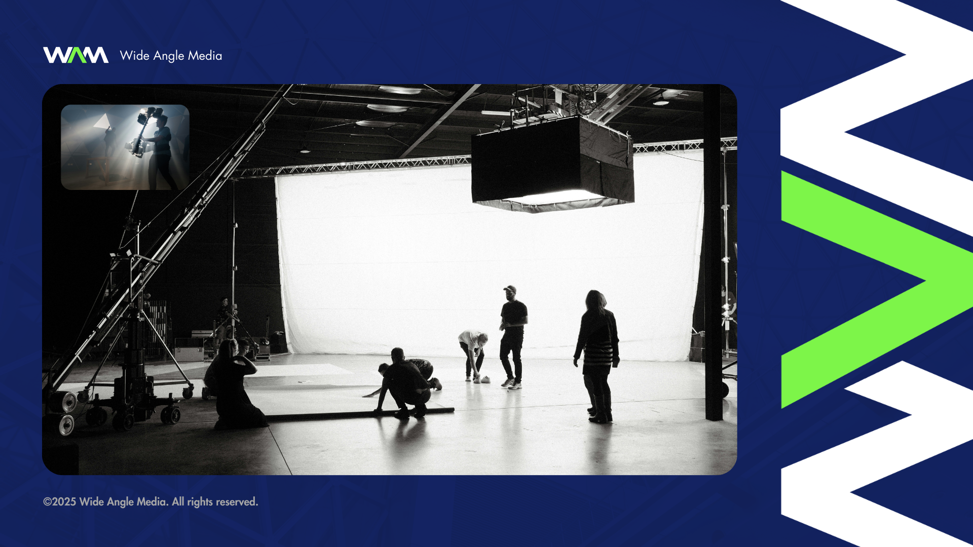
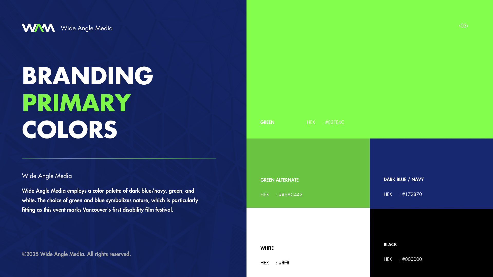
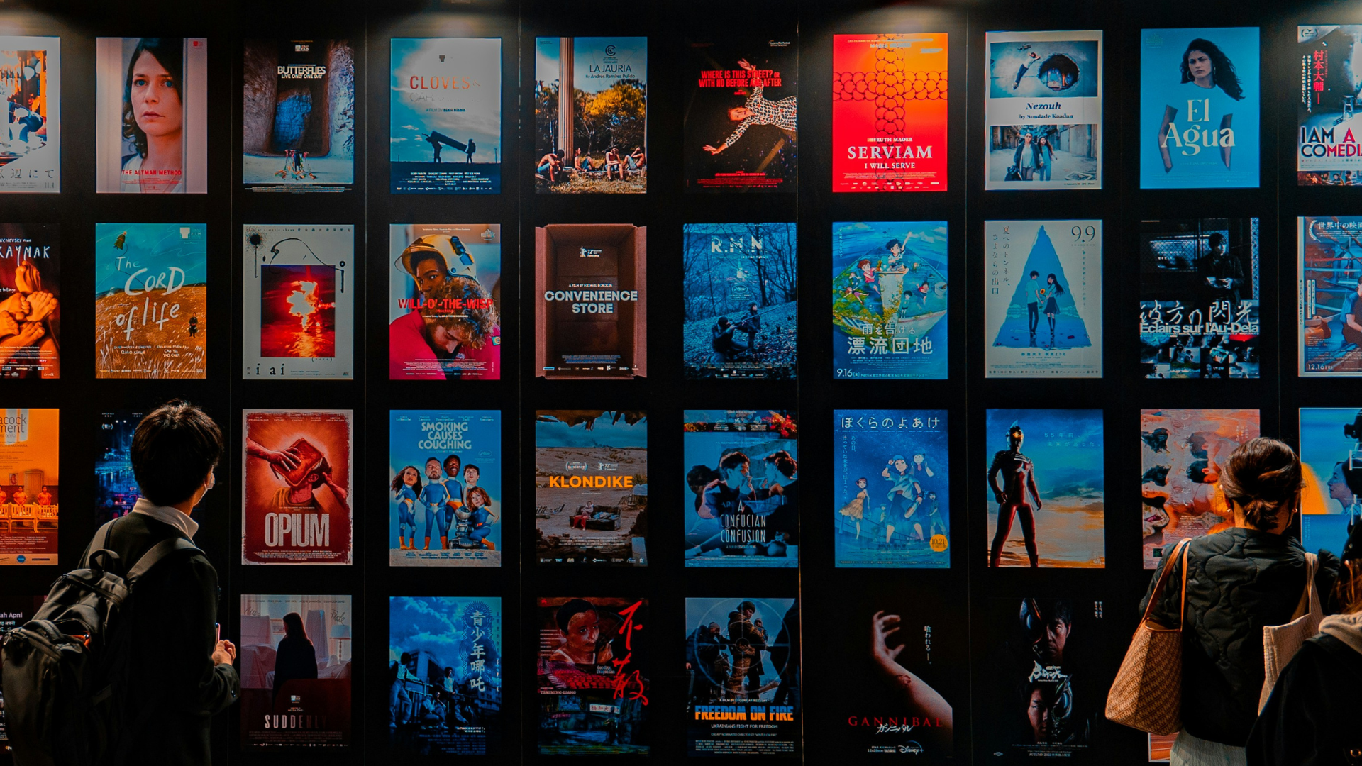
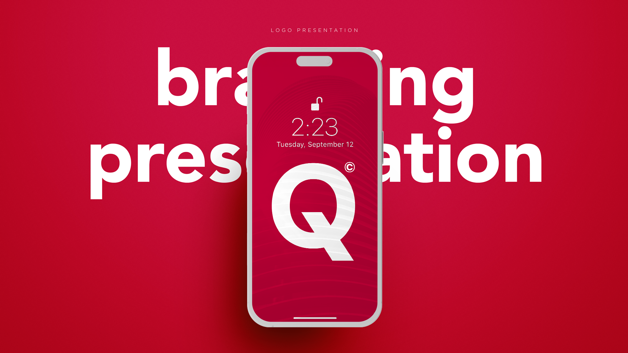
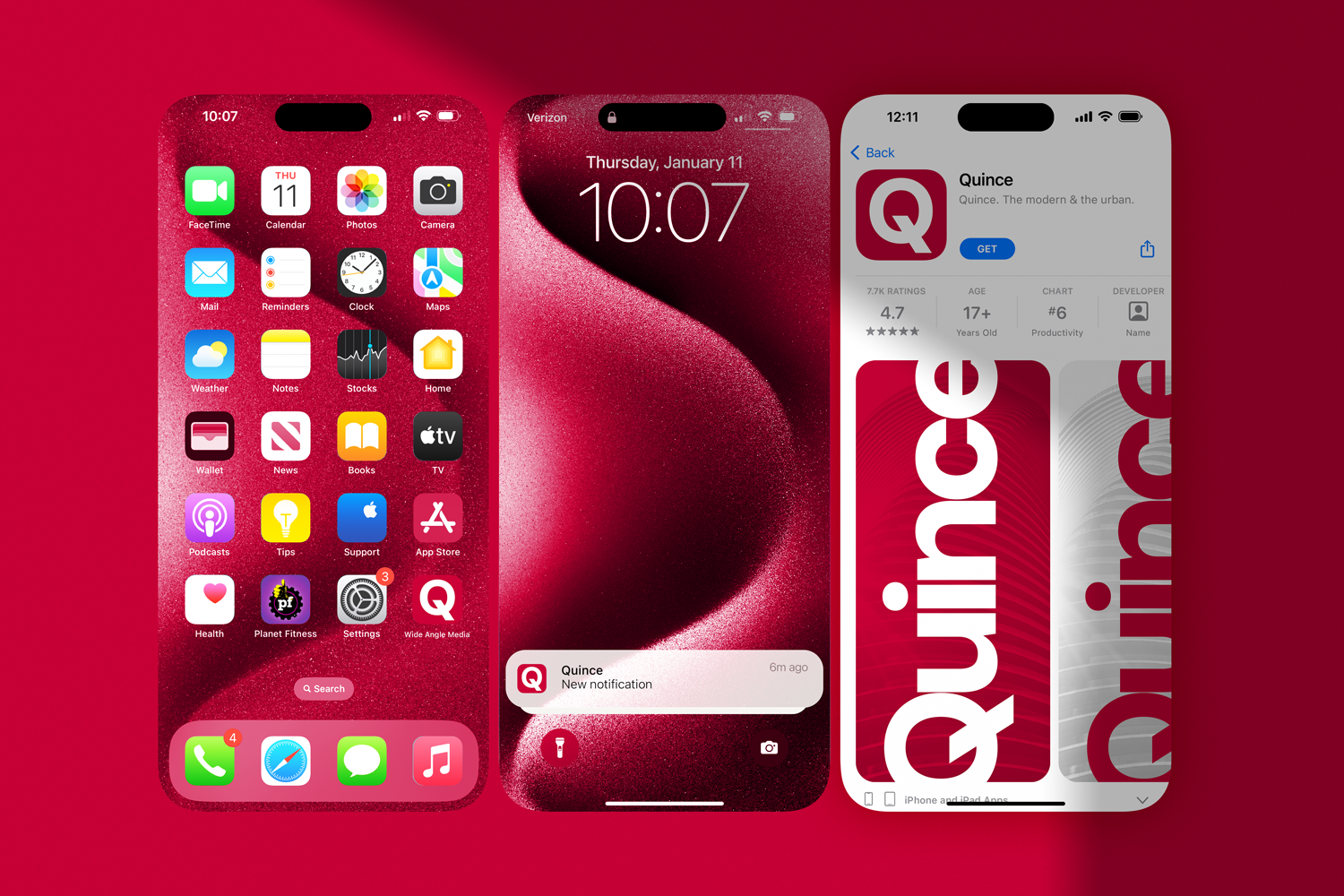
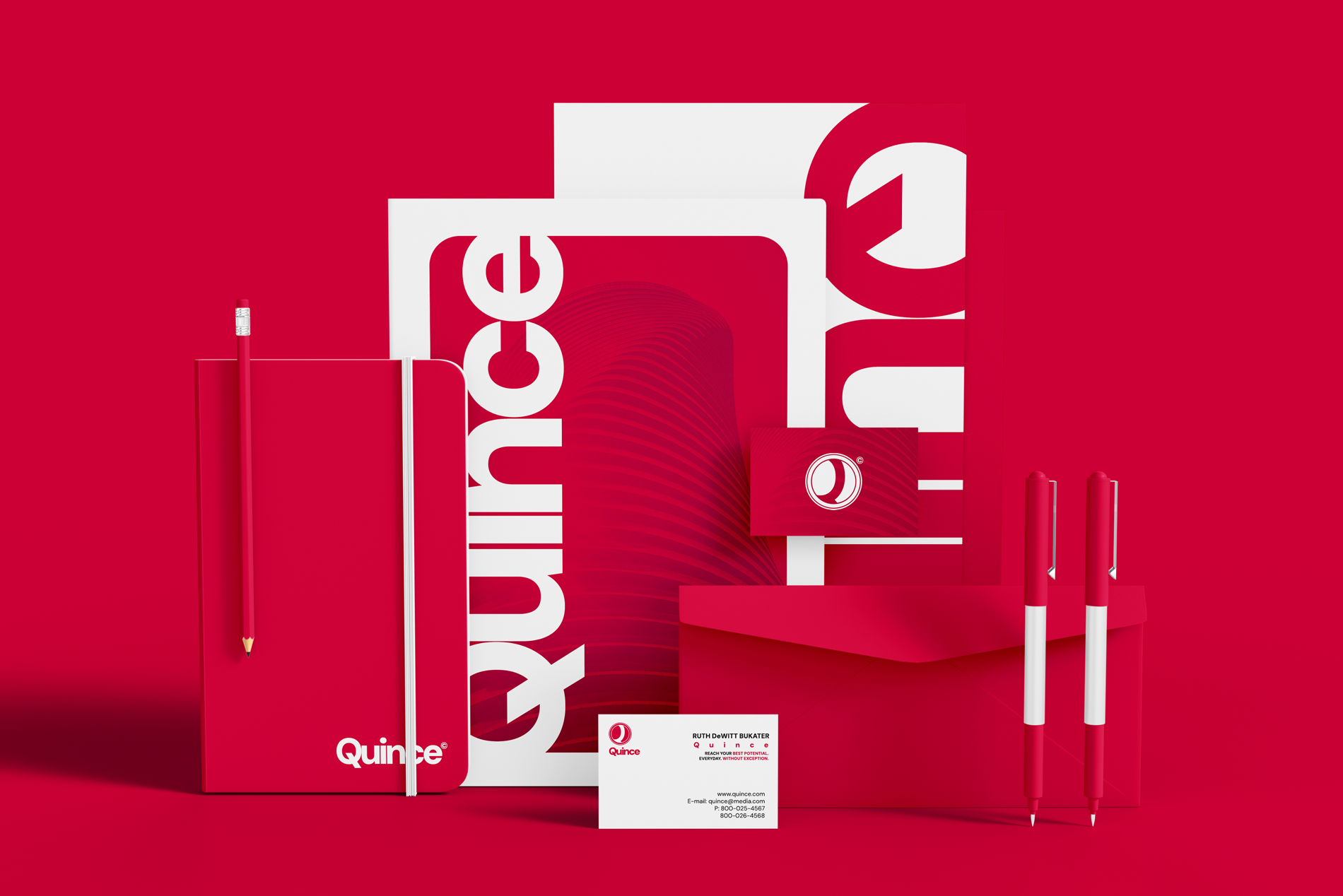
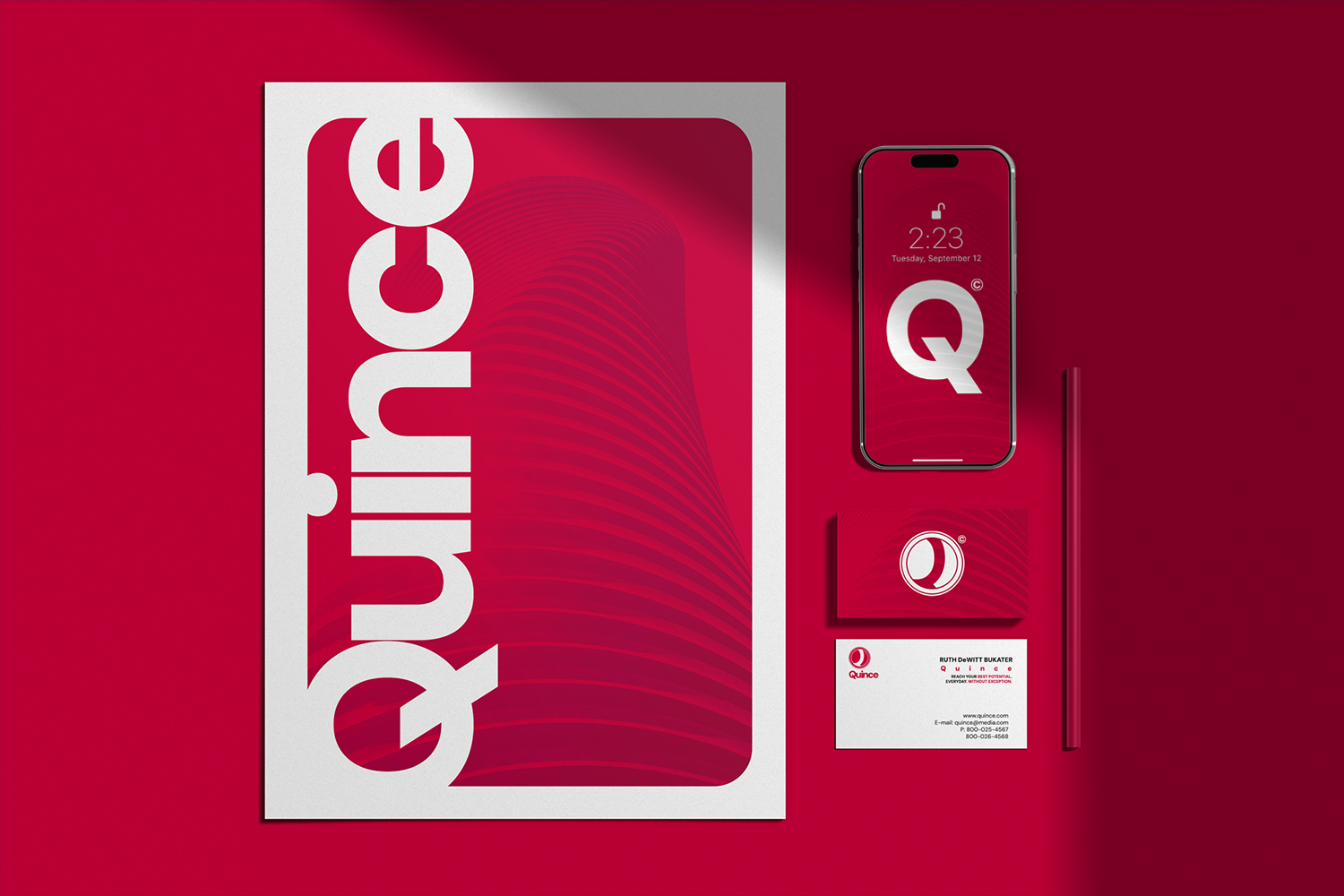
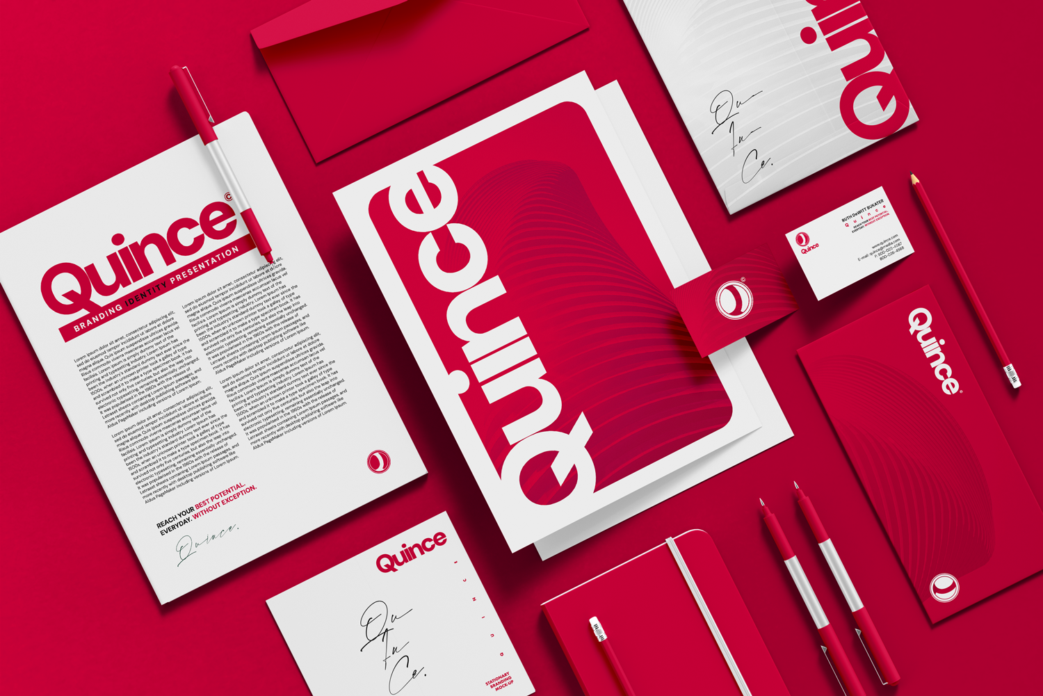
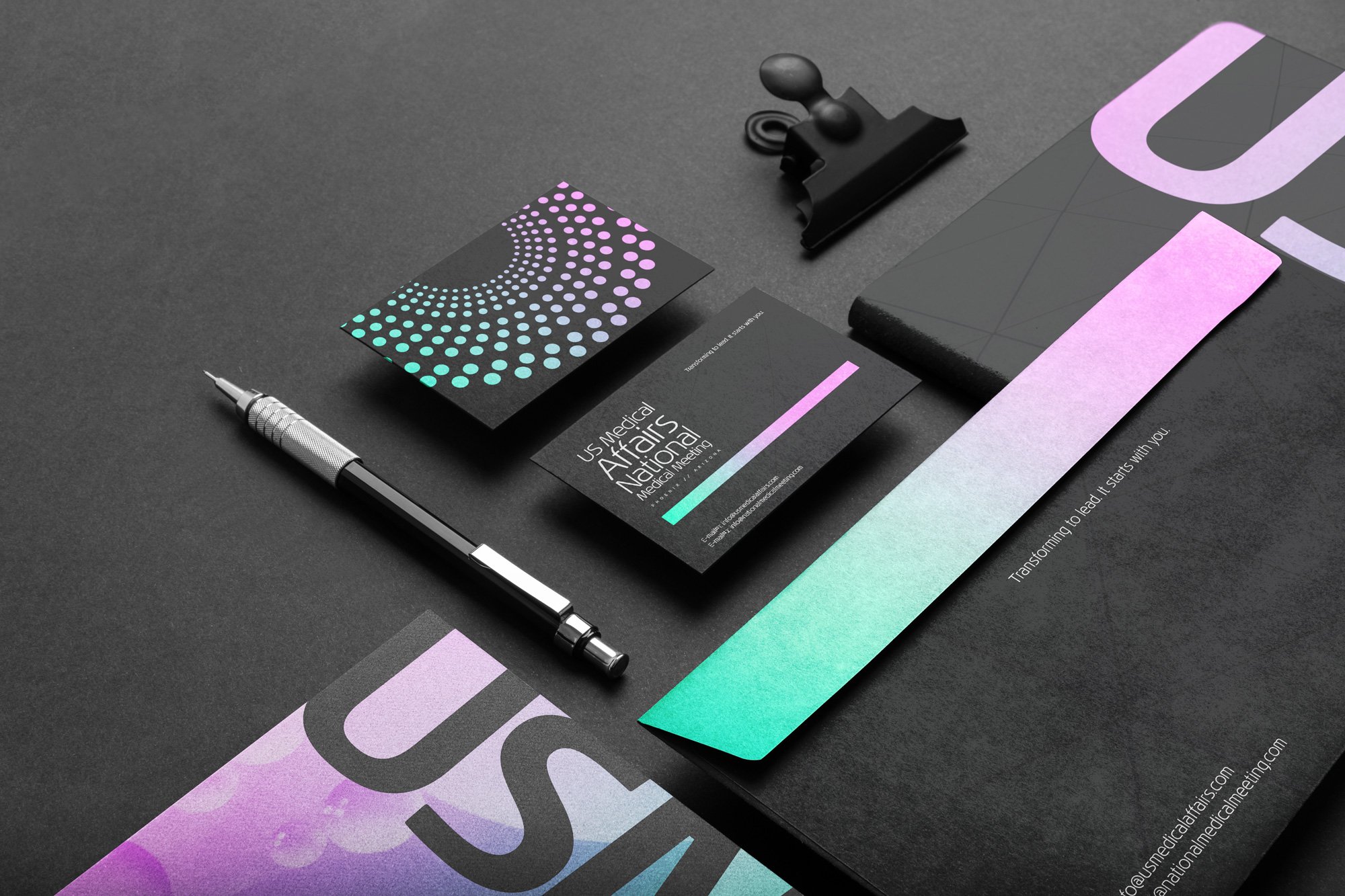
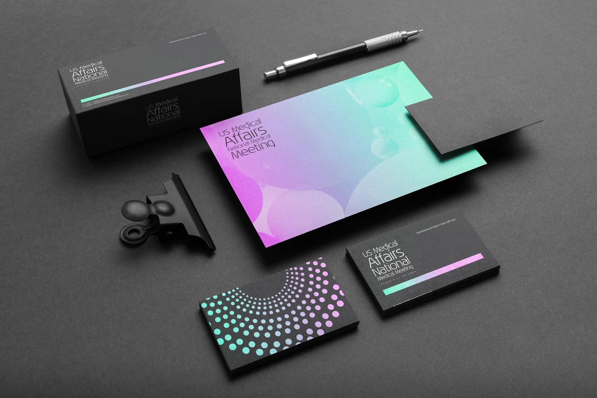
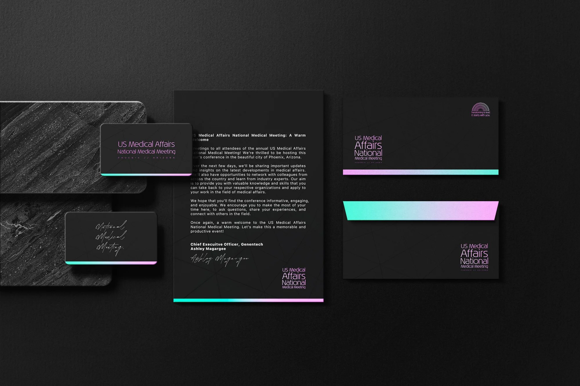
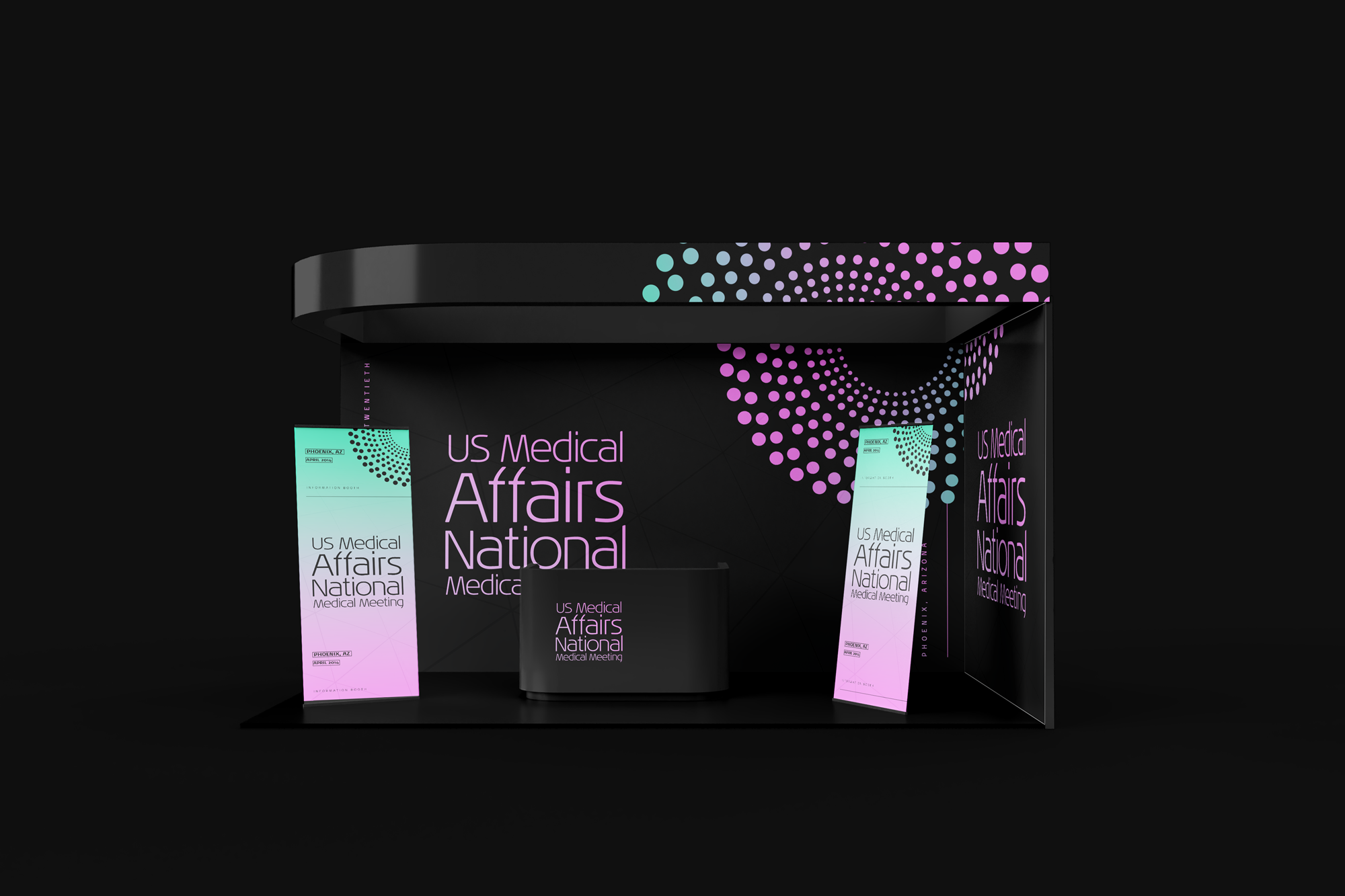
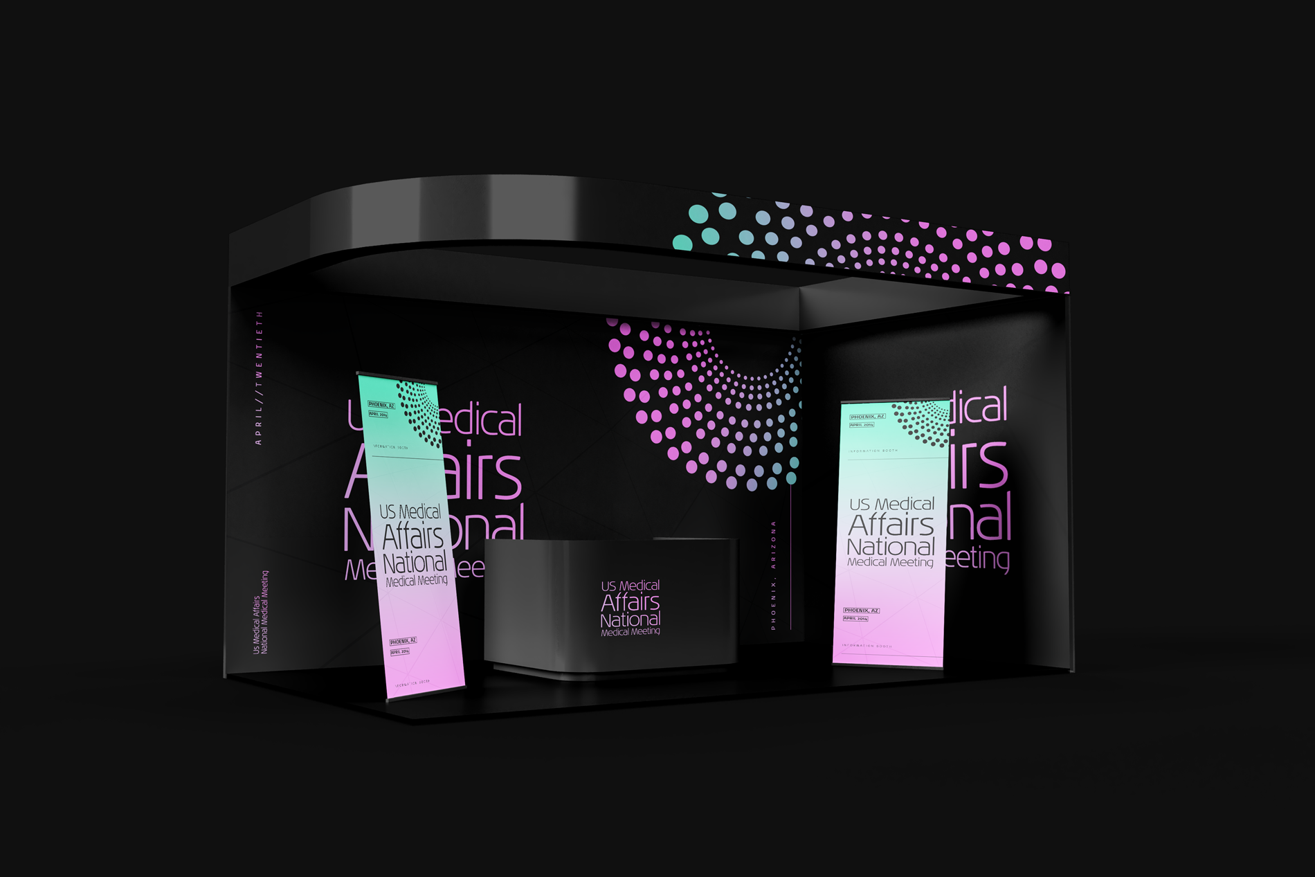
CASE STUDY 01: WIDE ANGLE MEDIA
The Goal: Build a brand that looks good on every medium, from an mobile screens to brand guidelines.
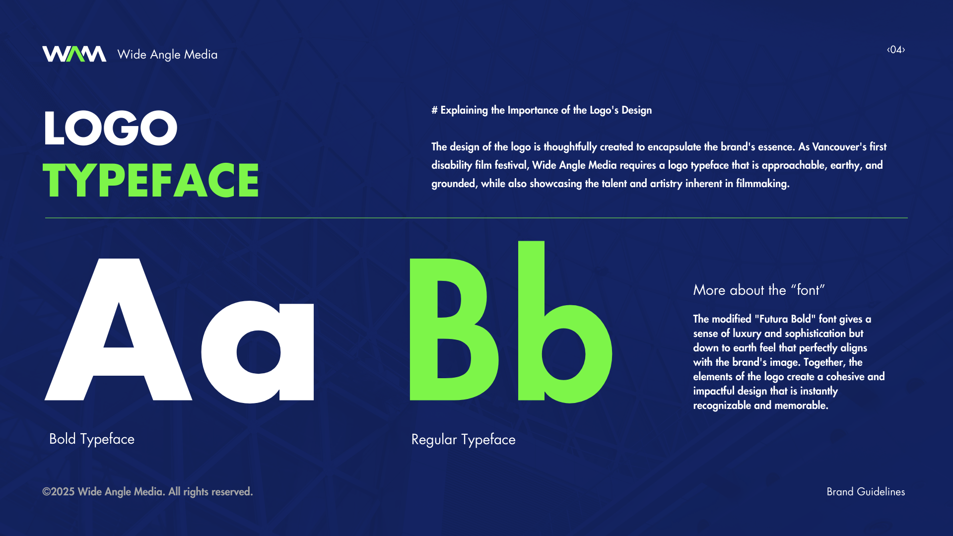
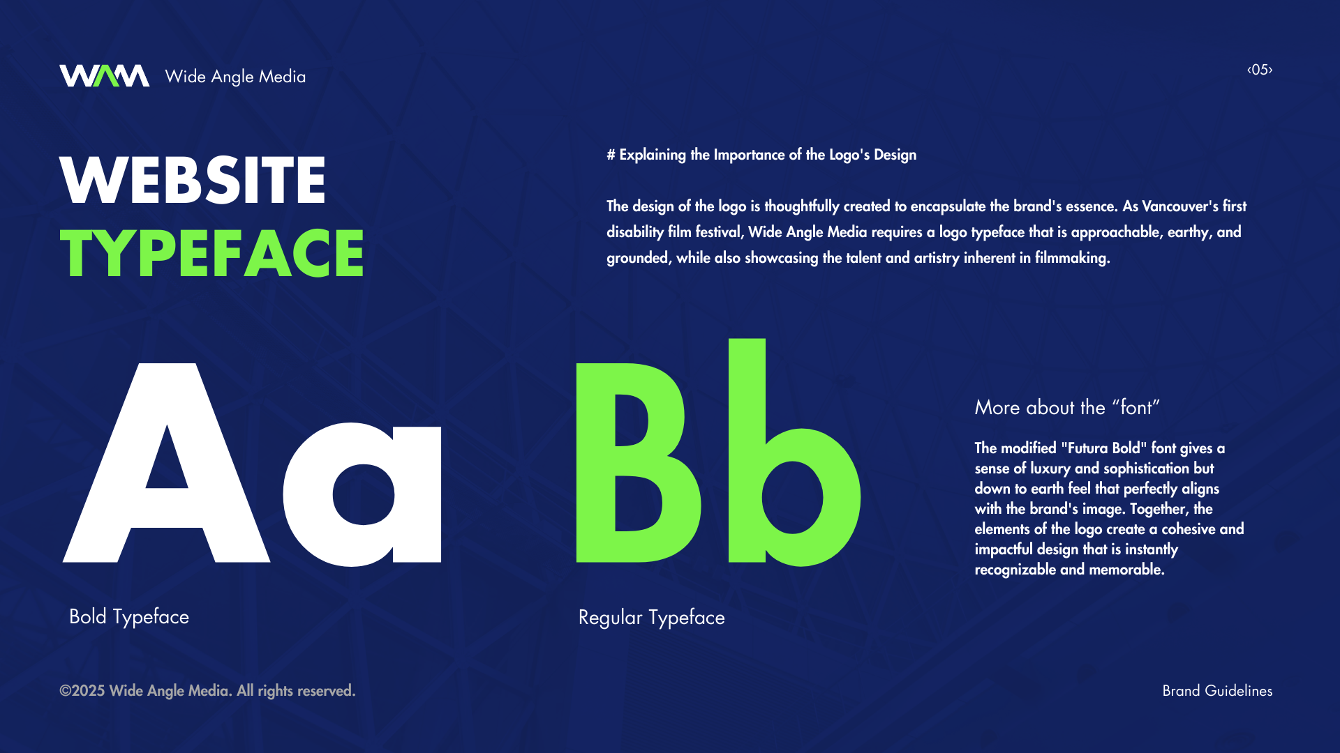
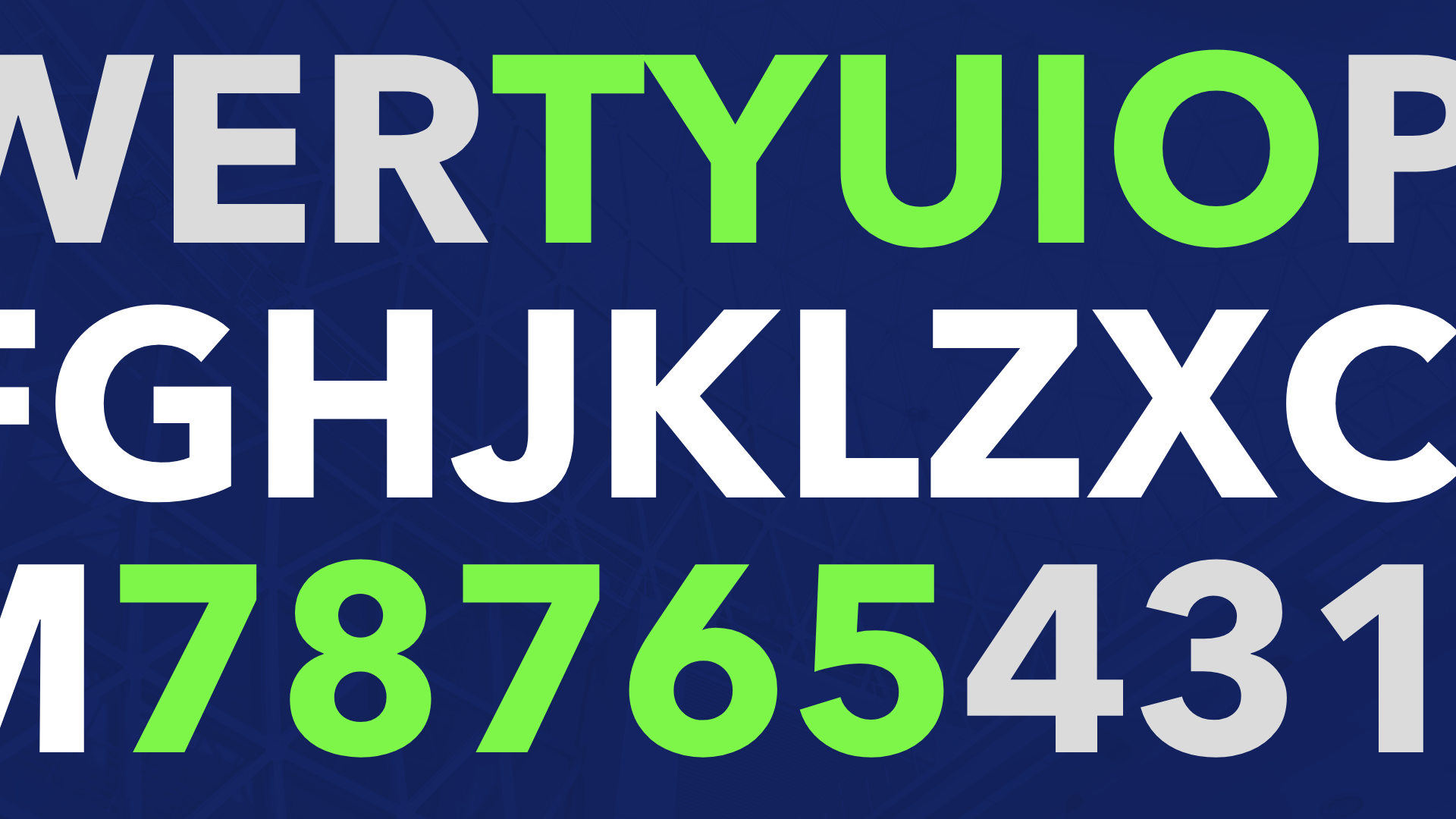
This brand identity system was designed to balance "Cinematic Prestige" with "Radical Accessibility."
Drawing from cinematic form, the logo operates as a literal frame for the festival’s vision. It symbolizes the transition from the unknown to the spotlight, giving unseen stories the platform they deserve. A high-contrast Electric Blue and Neon Green colors were chosen for maximum visibility, reinforcing the core value of accessibility. In addition to establishing brand identity, I also created related campaign materials: Brand Book, Go-To-Market Guide, app/website images and visuals, organic/paid social, OOH and PowerPoint presentations.
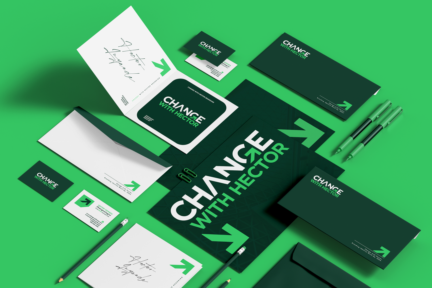
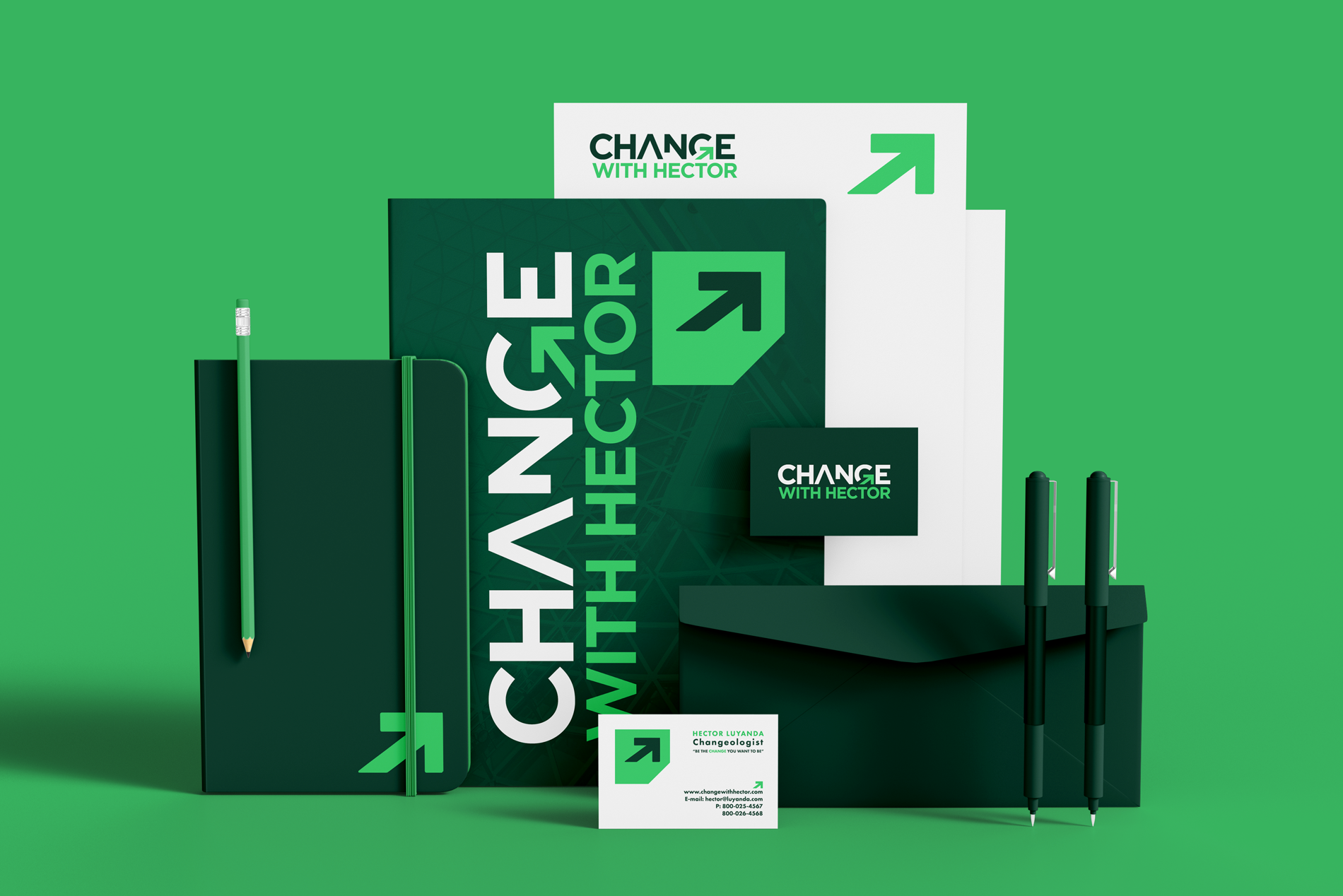

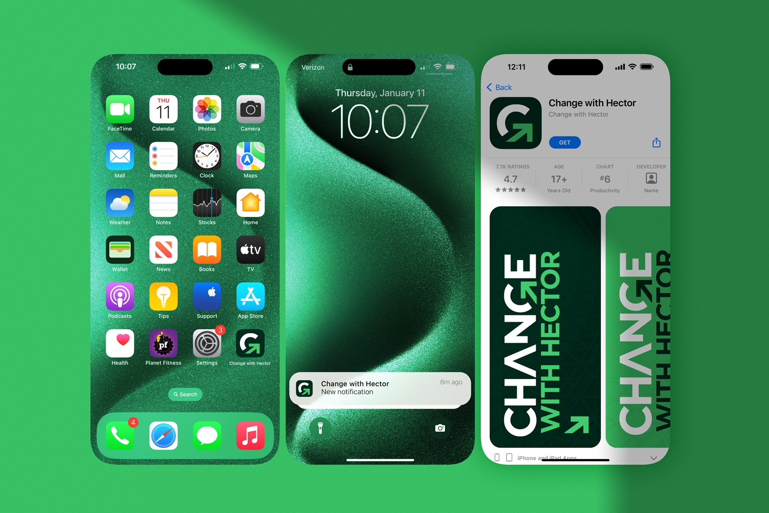
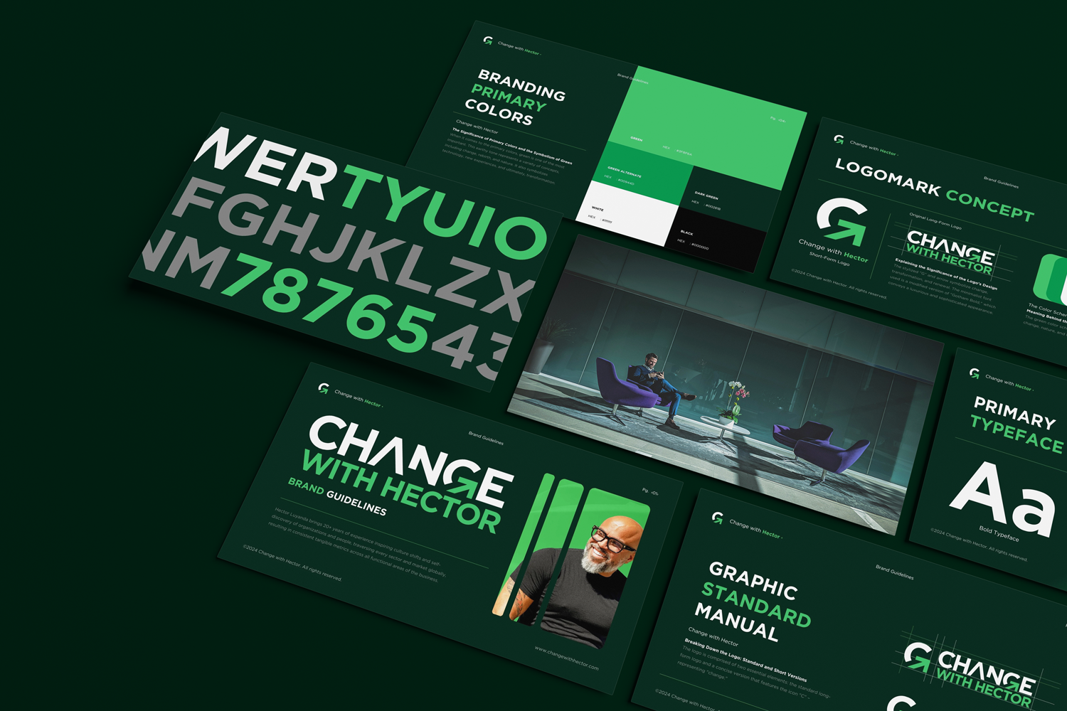
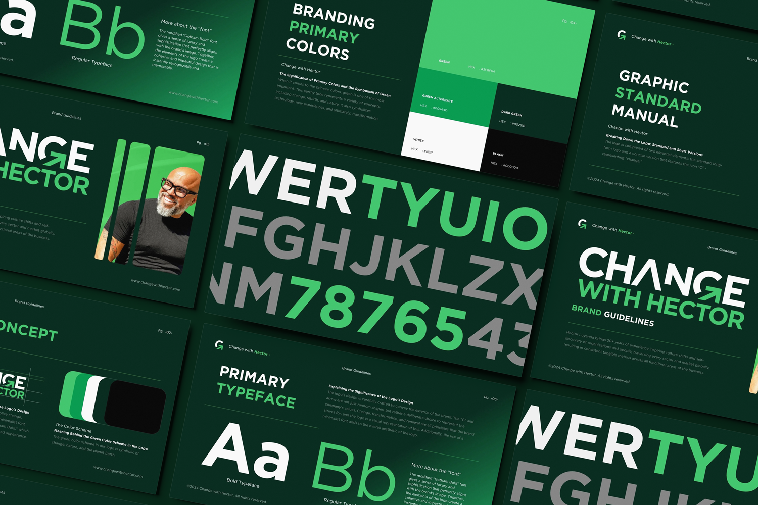
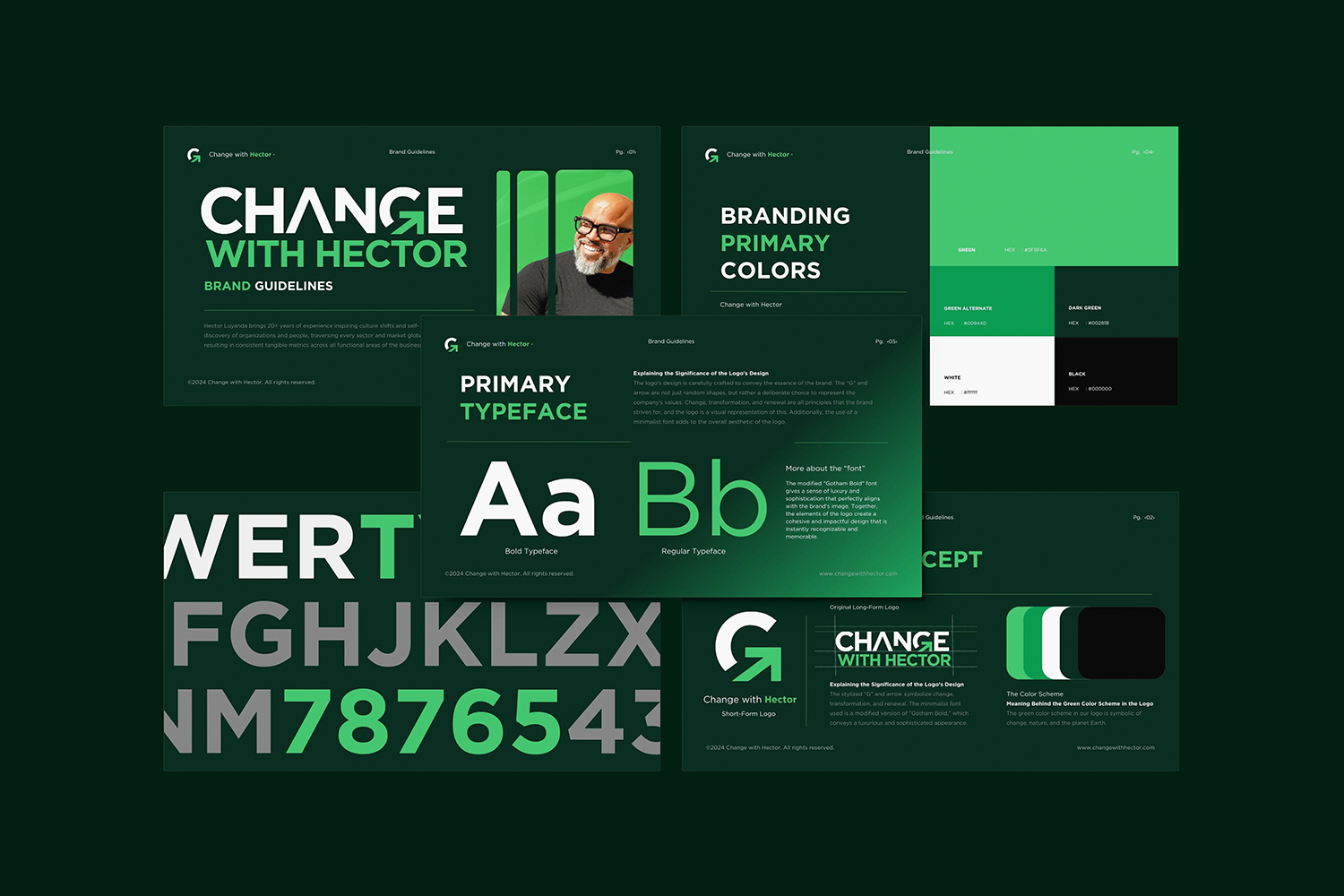


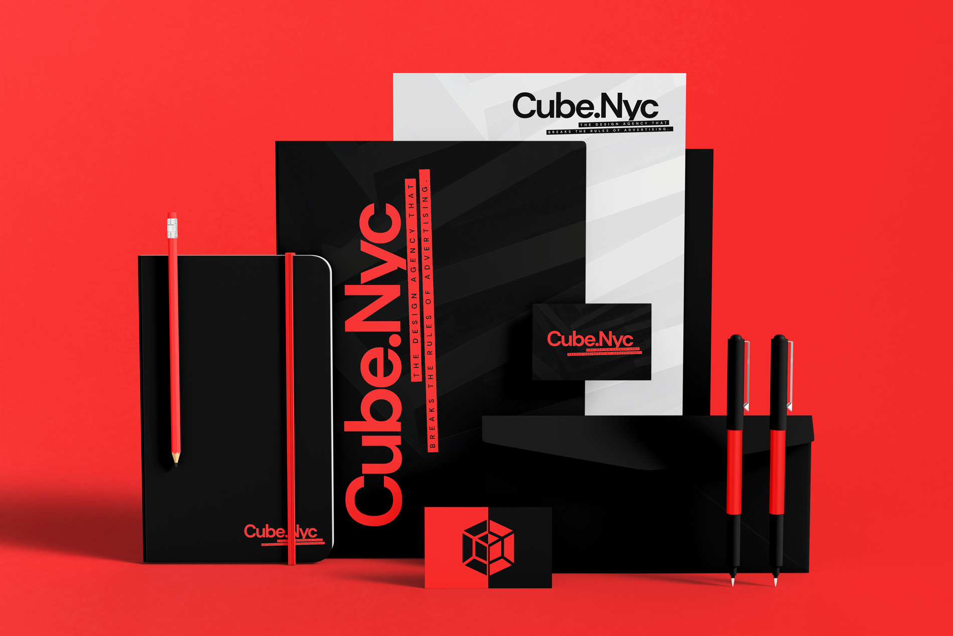
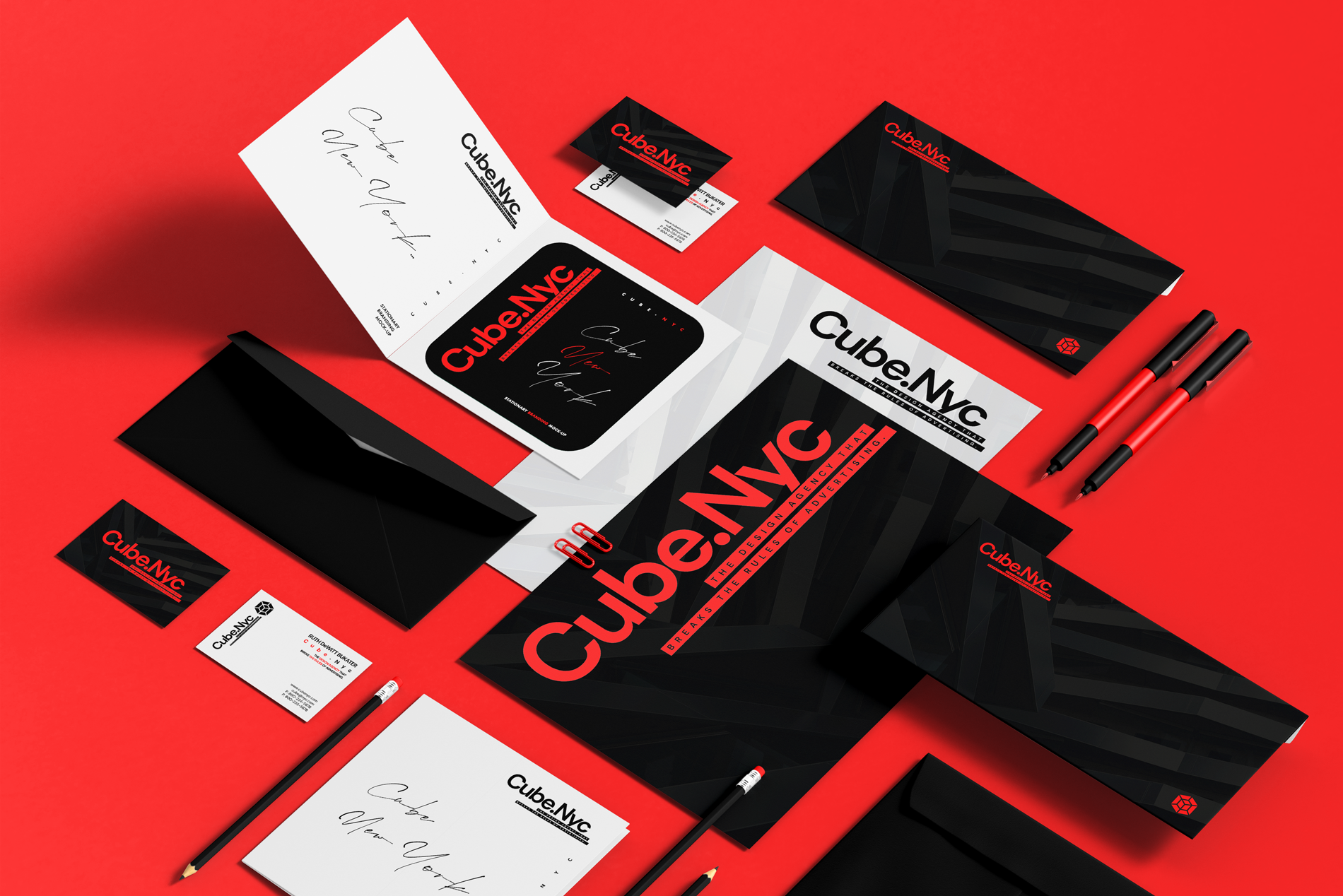
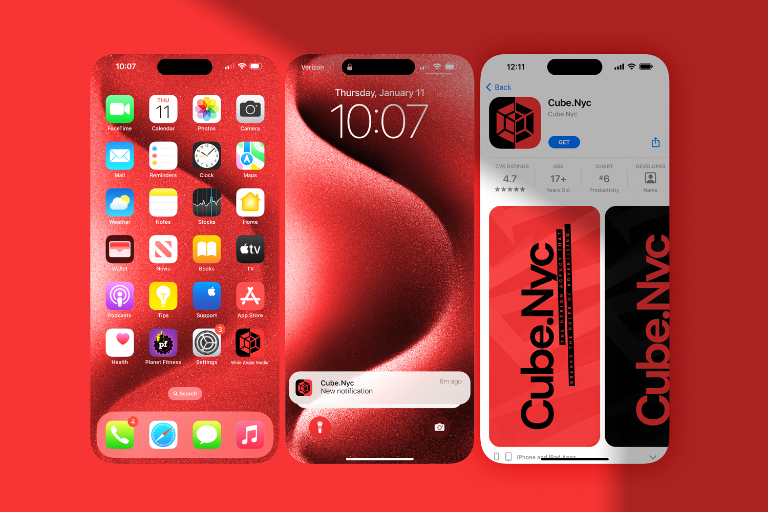
CASE STUDY 02: CHANGE WITH HECTOR
The Goal: Build a brand, and turn a personal name/image into a corporate institution.
The objective was to elevate a personal consultant into a scalable brand asset. I moved away from the "soft" aesthetics typical of the coaching industry in favor of something sharper and more corporate. The logo features a geometric arrow integrated into the typography. It is simple, structural, and points upward—signaling growth and momentum. To build trust, a brand must be consistent. I applied the signature "Organic/Earthy Green" aggressively across every touchpoint—from pens and notebooks to UX/UI and digital interfaces. This approach creates a unified visual ecosystem that makes the individual look like a Fortune 500 company.


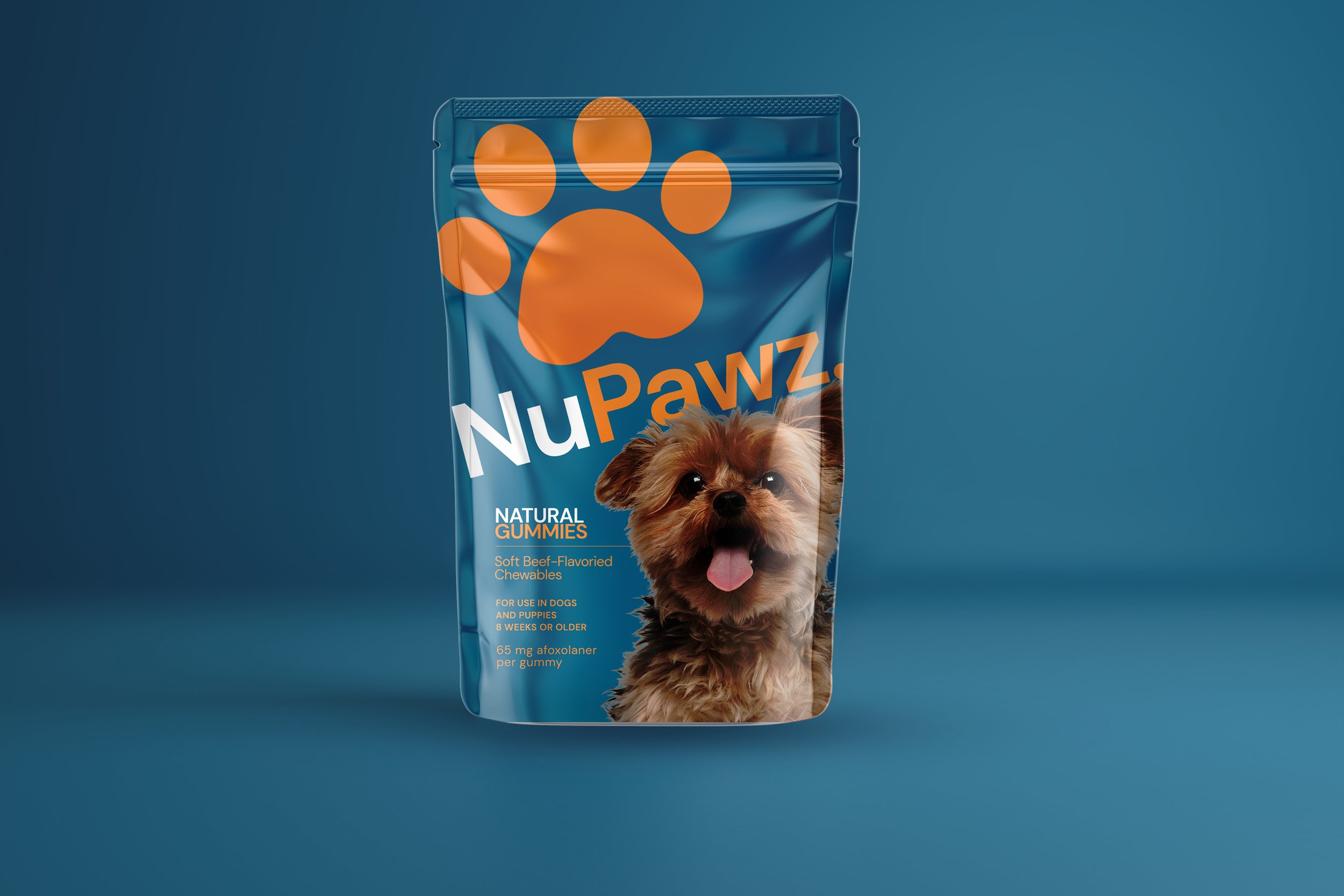
Developing a Cohesive Brand Identity and Packaging
I had the chance to work with NuPawz, a pet company, to develop their branding and product packaging. My objective was to create a recognizable brand identity in a highly competitive pet industry. To achieve this, I conducted thorough research and developed a logo and color scheme that reflected NuPawz's values of quality, trust, and innovation. Additionally, I worked on designing packaging that was both visually appealing and informative, ensuring that all necessary information about each product was included, such as nutritional values, ingredients, and usage instructions.
"I strive for two things in design: simplicity and clarity. Great design is born of those two things."
— Lindo Leader, graphic designer and creator of the FedEx logo